Creating picture charts
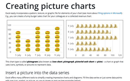
Excel easily incorporates a pattern, texture, or graphic file for elements of your chart (see more about filling options in Microsoft). E.g., you can create a funny burger sales chart for your colleagues or a collected revenue chart:
Creating a chart with dynamic labels
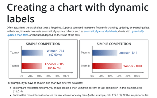
Often actualizing the graph data takes a long time. Suppose you need to present frequently changing, updating, or extending data. In that case, it's easier to create automatically updated charts, such as automatically extended charts, charts with dynamically updated chart titles, or labels that depend on the value of the cells:
Glossy Gantt chart with a vertical line
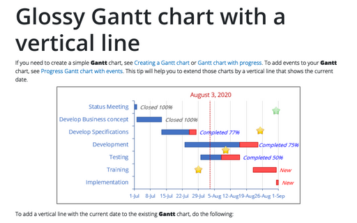
If you need to create a simple Gantt chart, see Creating a Gantt chart or Gantt chart with progress. To add events to your Gantt chart, see Progress Gantt chart with events. This tip will help you to extend those charts by a vertical line that shows the current date.
Creating Pie of Pie and Bar of Pie charts
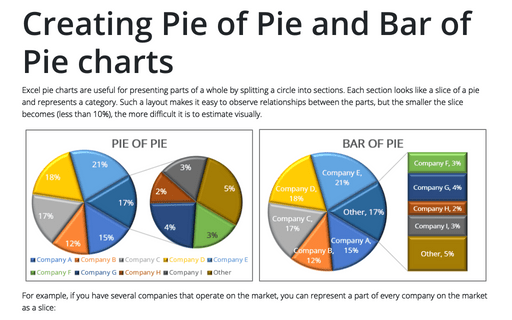
Excel pie charts are useful for presenting parts of a whole by splitting a circle into sections. Each section looks like a slice of a pie and represents a category. Such a layout makes it easy to observe relationships between the parts, but the smaller the slice becomes (less than 10%), the more difficult it is to estimate visually.
How to create simple interactive chart with radio or option buttons
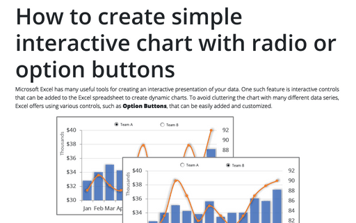
Microsoft Excel has many useful tools for creating an interactive presentation of your data. One such feature is interactive controls that can be added to the Excel spreadsheet to create dynamic charts. To avoid cluttering the chart with many different data series, Excel offers using various controls, such as Option Buttons, that can be easily added and customized.
Progressively create a Gantt chart in Excel
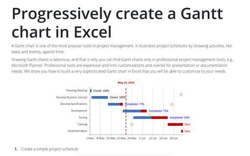
A Gantt chart is one of the most popular tools in project management. It illustrates project schedules
by showing activities, like tasks and events, against time.
How to freeze charts, shapes, text boxes, and other objects in Excel
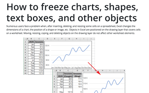
Numerous users face a problem when, after inserting, deleting, and resizing some cells on a spreadsheet, Excel changes the dimensions of a chart, the position of a shape or image, etc. Objects in Excel are positioned on the drawing layer that covers cells on a worksheet.
A quick way to duplicate all of the custom chart formatting
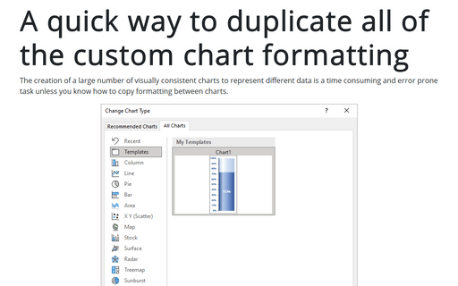
The creation of a large number of visually consistent charts to represent different data is a time consuming and error prone task unless you know how to copy formatting between charts.
How to create step chart in Excel
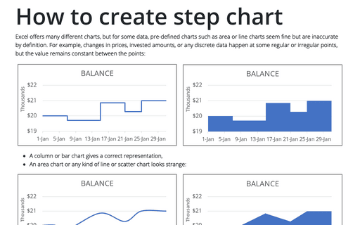
Excel offers many different charts, but for some data, pre-defined charts such as area or line charts seem fine but are inaccurate by definition. For example, changes in prices, invested amounts, or any discrete data happen at some regular or irregular points, but the value remains constant between the points:
Side by side comparison bar chart
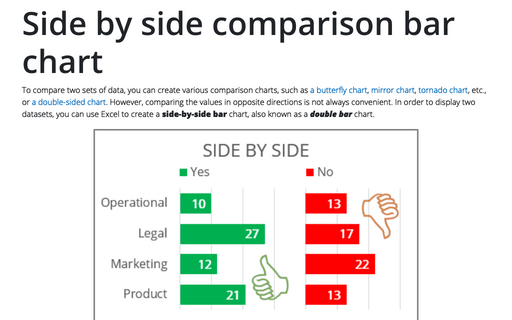
To compare two sets of data, you can create various comparison charts, such as a butterfly chart, mirror chart, tornado chart, etc., or a double-sided chart. However, comparing the values in opposite directions is not always convenient. In order to display two datasets, you can use Excel to create a side-by-side bar chart, also known as a double bar chart.
