How to add a vertical line to the scatter chart
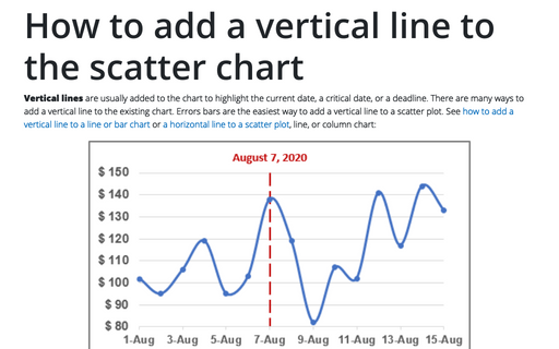
Vertical lines are usually added to the chart to highlight the current date, a critical date, or a deadline. There are many ways to add a vertical line to the existing chart. Errors bars are the easiest way to add a vertical line to a scatter plot. See how to add a vertical line to a line or bar chart or a horizontal line to a scatter plot, line, or column chart:
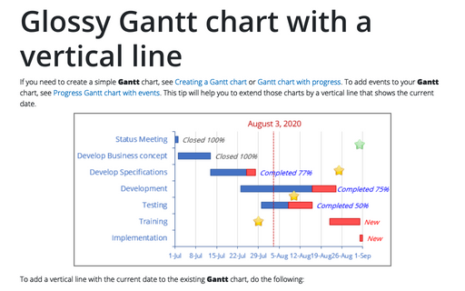
Glossy Gantt chart with a vertical line
If you need to create a simple Gantt chart, see Creating a Gantt chart or Gantt chart with progress. To add events to your Gantt chart, see Progress Gantt chart with events. This tip will help you to extend those charts by a vertical line that shows the current date.
How to create different types of histogram charts in Excel
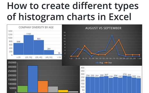
A histogram chart visualizes the distribution of continuous data. Each column in the histogram chart represents the frequency (amount) of the data within the specific range.
How to highlight a data point
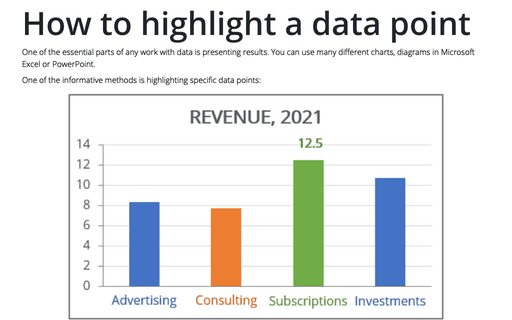
One of the essential parts of any work with data is presenting results. You can use many different
charts, diagrams in Microsoft Excel or PowerPoint.
How to create a Scrolling chart
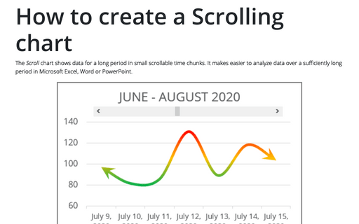
The Scroll chart shows data for a long period in small scrollable time chunks. It makes easier to analyze data over a sufficiently long period in Microsoft Excel, Word or PowerPoint.
The Scroll chart displays some contiguous range of data from a large dataset. Using the provided Control tools, it is possible to add a scroll bar to the chart area and view the desired data range:
The Scroll chart displays some contiguous range of data from a large dataset. Using the provided Control tools, it is possible to add a scroll bar to the chart area and view the desired data range:
Customize the vertical axis labels
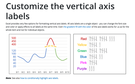
Excel provides very few options for formatting vertical axis labels. All axis labels are a single object - you can change the font size and color or apply effects to all labels at the same time. Even the gradient fill with the color of the axis labels works for us as for the whole item and not for individual objects.
Creating a glossy thermometer chart
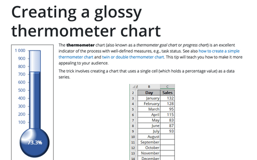
The thermometer chart (also known as a thermometer goal chart or progress chart) is an excellent indicator of the process with well-defined measures, e.g., task status. See also how to create a simple thermometer chart and twin or double thermometer chart. This tip will teach you how to make it more appealing to your audience.
How to create a Mosaic plot in Excel
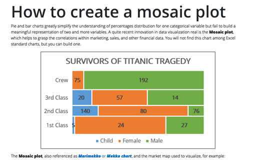
Pie and bar charts greatly simplify the understanding of percentages distribution for one categorical variable but fail to build a meaningful representation of two and more variables. A quite recent innovation in data visualization real is the Mosaic plot, which helps to grasp the correlations within marketing, sales, and other financial data. You will not find this chart among Excel standard charts, but you can build one.
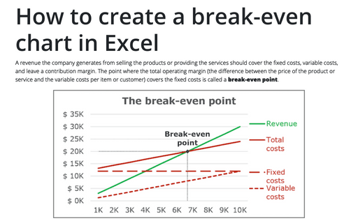
How to create a break-even chart in Excel
A revenue the company generates from selling the products or providing the services should cover the
fixed costs, variable costs, and leave a contribution margin. The point where the total operating
margin (the difference between the price of the product or service and the variable costs per item
or customer) covers the fixed costs is called a break-even point.
How to create a funny dog breeds lifespan chart in Excel
Span chart, also known as a range bar graph (range column graph), floating bar graph, difference graph, high-low graph, used to display the specific variable value range. Span charts are ideal for comparing ranges, and typically, each variable represents a particular category. All values for the selected category fall between minimal and maximal values that correspond to lower and upper bounds of the interval.
