Competition chart with residual data
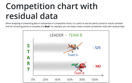
When analyzing or presenting data in comparison or competitive charts, it is useful to see the points scored or results achieved and the remaining points to complete the Goal. For example, you can easily create a simple competition chart with residual data:
Adding error bars
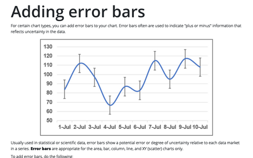
For certain chart types, you can add error bars to your chart. Error bars often are used to indicate "plus or minus" information that reflects uncertainty in the data.
How to add pictures to vertical axis of the bar chart
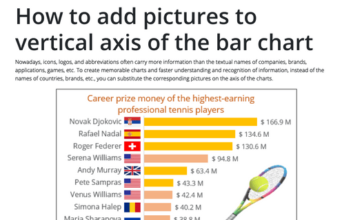
Nowadays, icons, logos, and abbreviations often carry more information than the textual names of companies, brands, applications, games, etc. To create memorable charts and faster understanding and recognition of information, instead of the names of countries, brands, etc., you can substitute the corresponding pictures on the axis of the charts.
How to make Tornado chart in Excel
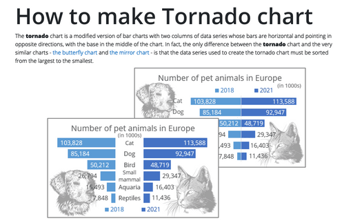
The tornado chart is a modified version of bar charts with two columns of data series whose bars are horizontal and pointing in opposite directions, with the base in the middle of the chart. In fact, the only difference between the tornado chart and the very similar charts - the butterfly chart and the mirror chart - is that the data series used to create the tornado chart must be sorted from the largest to the smallest.
How to add Dividers to the chart
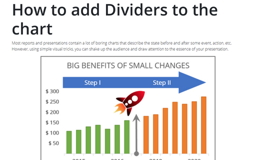
Most reports and presentations contain a lot of boring charts that describe the state before and after some
event, action, etc. However, using simple visual tricks, you can shake up the audience and draw attention
to the essence of your presentation.
Side by side comparison bar chart with differences
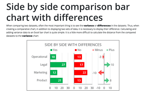
When comparing two datasets, often the most important thing is to see the variance or differences in the datasets. Thus, when creating a comparative chart, in addition to displaying two sets of data, it is necessary to display their difference. Calculating and adding variance data to an Excel bar chart is quite simple. It is a little more difficult to calculate the distance from the compared datasets to the variance chart:
Using Arrows in a Chart
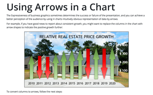
The Expressiveness of business graphics sometimes determines the success or failure of the presentation, and you can achieve a better perception of the audience by using in charts intuitively obvious representation of data by arrows.
Gantt chart with progress or progress Gantt chart
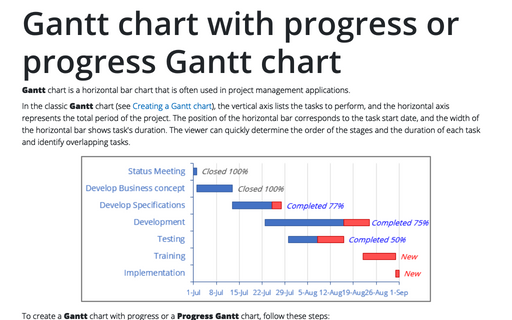
Gantt chart is a horizontal bar chart that is often used in project management
applications.
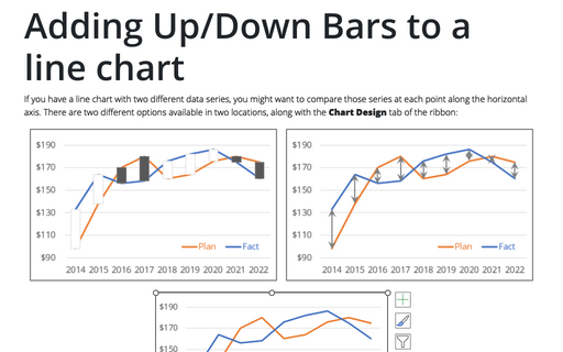
Adding Up/Down Bars to a line chart
If you have a line chart with two different data series, you might want to compare those series at each point along the horizontal axis. There are two different options available in two locations, along with the Chart Design tab of the ribbon:
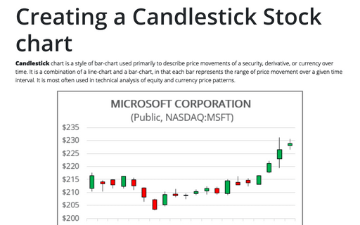
Creating a Candlestick Stock chart
Candlestick chart is a style of bar-chart used primarily to describe price movements of a security, derivative, or currency over time. It is a combination of a line-chart and a bar-chart, in that each bar represents the range of price movement over a given time interval. It is most often used in technical analysis of equity and currency price patterns.
