How to make Mirror chart in Excel
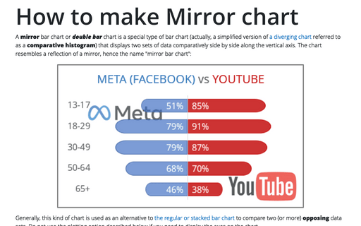
A mirror bar chart or double bar chart is a special type of bar chart (actually, a simplified version of a diverging chart referred to as a comparative histogram) that displays two sets of data comparatively side by side along the vertical axis. The chart resembles a reflection of a mirror, hence the name "mirror bar chart":
How to create Waterfall chart
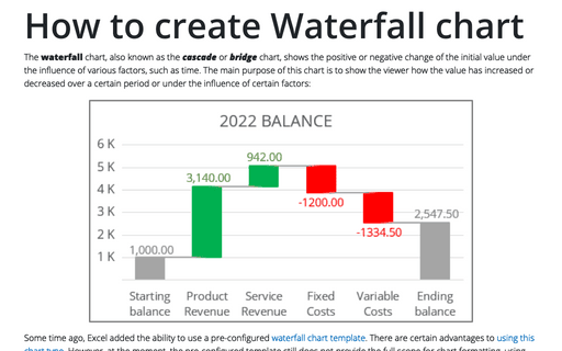
The waterfall chart, also known as the cascade or bridge chart, shows the positive or negative change of the initial value under the influence of various factors, such as time. The main purpose of this chart is to show the viewer how the value has increased or decreased over a certain period or under the influence of certain factors:
How to show Likert scale chart (integrated neutral)
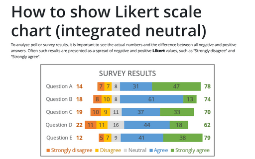
To analyze poll or survey results, it is important to see the actual numbers and the difference between all negative and positive answers. Often such results are presented as a spread of negative and positive Likert values, such as "Strongly disagree" and "Strongly agree".
Creating a simple thermometer chart
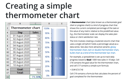
A thermometer chart (also known as a thermometer goal chart or progress chart) is a kind of progress chart that shows the current completed percentage of the task or the value of any metric relative to the predefined value. E.g., the thermometer scale can display the sales plan status or client satisfaction rate.
Using two axes in one chart
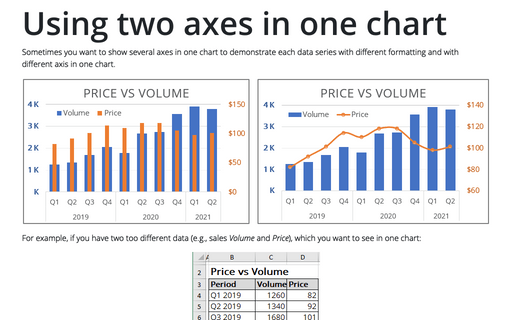
Sometimes you want to show several axes in one chart to demonstrate each data series with different
formatting and with different axis in one chart.
Create bidirectional bar chart in Excel
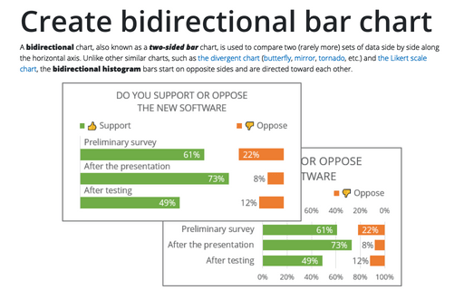
A bidirectional chart, also known as a two-sided bar chart, is used to compare two (rarely more) sets of data side by side along the horizontal axis. Unlike other similar charts, such as the divergent chart (butterfly, mirror, tornado, etc.) and the Likert scale chart, the bidirectional histogram bars start on opposite sides and are directed toward each other.
Creating picture charts
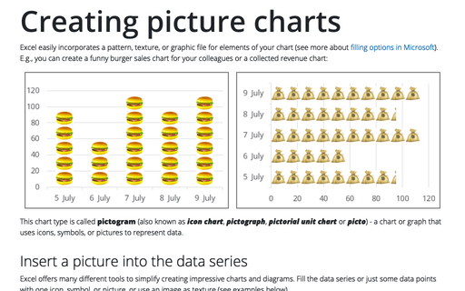
Excel easily incorporates a pattern, texture, or graphic file for elements of your chart (see more about filling options in Microsoft). E.g., you can create a funny burger sales chart for your colleagues or a collected revenue chart:
How to show Likert scale chart with extra neutral
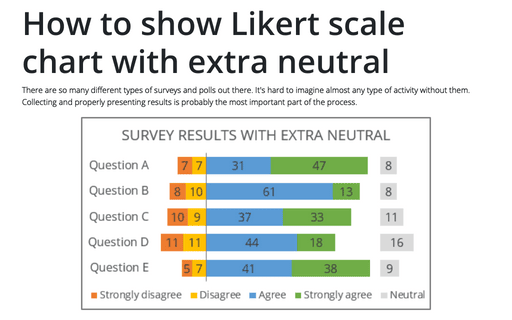
There are so many different types of surveys and polls out there. It's hard to imagine almost any type of activity without them. Collecting and properly presenting results is probably the most important part of the process.
Simple combination chart
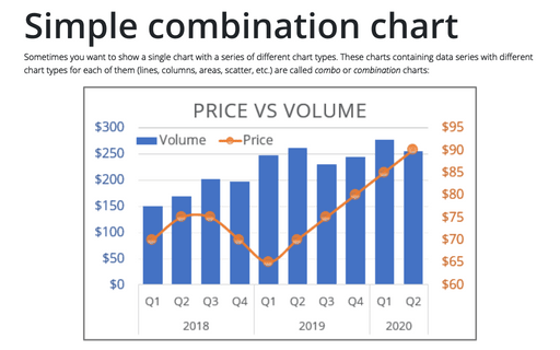
Sometimes you want to show a single chart with a series of different chart types. These charts containing data series with different chart types for each of them (lines, columns, areas, scatter, etc.) are called combo or combination charts:
Creating Pie of Pie and Bar of Pie charts
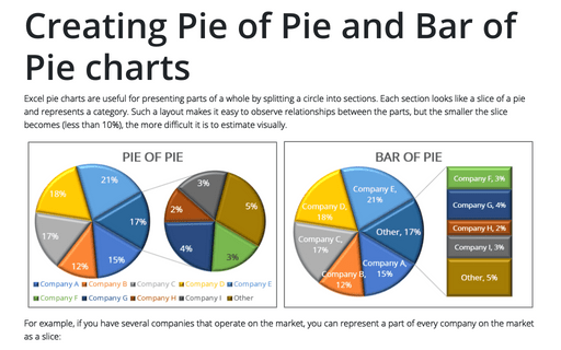
Excel pie charts are useful for presenting parts of a whole by splitting a circle into sections. Each section looks like a slice of a pie and represents a category. Such a layout makes it easy to observe relationships between the parts, but the smaller the slice becomes (less than 10%), the more difficult it is to estimate visually.
