How to make Tornado chart in Excel
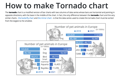
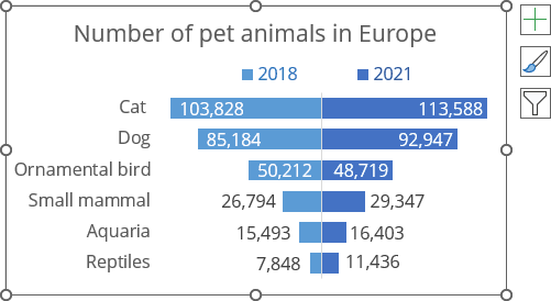
Thus, when plotting a chart, the largest value is located at the top, creating a resemblance of a tornado funnel:
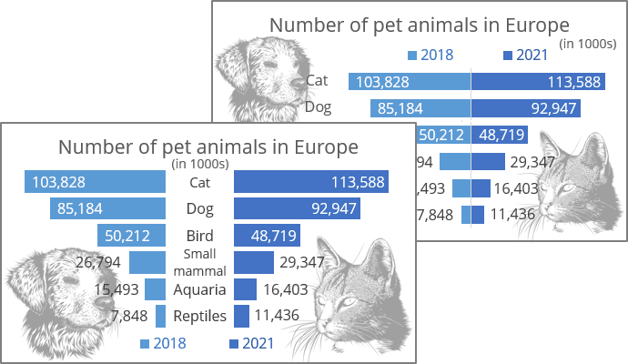
There are several different approaches how to create a tornado chart in Excel. Below you can see one of the variants; see another in creating a butterfly chart and a mirror chart.
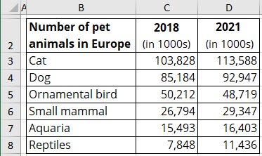
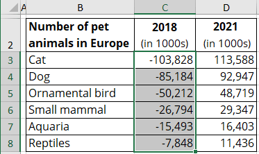
For example, the Tornado chart will be created based on the number of pet animals in Europe in 2018 and 2021 by animal type:
1. Prepare the data
To center the chart, add the negative symbol (the symbol minus "-") to all values of the data series you prefer to see on the left (see how to quickly transform your data without using formulas).
2. Create a simple bar chart
2.1. Select the data range (in this example, B2:D8).
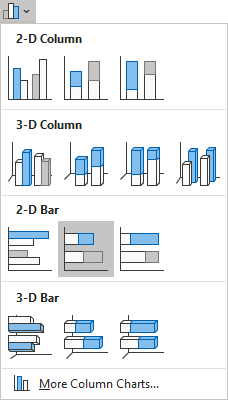
2.2. On the Insert tab, in the Charts group, choose the Insert Column or Bar Chart button:

From the Insert Column or Bar Chart dropdown list, under 2-D Bar, choose the Stacked Bar chart:
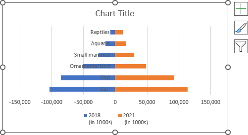
Excel creates a simple stacked bar chart:
3. Format the vertical axis
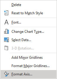
3.1. Right-click on the vertical axis, then click Format Axis... in the popup menu:
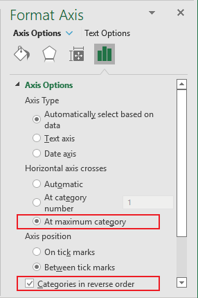
3.2. On the Format Axis pane, on the Axis Options tab:
- In the Axis Options section:
- Optionally, under Horizontal axis crosses, select the At maximum category option,
- At the end of the section, check the Categories in reverse order checkbox:
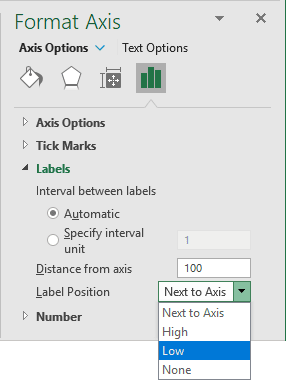
- In the Labels section, from the Label Position dropdown list, select Low:
4. Format the horizontal axis
4.1. Right-click on the horizontal axis, then click Format Axis... in the popup menu.
4.2. On the Format Axis pane, on the Axis Options tab:
- In the Axis Options section:
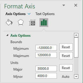
- Under Bounds, type the appropriate values in the Minimum and Maximum fields,
- Under Units, type the appropriate value in the Major field:
- Optionally (if you want to display the axis labels), in the Number section:
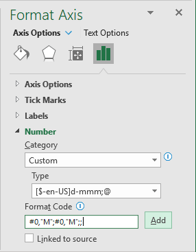
- From the Category dropdown list, select the Custom item,
- In the Format Code field, type the same format for positive and negative values (see more about conditional formatting and formatting to round off to thousands, millions, billions):
<format for the positive value>; <format for the negative value>; <format for the zero>:
Excel redraws the chart axis labels:
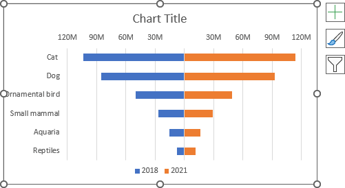
5. Format the chart
5.1. Fill the data series as you prefer (see more about filling options in Microsoft).
5.2. Optionally, type the chart title, remove gridlines, and move the legend.
5.3. To change the bar width, do the following:
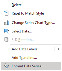
Right-click on any data series and choose Format Data Series... in the popup menu:
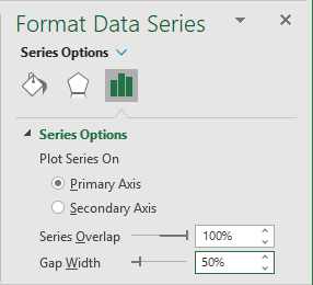
On the Format Data Series pane, on the Series Options tab, change the Gap Width setting:
For example:
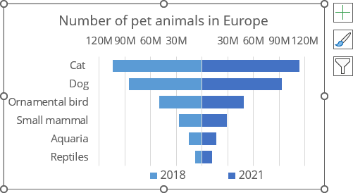
6. Add data labels
To add data labels to the data series, do one of the following:
- Click on the Chart Elements button, select the Data Labels list, then select the position of the labels:
- For the left data series, choose Inside Base:
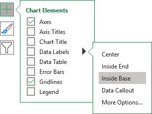
- For the right data series, choose Inside End.
- For the left data series, choose Inside Base:
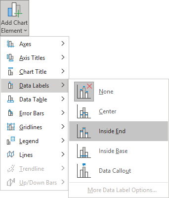
- On the Chart Design tab, in the Chart Layouts group, click the Add Chart Element button:

From the Add Chart Element dropdown list, choose Data Labels, then select the place for the labels:
- For the left data series, choose Inside Base,
- For the right data series, choose Inside End:
7. Format data labels
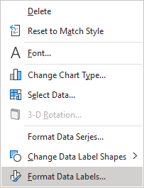
7.1. To format data labels, right-click on any of them for each data series, then select Format Data Labels... in the popup menu:
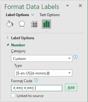
7.2. On the Format Data Labels pane, on the Label Options tab, in the Number group:
- In the Category dropdown list, select the Custom item,
- In the Format Code field, type the conditional formatting code:
<format for the positive value>; <format for the negative value>; <format for the zero>:
#,##0;#,##0; (see more about conditional formatting):
7.3. Position some labels as you prefer and modify their filling options.
For example:
8. Add middle labels (optionally)
In many cases, putting the vertical axis labels between the data series will be more informative. To add middle labels, follow the next steps:
Add a new data series
8.1. Do one of the following:
- Right-click on the chart plot area and choose Select Data... in the popup menu:
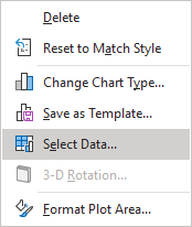
- On the Chart Design tab, in the Data group, click the Select Data button:

8.2. In the Select Data Source dialog box, click the Add button:
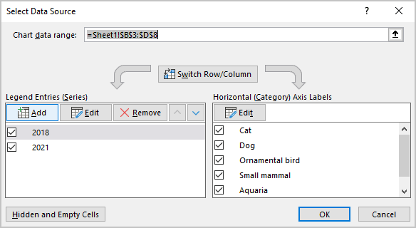
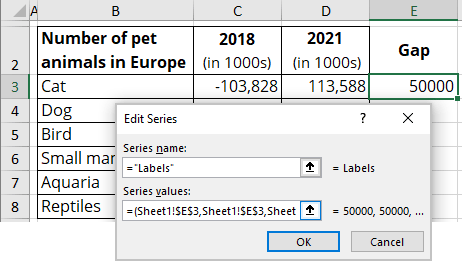
8.3. In the Edit Series dialog box:
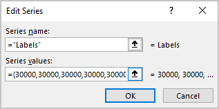
- In the Series name field, select the appropriate value,
- In the Series values field, type as many values as many bars in the chart.
In this example, = {30 000, 30 000, 30 000, 30 000, 30 000, 30 000}:
Note: You can experiment with that value to add a space you really need. Instead of changing so many amounts, you can add the value to some cell, then in the Edit Series dialog box, add the link to that cell using the structure:
= (<link>, <link> ...).
For example:
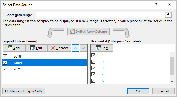
8.4. In the Select Data Source dialog box, move the new data series to the middle of the data series using the Move Up button:
Format the horizontal axis
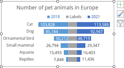
8.5. Change the maximum value of the horizontal axis to display all the data (see step 4).
For example:
Note: See how to select invisible elements in the chart.
Format the new data series
8.6. Right-click on the first data series (in this example, Labels) and choose Format Data Series... in the popup menu:

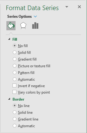
8.7. On the Format Data Series pane, on the Fill & Line tab:
- In the Fill section, select the No fill option,
- In the Border section, select the No line option:
8.8. Add the labels for the new data series and format them.
Make any other adjustments you desire.

