Trendlines and Moving Average in Excel
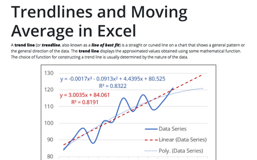
A trend line (or trendline, also known as a line of best fit) is a straight or curved line on a chart that shows a general pattern or the general direction of the data. The trend line displays the approximated values obtained using some mathematical function. The choice of function for constructing a trend line is usually determined by the nature of the data.
Format trendlines and Moving Average
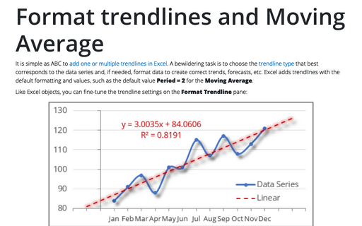
It is simple as ABC to add one or multiple trendlines in Excel. A bewildering task is to choose the trendline type that best corresponds to the data series and, if needed, format data to create correct trends, forecasts, etc. Excel adds trendlines with the default formatting and values, such as the default value Period = 2 for the Moving Average.
Logarithmic trend equation and forecast
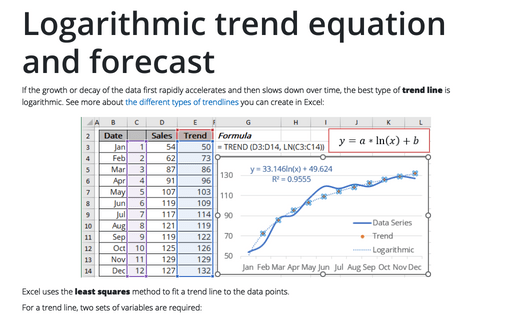
If the growth or decay of the data first rapidly accelerates and then slows down over time, the best type of trend line is logarithmic. See more about the different types of trendlines you can create in Excel:
Polynomial trend equation and forecast
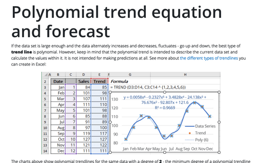
If the data set is large enough and the data alternately increases and decreases, fluctuates - go up and down, the best type of trend line is polynomial. However, keep in mind that the polynomial trend is intended to describe the current data set and calculate the values within it. It is not intended for making predictions at all. See more about the different types of trendlines you can create in Excel:
Power trend equation and forecast
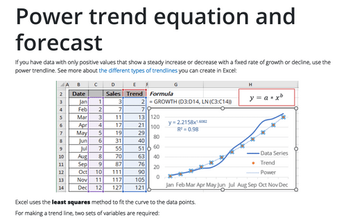
If you have data with only positive values that show a steady increase or decrease with a fixed rate of growth or decline, use the power trendline. See more about the different types of trendlines you can create in Excel:
Exponential trend equation and forecast
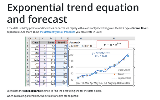
If the data is strictly positive and increases or decreases rapidly with a constantly increasing rate, the best type of trend line is exponential. See more about the different types of trendlines you can create in Excel:
Linear trend equation and forecast
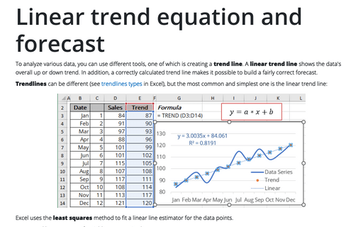
To analyze various data, you can use different tools, one of which is creating a trend line. A linear trend line shows the data's overall up or down trend. In addition, a correctly calculated trend line makes it possible to build a fairly correct forecast.
Displaying conditional colors in a column chart
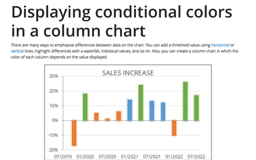
There are many ways to emphasize differences between data on the chart. You can add a threshold value using horizontal or vertical lines, highlight differences with a waterfall, individual values, and so on. Also, you can create a column chart in which the color of each column depends on the value displayed.
How to add a horizontal line to the chart
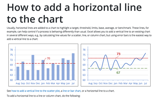
Usually, horizontal lines are added to a chart to highlight a target, threshold, limits, base, average, or benchmark. These lines, for example, can help control if a process is behaving differently than usual. Excel allows you to add a vertical line to an existing chart in several different ways, e.g., by calculating line values for a scatter, line, or column chart, but using error bars is the easiest way to add a vertical line to a chart:
How to add a vertical line to the line or bar chart
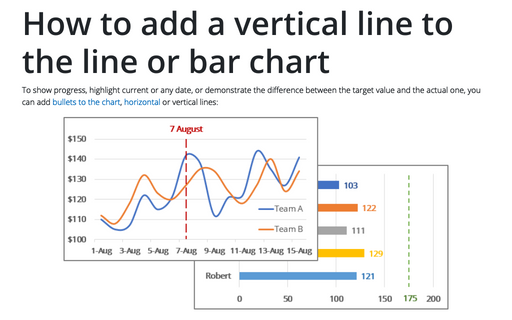
To show progress, highlight current or any date, or demonstrate the difference between the target value and the actual one, you can add bullets to the chart, horizontal or vertical lines:
