Customize the horizontal axis labels
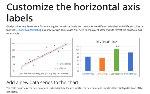
Excel provides very few options for formatting horizontal axis labels. You cannot format different axis labels with different colors or font sizes. Conditional formatting also only works in some cases. You need to implement some tricks to format the horizontal axis, for example:
Cascade chart using stepped line chart in Excel
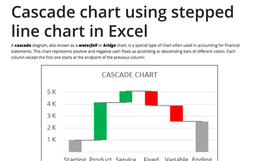
A cascade diagram, also known as a waterfall or bridge chart, is a special type of chart often used in accounting for financial statements. This chart represents positive and negative cash flows as ascending or descending bars of different colors. Each column except the first one starts at the endpoint of the previous column:
How to create bar chart of the survey results
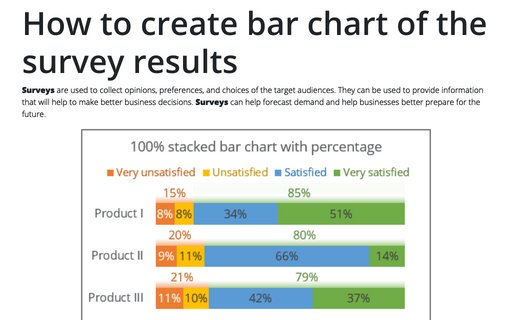
Surveys are used to collect opinions, preferences, and choices of the target audiences. They can be used to provide information that will help to make better business decisions. Surveys can help forecast demand and help businesses better prepare for the future.
5 Excel features to create data-dependent visualizations
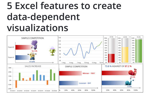
There are several useful features in Excel that can help to create your charts, which automatically change visual appearance depending on data.
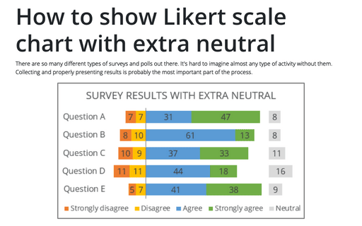
How to show Likert scale chart with extra neutral
There are so many different types of surveys and polls out there. It's hard to imagine almost any type of activity without them. Collecting and properly presenting results is probably the most important part of the process.
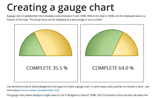
Creating a gauge chart
A gauge, dial, or speedometer chart displays a value between 0 and 100%. Where the Goal is 100%, and the displayed value is a fraction of the Goal. The actual value can be displayed as a percentage or as a number:
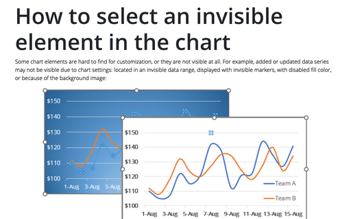
How to select an invisible element in the chart
Some chart elements are hard to find for customization, or they are not visible at all. For example, added or updated data series may not be visible due to chart settings: located in an invisible data range, displayed with invisible markers, with disabled fill color, or because of the background image:
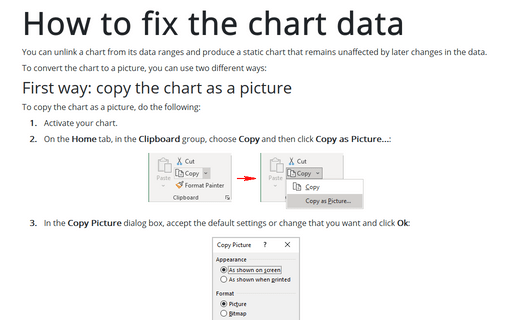
How to fix the chart data
You can unlink a chart from its data ranges and produce a static chart that remains unaffected by later changes in the data.
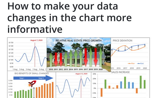
How to make your data changes in the chart more informative
Simple line and bar charts often attract little or no interest in the audience. Still, Excel allows you to attract attention to your data by emphasizing change direction, difference, or period.
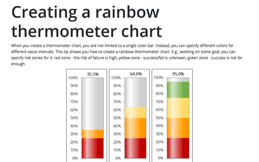
Creating a rainbow thermometer chart
When you create a thermometer chart, you are not limited to a single color bar. Instead, you can specify different colors for different value intervals. This tip shows you how to create a rainbow thermometer chart. E.g., working on some goal, you can specify risk zones for it: red zone - the risk of failure is high, yellow zone - success/fail is unknown, green zone - success is not far enough.
