Creating a simple thermometer chart
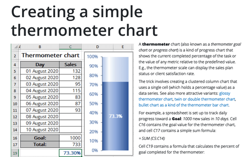
A thermometer chart (also known as a thermometer goal chart or progress chart) is a kind of progress chart that shows the current completed percentage of the task or the value of any metric relative to the predefined value. E.g., the thermometer scale can display the sales plan status or client satisfaction rate.
How to use progress pie charts for numbering in PowerPoint
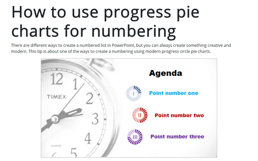
There are different ways to create a numbered list in PowerPoint, but you can always create something creative and modern. This tip is about one of the ways to create a numbering using modern progress circle pie charts.
Glossy Gantt chart with a vertical line
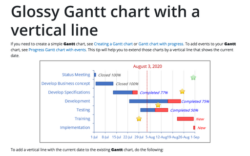
If you need to create a simple Gantt chart, see Creating a Gantt chart or Gantt chart with progress. To add events to your Gantt chart, see Progress Gantt chart with events. This tip will help you to extend those charts by a vertical line that shows the current date.
Creating Pie of Pie and Bar of Pie charts
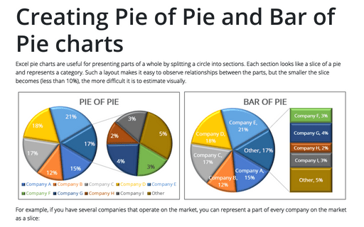
Excel pie charts are useful for presenting parts of a whole by splitting a circle into sections. Each section looks like a slice of a pie and represents a category. Such a layout makes it easy to observe relationships between the parts, but the smaller the slice becomes (less than 10%), the more difficult it is to estimate visually.
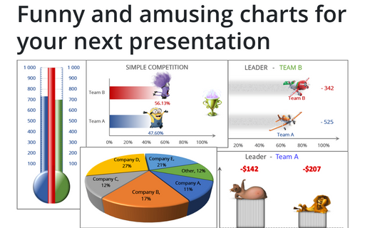
Funny and amusing charts for your next presentation
Several different Excel features can make your presentation less boring:
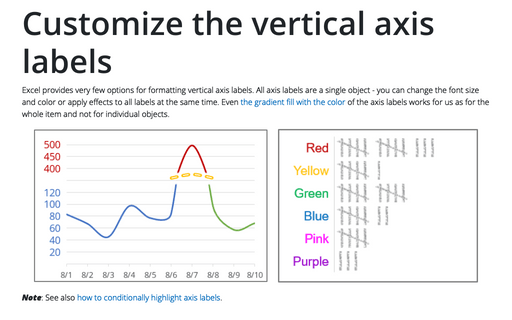
Customize the vertical axis labels
Excel provides very few options for formatting vertical axis labels. All axis labels are a single object - you can change the font size and color or apply effects to all labels at the same time. Even the gradient fill with the color of the axis labels works for us as for the whole item and not for individual objects.
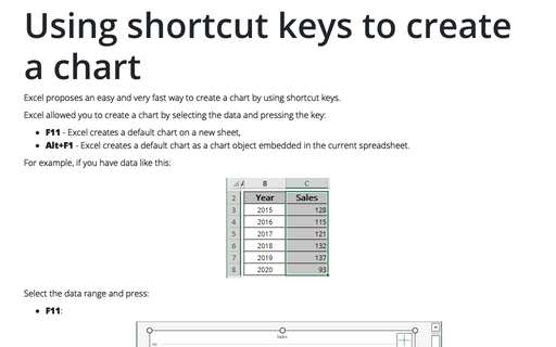
Using shortcut keys to create a chart
Excel proposes an easy and very fast way to create a chart by using shortcut keys.
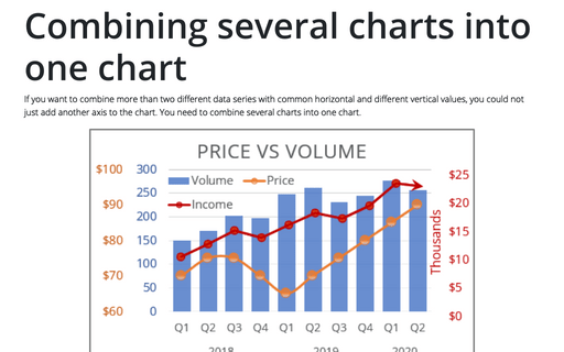
Combining several charts into one chart
If you want to combine more than two different data series with common horizontal and different vertical values, you could not just add another axis to the chart. You need to combine several charts into one chart.
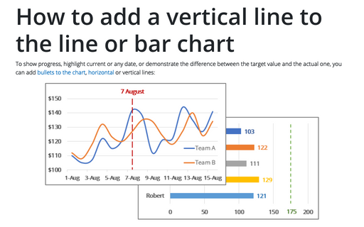
How to add a vertical line to the line or bar chart
To show progress, highlight current or any date, or demonstrate the difference between the target value and the actual one, you can add bullets to the chart, horizontal or vertical lines:
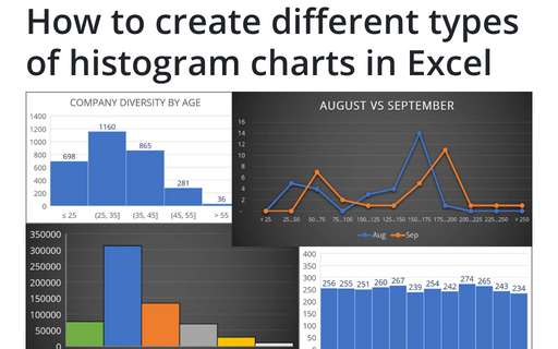
How to create different types of histogram charts in Excel
A histogram chart visualizes the distribution of continuous data. Each column in the histogram chart represents the frequency (amount) of the data within the specific range.
