Exponential trend equation and forecast
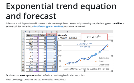
If the data is strictly positive and increases or decreases rapidly with a constantly increasing rate, the best type of trend line is exponential. See more about the different types of trendlines you can create in Excel:
How to change the default colors that Excel uses for chart series
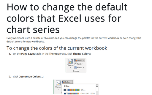
Every workbook uses a palette of 56 colors, but you can change the palette for the current workbook or even change the default colors for new workbooks.
How to stress cyclic processes using two arrow circle diagram
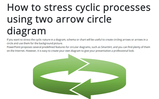
If you want to stress the cyclic nature in a diagram, schema or chart will be useful to create circling arrows or arrows in a circle and use them for the background picture.
PowerPoint proposes several predefined features for circular diagrams, such as SmartArt, and you can find plenty of them on the Internet. However, it is easy to create your own diagram to give your presentation a professional look.
PowerPoint proposes several predefined features for circular diagrams, such as SmartArt, and you can find plenty of them on the Internet. However, it is easy to create your own diagram to give your presentation a professional look.
Turn off or on automatically opening of Design Ideas pane
The new PowerPoint Designer feature automatically generates design ideas on the new Design Ideas pane. By default, this pane appears on the right side of the slide and can be very useful for creative users:
How to add text to the connector in the flowchart
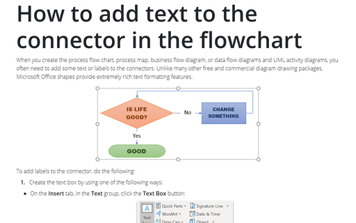
When you create the process flow chart, process map, business flow diagram, or data flow diagrams and UML
activity diagrams, you often need to add some text or labels to the connectors. Unlike many other free and
commercial diagram drawing packages, Microsoft Office shapes provide extremely rich text formatting
features.
How to create a cycle flow chart using four arrows in a circle
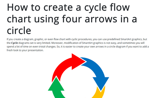
If you create a diagram, graphic, or even flow chart with cyclic procedures, you can use predefined SmartArt graphics, but the Cycle diagrams set is very limited. Moreover, modification of SmartArt graphics is not easy, and sometimes you will spend a lot of time on even trivial changes. So, it is easier to create your own arrows in a circle diagram if you want to add a fresh look to your presentation.
Creating and using named ranges
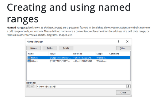
Named ranges (also known as defined ranges) are a powerful feature in Excel that allows you to assign a symbolic name to a cell, range of cells, or formula. These defined names are a convenient replacement for the address of a cell, data range, or formula in other formulas, charts, diagrams, shapes, etc.
Select special types of cells
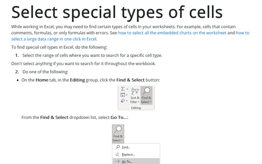
While working in Excel, you may need to find certain types of cells in your worksheets. For example, cells that contain comments, formulas, or only formulas with errors. See how to select all the embedded charts on the worksheet and how to select a large data range in one click in Excel.
How to format negative timestamps
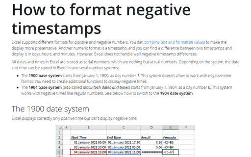
Excel supports different formats for positive and negative numbers. You can combine text and formatted values to make the display more presentative. Another numeric format is a timestamp, and you can find a difference between two timestamps and display it in days, hours, and minutes. However, Excel does not handle well negative timestamp differences.
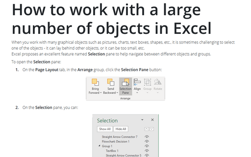
How to work with a large number of objects in Excel
When you work with many graphical objects such as pictures, charts, text boxes, shapes, etc., it is sometimes challenging to select one of the objects - it can lay behind other objects, or it can be too small, etc.
Excel proposes an excellent feature named Selection pane to help navigate between different objects and groups.
Excel proposes an excellent feature named Selection pane to help navigate between different objects and groups.
