Waterfall chart
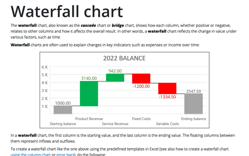
The waterfall chart, also known as the cascade chart or bridge chart, shows how each column, whether positive or negative, relates to other columns and how it affects the overall result. In other words, a waterfall chart reflects the change in value under various factors, such as time.
How to turn on or turn off automatic generation of Alternative text for pictures
All visual objects in the document, including images, charts, photographs, diagrams, and other informative non-textual (visual) content, require Alternative text (Alt text) descriptions. Adding alt text can help people understand the content of images, graphs, and other similar objects. Alt text is read aloud when a screen reader meets such a visual object.
Trendlines and Moving Average in Excel
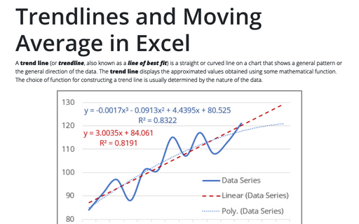
A trend line (or trendline, also known as a line of best fit) is a straight or curved line on a chart that shows a general pattern or the general direction of the data. The trend line displays the approximated values obtained using some mathematical function. The choice of function for constructing a trend line is usually determined by the nature of the data.
How to work with images in a Word document
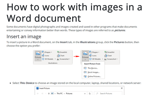
Some documents have digital photographs and images created and saved in other programs that make documents entertaining or convey information better than words. These types of images are referred to as pictures.
How to view currency exchange rates in Excel
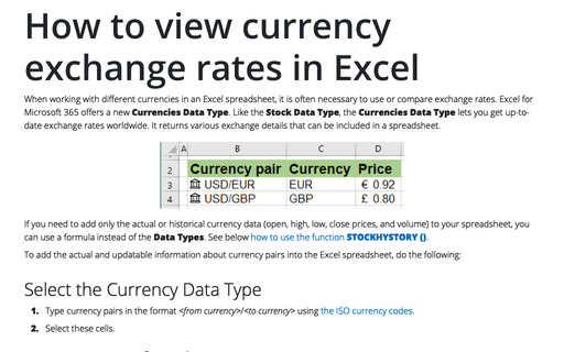
When working with different currencies in an Excel spreadsheet, it is often necessary to use or compare exchange rates. Excel for Microsoft 365 offers a new Currencies Data Type. Like the Stock Data Type, the Currencies Data Type lets you get up-to-date exchange rates worldwide. It returns various exchange details that can be included in a spreadsheet.
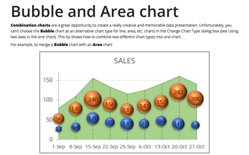
Bubble and Area chart
Combination charts are a great opportunity to create a really creative and memorable data presentation. Unfortunately, you can't choose the Bubble chart as an alternative chart type for line, area, etc. charts in the Change Chart Type dialog box (see Using two axes in the one chart). This tip shows how to combine two different chart types into one chart.
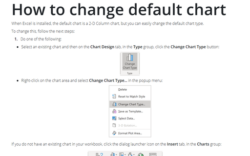
How to change default chart
When Excel is installed, the default chart is a 2-D Column chart, but you can easily change the default chart type.
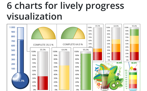
6 charts for lively progress visualization
There are several different charts in Excel that can help you to create a perfect progress illustration.
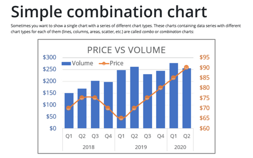
Simple combination chart
Sometimes you want to show a single chart with a series of different chart types. These charts containing data series with different chart types for each of them (lines, columns, areas, scatter, etc.) are called combo or combination charts:
How to create dependent on a volume chart title
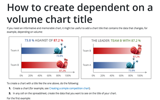
If you need an informative and memorable chart, it might be useful to add a chart title that contains the data that changes, for example, depending on volume:
