How to use progress pie charts for numbering in PowerPoint
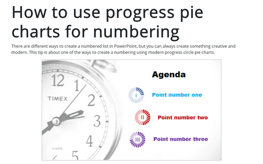
There are different ways to create a numbered list in PowerPoint, but you can always create something creative and modern. This tip is about one of the ways to create a numbering using modern progress circle pie charts.
How to create irregular polygon charts in Excel
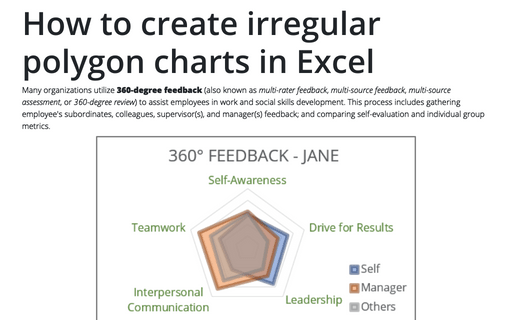
Many organizations utilize 360-degree feedback (also known as multi-rater feedback, multi-source feedback, multi-source assessment, or 360-degree review) to assist
employees in work and social skills development. This process includes gathering employee's subordinates, colleagues, supervisor(s), and manager(s) feedback; and comparing self-evaluation and individual group metrics.
Creating Pie of Pie and Bar of Pie charts
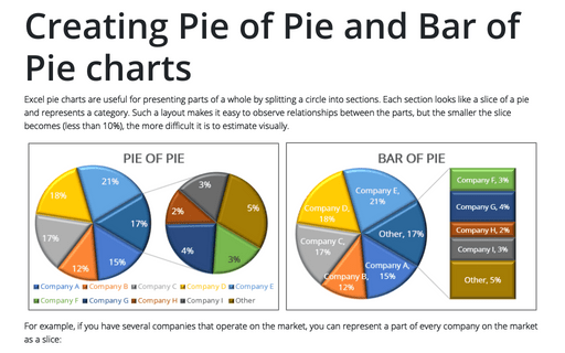
Excel pie charts are useful for presenting parts of a whole by splitting a circle into sections. Each section looks like a slice of a pie and represents a category. Such a layout makes it easy to observe relationships between the parts, but the smaller the slice becomes (less than 10%), the more difficult it is to estimate visually.
Funny and amusing charts for your next presentation
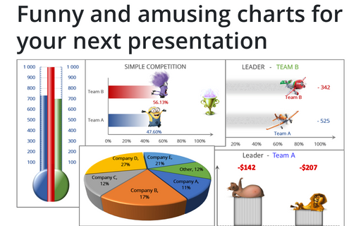
Several different Excel features can make your presentation less boring:
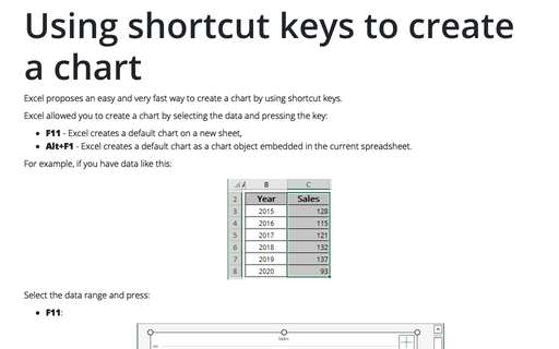
Using shortcut keys to create a chart
Excel proposes an easy and very fast way to create a chart by using shortcut keys.
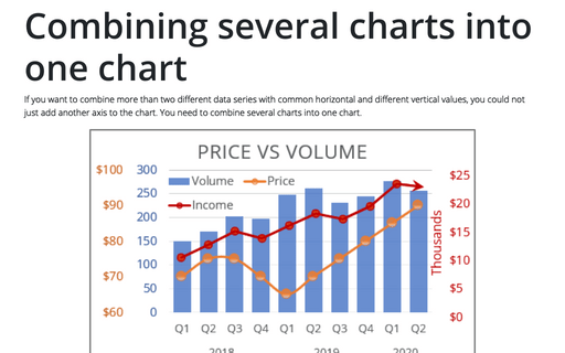
Combining several charts into one chart
If you want to combine more than two different data series with common horizontal and different vertical values, you could not just add another axis to the chart. You need to combine several charts into one chart.
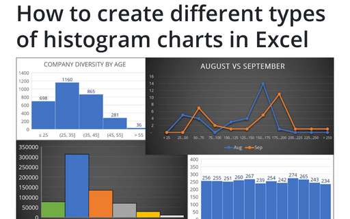
How to create different types of histogram charts in Excel
A histogram chart visualizes the distribution of continuous data. Each column in the histogram chart represents the frequency (amount) of the data within the specific range.
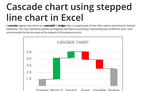
Cascade chart using stepped line chart in Excel
A cascade diagram, also known as a waterfall or bridge chart, is a special type of chart often used in accounting for financial statements. This chart represents positive and negative cash flows as ascending or descending bars of different colors. Each column except the first one starts at the endpoint of the previous column:
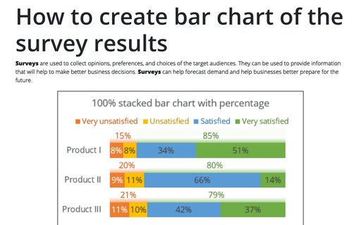
How to create bar chart of the survey results
Surveys are used to collect opinions, preferences, and choices of the target audiences. They can be used to provide information that will help to make better business decisions. Surveys can help forecast demand and help businesses better prepare for the future.
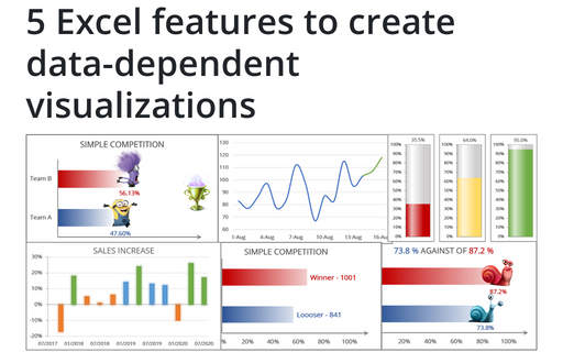
5 Excel features to create data-dependent visualizations
There are several useful features in Excel that can help to create your charts, which automatically change visual appearance depending on data.
