How to create simple diverging bar chart
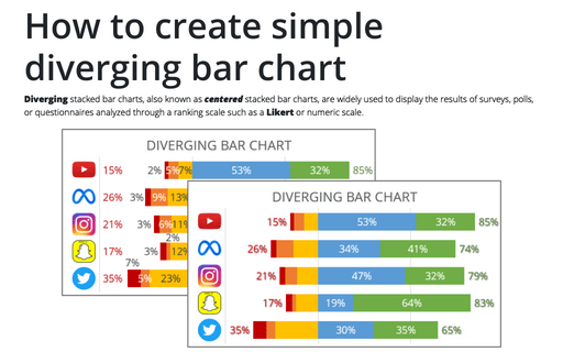
Diverging stacked bar charts, also known as centered stacked bar charts, are widely used to display the results of surveys, polls, or questionnaires analyzed through a ranking scale such as a Likert or numeric scale.
Format trendlines and Moving Average
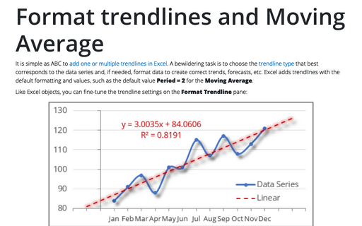
It is simple as ABC to add one or multiple trendlines in Excel. A bewildering task is to choose the trendline type that best corresponds to the data series and, if needed, format data to create correct trends, forecasts, etc. Excel adds trendlines with the default formatting and values, such as the default value Period = 2 for the Moving Average.
How to add labels to the Marimekko chart
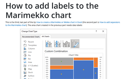
This is the third, last part of the tip How to create a Marimekko or Mekko chart in Excel (the second part is How to add separators to the Marimekko chart). The area chart created in the previous part needs data labels:
How to add labels to the Mosaic plot
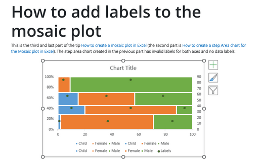
This is the third and last part of the tip How to create a Mosaic plot in Excel (the second part is How to create a step Area chart for the Mosaic plot in Excel). The step area chart created in the previous part has invalid labels for both axes and no data labels:
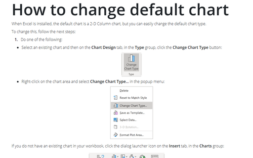
How to change default chart
When Excel is installed, the default chart is a 2-D Column chart, but you can easily change the default chart type.
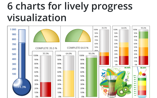
6 charts for lively progress visualization
There are several different charts in Excel that can help you to create a perfect progress illustration.
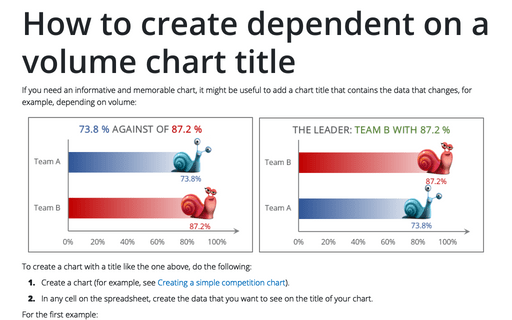
How to create dependent on a volume chart title
If you need an informative and memorable chart, it might be useful to add a chart title that contains the data that changes, for example, depending on volume:
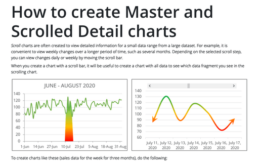
How to create Master and Scrolled Detail charts
Scroll charts are often created to view detailed information for a small data range from a large dataset. For example, it is convenient to view weekly changes over a longer period of time, such as several months. Depending on the selected scroll step, you can view changes daily or weekly by moving the scroll bar.
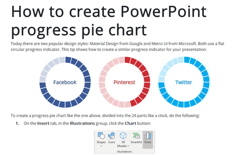
How to create PowerPoint progress pie chart
Today there are two popular design styles: Material Design from Google and Metro UI from Microsoft. Both use a flat circular progress indicator. This tip shows how to create a similar progress indicator for your presentation.
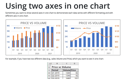
Using two axes in one chart
Sometimes you want to show several axes in one chart to demonstrate each data series with different
formatting and with different axis in one chart.
