How to create step chart in Excel
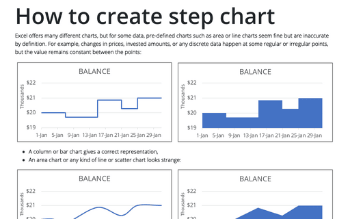
Excel offers many different charts, but for some data, pre-defined charts such as area or line charts seem fine but are inaccurate by definition. For example, changes in prices, invested amounts, or any discrete data happen at some regular or irregular points, but the value remains constant between the points:
How to draw a chart with chalk effect in PowerPoint
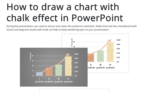
During the presentation, you need to attract and retain the audience's attention. Slides that look like
a blackboard with charts and diagrams drawn with chalk can help to keep wandering eyes on your
presentation.
Format trendlines and Moving Average
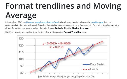
It is simple as ABC to add one or multiple trendlines in Excel. A bewildering task is to choose the trendline type that best corresponds to the data series and, if needed, format data to create correct trends, forecasts, etc. Excel adds trendlines with the default formatting and values, such as the default value Period = 2 for the Moving Average.
How to use full circle progress charts for numbering
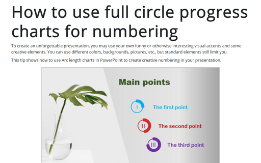
To create an unforgettable presentation, you may use your own funny or otherwise interesting visual accents and some creative elements. You can use different colors, backgrounds, pictures, etc., but standard elements still limit you.
How to create full circle progress charts in PowerPoint
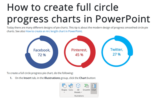
Today there are many different designs of pie charts. This tip is about the modern design of progress smoothed circle pie charts.
See also How to create an Arc length chart in PowerPoint.
See also How to create an Arc length chart in PowerPoint.
Waterfall chart
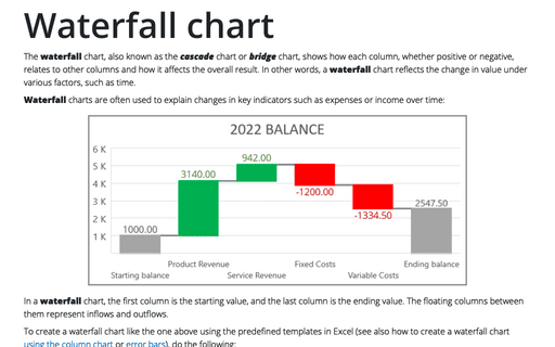
The waterfall chart, also known as the cascade chart or bridge chart, shows how each column, whether positive or negative, relates to other columns and how it affects the overall result. In other words, a waterfall chart reflects the change in value under various factors, such as time.
Customize the horizontal axis labels
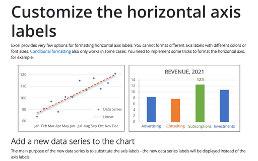
Excel provides very few options for formatting horizontal axis labels. You cannot format different axis labels with different colors or font sizes. Conditional formatting also only works in some cases. You need to implement some tricks to format the horizontal axis, for example:
How to create a span chart in Excel
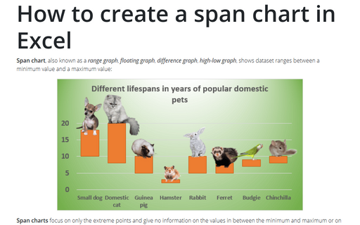
Span chart, also known as a range graph, floating graph, difference graph, high-low graph, shows dataset ranges between a minimum value and a maximum value:
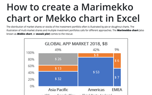
How to create a Marimekko chart or Mekko chart in Excel
The distribution of market shares or stocks of the investment portfolio often is illustrated
by pie or doughnut charts. The illustration of multi-market shares and multiple investment
portfolios calls for different approaches. The Marimekko chart (also known as
Mekko chart, or mosaic plot) comes to the rescue.
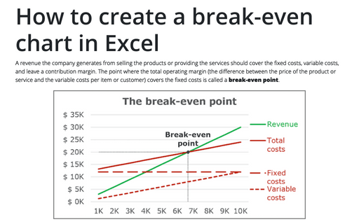
How to create a break-even chart in Excel
A revenue the company generates from selling the products or providing the services should cover the
fixed costs, variable costs, and leave a contribution margin. The point where the total operating
margin (the difference between the price of the product or service and the variable costs per item
or customer) covers the fixed costs is called a break-even point.
