How to create a Marimekko chart or Mekko chart in Excel
The distribution of market shares or stocks of the investment portfolio often is illustrated
by pie or doughnut charts. The illustration of multi-market shares and multiple investment
portfolios calls for different approaches. The Marimekko chart (also known as
Mekko chart, or mosaic plot) comes to the rescue.
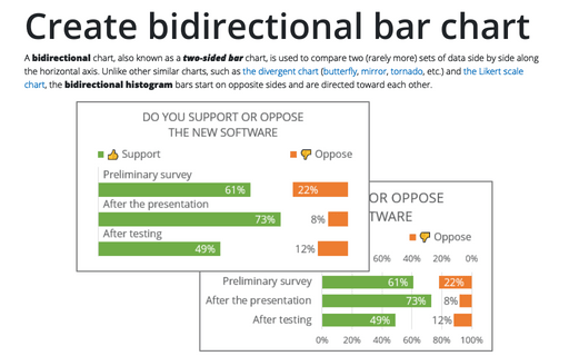
Create bidirectional bar chart in Excel
A bidirectional chart, also known as a two-sided bar chart, is used to compare two (rarely more) sets of data side by side along the horizontal axis. Unlike other similar charts, such as the divergent chart (butterfly, mirror, tornado, etc.) and the Likert scale chart, the bidirectional histogram bars start on opposite sides and are directed toward each other.
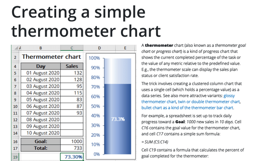
Creating a simple thermometer chart
A thermometer chart (also known as a thermometer goal chart or progress chart) is a kind of progress chart that shows the current completed percentage of the task or the value of any metric relative to the predefined value. E.g., the thermometer scale can display the sales plan status or client satisfaction rate.
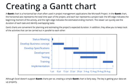
Creating a Gantt chart
A Gantt chart is a horizontal bar chart often used in project management applications like Microsoft Project. In the Gantt chart, the horizontal axis represents the total time span of the project, and each bar represents a project task: the left edge indicates the beginning moment of the activity, and the right edge indicates the estimated ending moment. The viewer can quickly see the duration of each task and identify overlapping tasks.
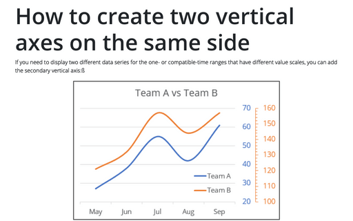
How to create two vertical axes on the same side
If you need to display two different data series for the one- or compatible-time ranges that have different value scales, you can add the secondary vertical axis:ß
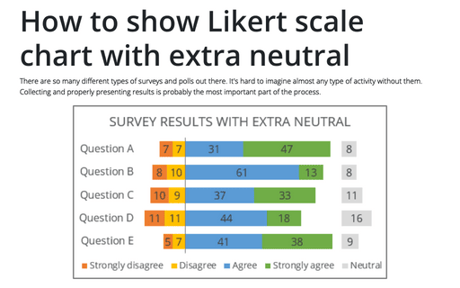
How to show Likert scale chart with extra neutral
There are so many different types of surveys and polls out there. It's hard to imagine almost any type of activity without them. Collecting and properly presenting results is probably the most important part of the process.
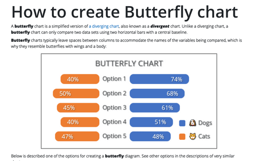
How to create Butterfly chart in Excel
A butterfly chart is a simplified version of a diverging chart, also known as a divergent chart. Unlike a diverging chart, a butterfly chart can only compare two data sets using two horizontal bars with a central baseline.
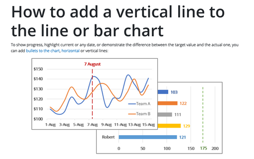
How to add a vertical line to the line or bar chart
To show progress, highlight current or any date, or demonstrate the difference between the target value and the actual one, you can add bullets to the chart, horizontal or vertical lines:
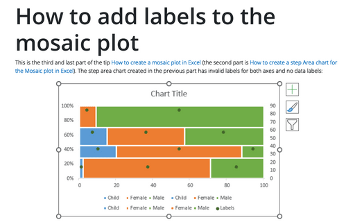
How to add labels to the Mosaic plot
This is the third and last part of the tip How to create a Mosaic plot in Excel (the second part is How to create a step Area chart for the Mosaic plot in Excel). The step area chart created in the previous part has invalid labels for both axes and no data labels:
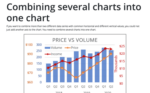
Combining several charts into one chart
If you want to combine more than two different data series with common horizontal and different vertical values, you could not just add another axis to the chart. You need to combine several charts into one chart.

