How to add Dividers to the chart
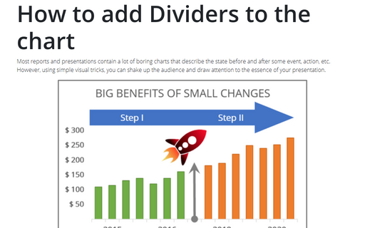
Most reports and presentations contain a lot of boring charts that describe the state before and after some
event, action, etc. However, using simple visual tricks, you can shake up the audience and draw attention
to the essence of your presentation.
Bubble and Area chart
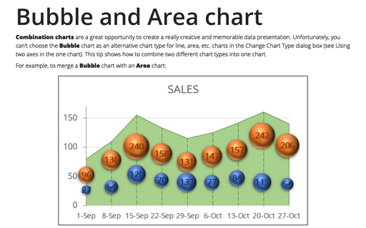
Combination charts are a great opportunity to create a really creative and memorable data presentation. Unfortunately, you can't choose the Bubble chart as an alternative chart type for line, area, etc. charts in the Change Chart Type dialog box (see Using two axes in the one chart). This tip shows how to combine two different chart types into one chart.
How to create Master and Scrolled Detail charts
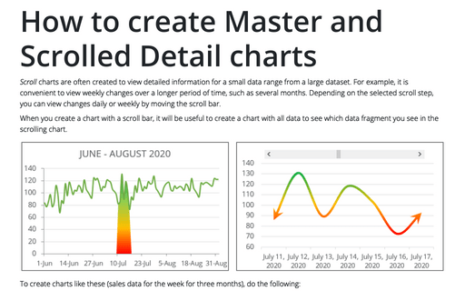
Scroll charts are often created to view detailed information for a small data range from a large dataset. For example, it is convenient to view weekly changes over a longer period of time, such as several months. Depending on the selected scroll step, you can view changes daily or weekly by moving the scroll bar.
How to create a span chart in Excel
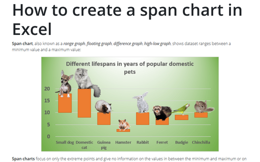
Span chart, also known as a range graph, floating graph, difference graph, high-low graph, shows dataset ranges between a minimum value and a maximum value:
How to create a simple Bullet graph in Excel
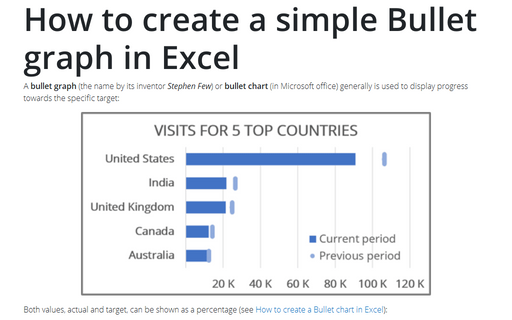
A bullet graph (the name by its inventor Stephen Few) or bullet chart (in Microsoft office) generally is used to display progress towards the specific target:
How to create a Bullet chart in Excel
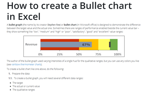
A bullet graph (the name by its creator Stephen Few) or bullet chart (in Microsoft office) is designed to demonstrate the difference between the target value and the actual one. Sometimes there are ranges of performance enabled beside the current value bar – they show something like "low", "medium" and "high" or "poor", "satisfactory", "good" and "excellent" value ranges:
The Area chart for Investments
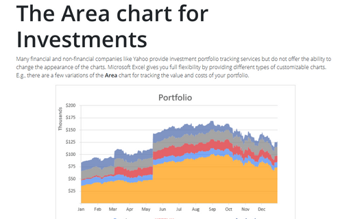
Many financial and non-financial companies like Yahoo provide investment portfolio tracking services
but do not offer the ability to change the appearance of the charts. Microsoft Excel gives you full
flexibility by providing different types of customizable charts. E.g., there are a few variations of
the Area chart for tracking the value and costs of your portfolio.
How to create an Arc length chart in PowerPoint
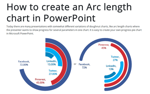
Today there are many presentations with somewhat different variations of doughnut charts, like arc length charts where the presenter wants to show progress for several parameters in one chart. It is easy to create your own progress pie chart in Microsoft PowerPoint.
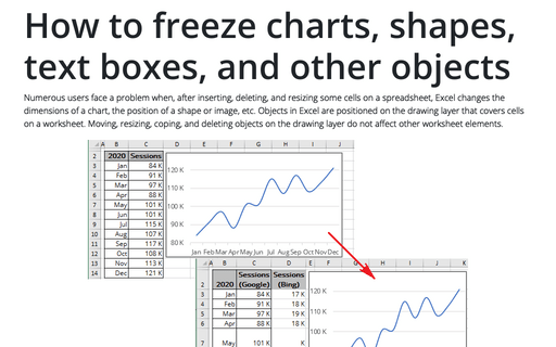
How to freeze charts, shapes, text boxes, and other objects in Excel
Numerous users face a problem when, after inserting, deleting, and resizing some cells on a spreadsheet, Excel changes the dimensions of a chart, the position of a shape or image, etc. Objects in Excel are positioned on the drawing layer that covers cells on a worksheet.
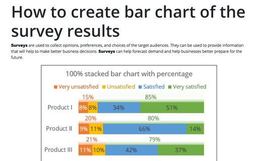
How to create bar chart of the survey results
Surveys are used to collect opinions, preferences, and choices of the target audiences. They can be used to provide information that will help to make better business decisions. Surveys can help forecast demand and help businesses better prepare for the future.
