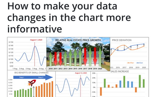
How to make your data changes in the chart more informative
Simple line and bar charts often attract little or no interest in the audience. Still, Excel allows you to attract attention to your data by emphasizing change direction, difference, or period.
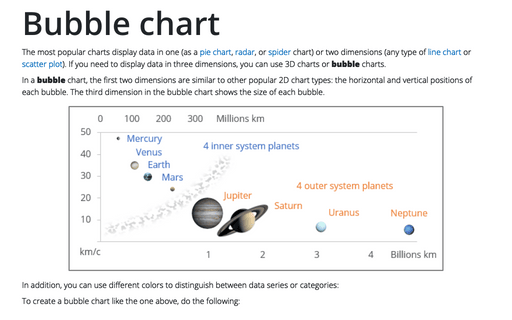
Bubble chart
The most popular charts display data in one (as a pie chart, radar, or spider chart) or two dimensions (any type of line chart or scatter plot). If you need to display data in three dimensions, you can use 3D charts or bubble charts.
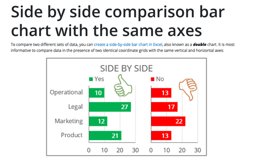
Side by side comparison bar chart with the same axes
To compare two different sets of data, you can create a side-by-side bar chart in Excel, also known as a double chart. It is most informative to compare data in the presence of two identical coordinate grids with the same vertical and horizontal axes:
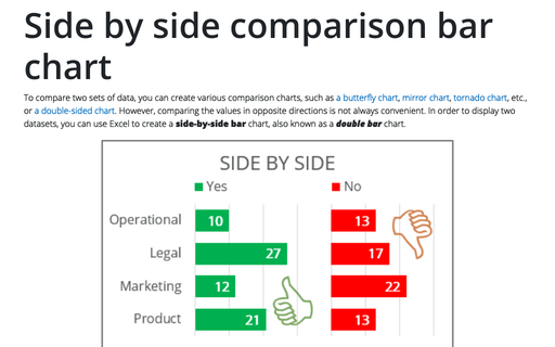
Side by side comparison bar chart
To compare two sets of data, you can create various comparison charts, such as a butterfly chart, mirror chart, tornado chart, etc., or a double-sided chart. However, comparing the values in opposite directions is not always convenient. In order to display two datasets, you can use Excel to create a side-by-side bar chart, also known as a double bar chart.
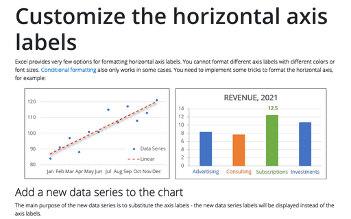
Customize the horizontal axis labels
Excel provides very few options for formatting horizontal axis labels. You cannot format different axis labels with different colors or font sizes. Conditional formatting also only works in some cases. You need to implement some tricks to format the horizontal axis, for example:
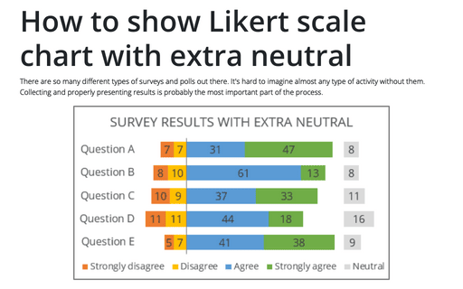
How to show Likert scale chart with extra neutral
There are so many different types of surveys and polls out there. It's hard to imagine almost any type of activity without them. Collecting and properly presenting results is probably the most important part of the process.
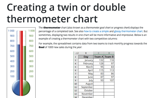
Creating a twin or double thermometer chart
The thermometer chart (also known as a thermometer goal chart or progress chart) displays the percentage of a completed task. See also how to create a simple and glossy thermometer chart. But sometimes, displaying two results in one chart will be more informative and impressive. Below is an example of creating a thermometer chart with two competitive columns:
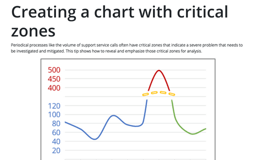
Creating a chart with critical zones
Periodical processes like the volume of support service calls often have critical zones that indicate a severe problem that needs to be investigated and mitigated. This tip shows how to reveal and emphasize those critical zones for analysis.
Column and row headers
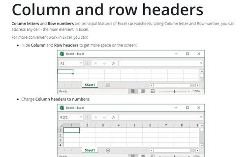
Column letters and Row numbers are principal features of Excel spreadsheets. Using Column letter and Row number, you can address any cell - the main element in Excel.
How to create simple diverging bar chart
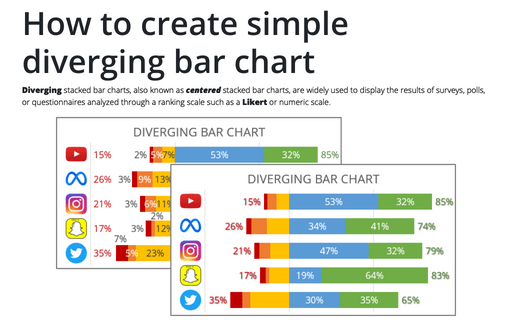
Diverging stacked bar charts, also known as centered stacked bar charts, are widely used to display the results of surveys, polls, or questionnaires analyzed through a ranking scale such as a Likert or numeric scale.
