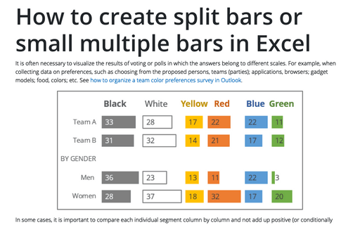
How to create one chat of split bars or small multiple bars in Excel
It is often necessary to visualize the results of voting or polls in which the answers belong to different scales. For example, when collecting data on preferences, such as choosing from the proposed persons, teams (parties); applications, browsers; gadget models; food, colors; etc. See how to organize a team color preferences survey in Outlook.
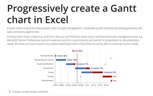
Progressively create a Gantt chart in Excel
A Gantt chart is one of the most popular tools in project management. It illustrates project schedules
by showing activities, like tasks and events, against time.
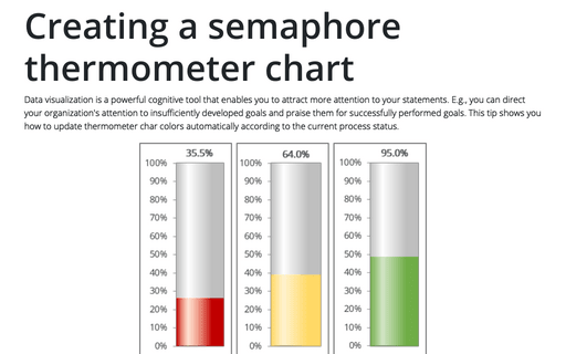
Creating a semaphore thermometer chart
Data visualization is a powerful cognitive tool that enables you to attract more attention to your statements. E.g., you can direct your organization's attention to insufficiently developed goals and praise them for successfully performed goals. This tip shows you how to update thermometer char colors automatically according to the current process status.
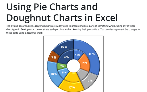
Using Pie Charts and Doughnut Charts in Excel
The pie and donut (in Excel, doughnut) charts are widely used to present multiple parts of something whole. Using any of these chart types in Excel, you can demonstrate each part in one chart keeping their proportions. You can also represent the changes in those parts using a doughnut chart:
Creating a chart with dynamic labels
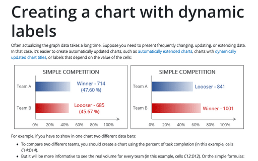
Often actualizing the graph data takes a long time. Suppose you need to present frequently changing, updating, or extending data. In that case, it's easier to create automatically updated charts, such as automatically extended charts, charts with dynamically updated chart titles, or labels that depend on the value of the cells:
How to make Mirror chart in Excel
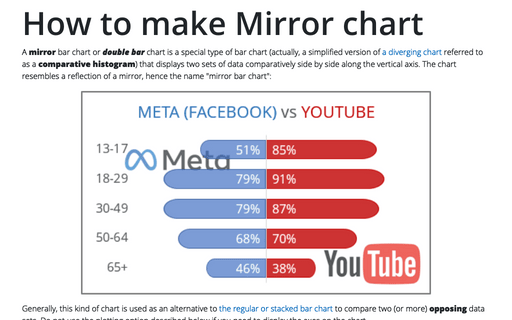
A mirror bar chart or double bar chart is a special type of bar chart (actually, a simplified version of a diverging chart referred to as a comparative histogram) that displays two sets of data comparatively side by side along the vertical axis. The chart resembles a reflection of a mirror, hence the name "mirror bar chart":
How to create an Arc length chart in PowerPoint
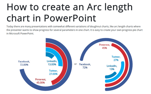
Today there are many presentations with somewhat different variations of doughnut charts, like arc length charts where the presenter wants to show progress for several parameters in one chart. It is easy to create your own progress pie chart in Microsoft PowerPoint.
How to create Butterfly chart in Excel
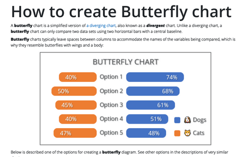
A butterfly chart is a simplified version of a diverging chart, also known as a divergent chart. Unlike a diverging chart, a butterfly chart can only compare two data sets using two horizontal bars with a central baseline.
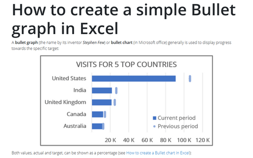
How to create a simple Bullet graph in Excel
A bullet graph (the name by its inventor Stephen Few) or bullet chart (in Microsoft office) generally is used to display progress towards the specific target:
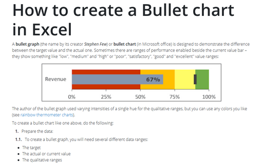
How to create a Bullet chart in Excel
A bullet graph (the name by its creator Stephen Few) or bullet chart (in Microsoft office) is designed to demonstrate the difference between the target value and the actual one. Sometimes there are ranges of performance enabled beside the current value bar – they show something like "low", "medium" and "high" or "poor", "satisfactory", "good" and "excellent" value ranges:
