How to select an invisible element in the chart
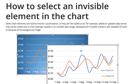
Some chart elements are hard to find for customization, or they are not visible at all. For example, added or updated data series may not be visible due to chart settings: located in an invisible data range, displayed with invisible markers, with disabled fill color, or because of the background image:
How to fix the chart data
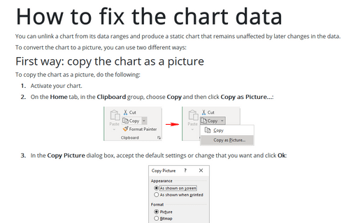
You can unlink a chart from its data ranges and produce a static chart that remains unaffected by later changes in the data.
How to make your data changes in the chart more informative
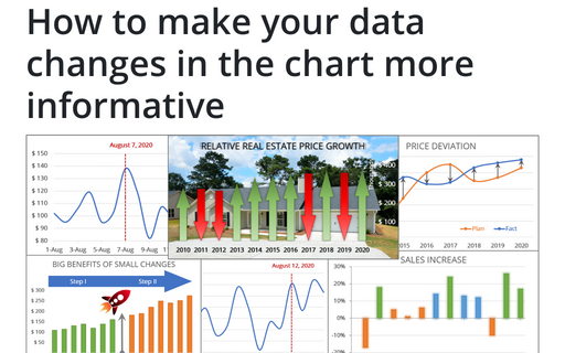
Simple line and bar charts often attract little or no interest in the audience. Still, Excel allows you to attract attention to your data by emphasizing change direction, difference, or period.
Creating a rainbow thermometer chart
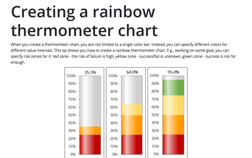
When you create a thermometer chart, you are not limited to a single color bar. Instead, you can specify different colors for different value intervals. This tip shows you how to create a rainbow thermometer chart. E.g., working on some goal, you can specify risk zones for it: red zone - the risk of failure is high, yellow zone - success/fail is unknown, green zone - success is not far enough.
How to create a Marimekko chart or Mekko chart in Excel
The distribution of market shares or stocks of the investment portfolio often is illustrated
by pie or doughnut charts. The illustration of multi-market shares and multiple investment
portfolios calls for different approaches. The Marimekko chart (also known as
Mekko chart, or mosaic plot) comes to the rescue.
Waterfall chart
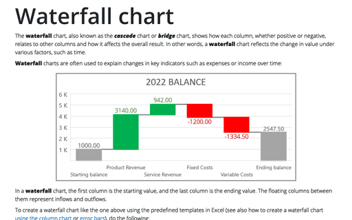
The waterfall chart, also known as the cascade chart or bridge chart, shows how each column, whether positive or negative, relates to other columns and how it affects the overall result. In other words, a waterfall chart reflects the change in value under various factors, such as time.
How to create simple diverging bar chart
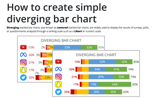
Diverging stacked bar charts, also known as centered stacked bar charts, are widely used to display the results of surveys, polls, or questionnaires analyzed through a ranking scale such as a Likert or numeric scale.
How to create Waterfall chart
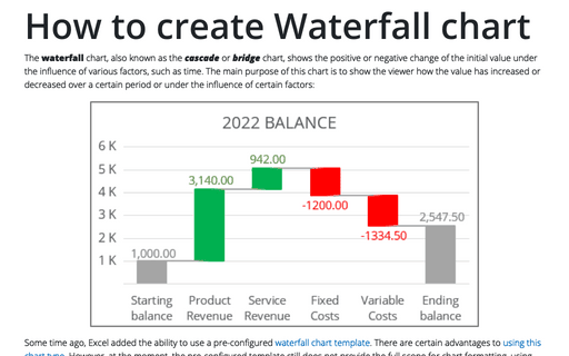
The waterfall chart, also known as the cascade or bridge chart, shows the positive or negative change of the initial value under the influence of various factors, such as time. The main purpose of this chart is to show the viewer how the value has increased or decreased over a certain period or under the influence of certain factors:
How to create a histogram chart by category using frequencies in Excel
There are several ways to create a histogram chart in Excel. By the moment, Excel uses two different algorithms to calculate the data for a histogram chart:
How to add separators to the Marimekko chart
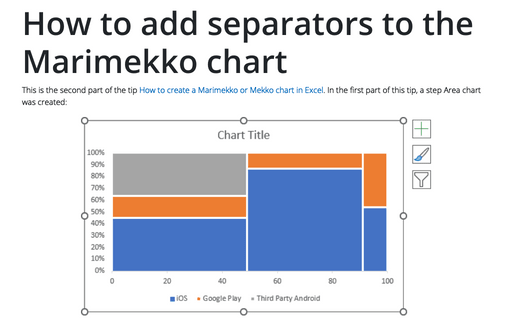
This is the second part of the tip How to create a Marimekko or Mekko chart in Excel. In the first part of this tip, a step Area chart was created:
