Simple combination chart
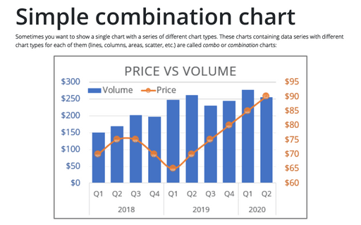
Sometimes you want to show a single chart with a series of different chart types. These charts containing data series with different chart types for each of them (lines, columns, areas, scatter, etc.) are called combo or combination charts:
How to create dependent on a volume chart title
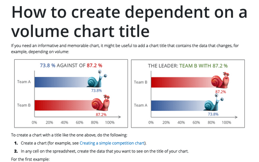
If you need an informative and memorable chart, it might be useful to add a chart title that contains the data that changes, for example, depending on volume:
How to create Master and Scrolled Detail charts
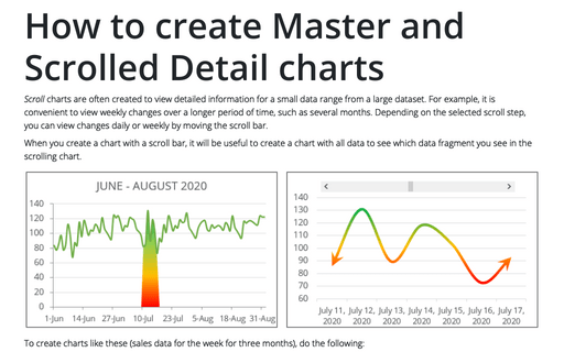
Scroll charts are often created to view detailed information for a small data range from a large dataset. For example, it is convenient to view weekly changes over a longer period of time, such as several months. Depending on the selected scroll step, you can view changes daily or weekly by moving the scroll bar.
How to create PowerPoint progress pie chart
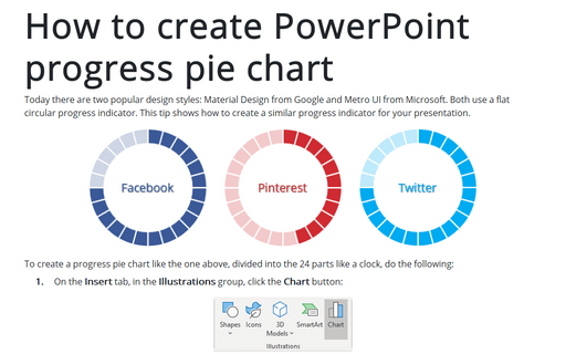
Today there are two popular design styles: Material Design from Google and Metro UI from Microsoft. Both use a flat circular progress indicator. This tip shows how to create a similar progress indicator for your presentation.
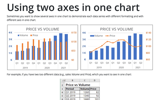
Using two axes in one chart
Sometimes you want to show several axes in one chart to demonstrate each data series with different
formatting and with different axis in one chart.
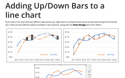
Adding Up/Down Bars to a line chart
If you have a line chart with two different data series, you might want to compare those series at each point along the horizontal axis. There are two different options available in two locations, along with the Chart Design tab of the ribbon:
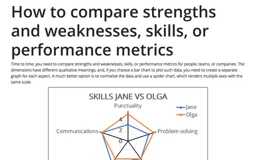
How to compare strengths and weaknesses, skills, or performance metrics
Time to time, you need to compare strengths and weaknesses, skills, or performance metrics for people, teams, or companies. The dimensions have different qualitative meanings, and, if you choose a bar chart to plot such data, you need to create a separate graph for each aspect.
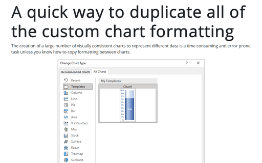
A quick way to duplicate all of the custom chart formatting
The creation of a large number of visually consistent charts to represent different data is a time consuming and error prone task unless you know how to copy formatting between charts.
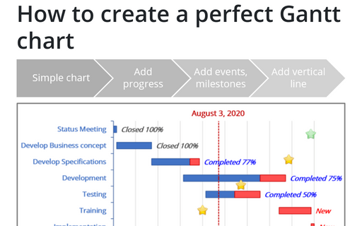
How to create a perfect Gantt chart
Gantt charts illustrate project schedules and, thus, often used by project managers. Project management tools like Microsoft Project are better suited for Gantt charts, but it is easy to create a Gantt chart in Excel following the simple steps.
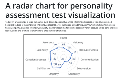
A radar chart for personality assessment test visualization
Today, HR professionals in large companies build detailed personality profiles, which include scores of workplace-oriented behavioral indices of the employee. The behavioral scores cover such areas as leadership, communication skills, interpersonal finesse, empathy, diligence, rationality, analyticity, etc.
