Glossy Gantt chart with a vertical line
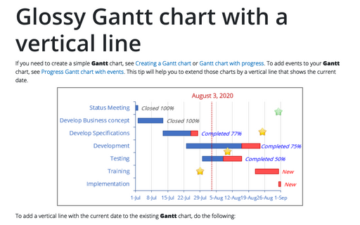
If you need to create a simple Gantt chart, see Creating a Gantt chart or Gantt chart with progress. To add events to your Gantt chart, see Progress Gantt chart with events. This tip will help you to extend those charts by a vertical line that shows the current date.
How to create different types of histogram charts in Excel
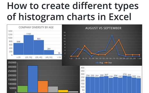
A histogram chart visualizes the distribution of continuous data. Each column in the histogram chart represents the frequency (amount) of the data within the specific range.
Progressively create a Gantt chart in Excel
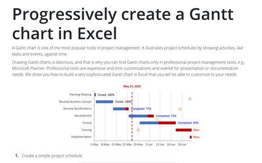
A Gantt chart is one of the most popular tools in project management. It illustrates project schedules
by showing activities, like tasks and events, against time.
How to change axis labels order in a bar chart
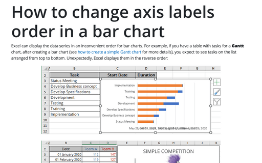
Excel can display the data series in an inconvenient order for bar charts. For example, if you have a table with tasks for a Gantt chart, after creating a bar chart (see how to create a simple Gantt chart for more details), you expect to see tasks on the list arranged from top to bottom. Unexpectedly, Excel displays them in the reverse order:
How to add pictures to vertical axis of the bar chart
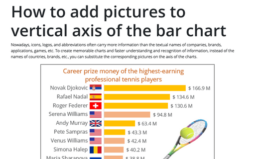
Nowadays, icons, logos, and abbreviations often carry more information than the textual names of companies, brands, applications, games, etc. To create memorable charts and faster understanding and recognition of information, instead of the names of countries, brands, etc., you can substitute the corresponding pictures on the axis of the charts.
How to show Likert scale chart with extra neutral
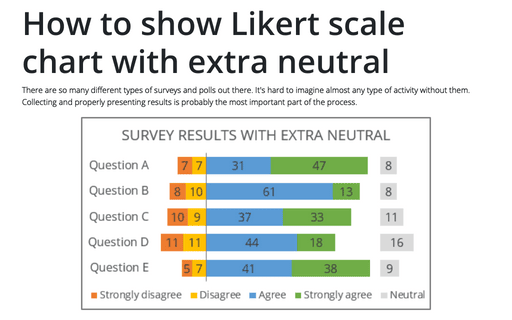
There are so many different types of surveys and polls out there. It's hard to imagine almost any type of activity without them. Collecting and properly presenting results is probably the most important part of the process.
Tally chart in Excel
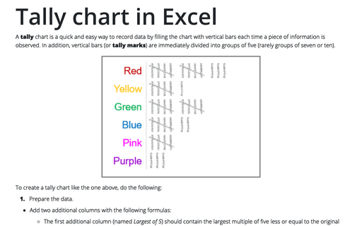
A tally chart is a quick and easy way to record data by filling the chart with vertical bars each time a piece of information is observed. In addition, vertical bars (or tally marks) are immediately divided into groups of five (rarely groups of seven or ten).
Creating pictogram chart with colorful filling
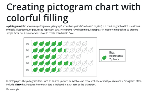
A pictogram (also known as pictorgamme, pictograph, icon chart, pictorial unit chart, or picto) is a chart or graph which uses icons, symbols, illustrations, or pictures to represent data. Pictograms have become quite popular in modern infographics to present simple facts, but it is not obvious how to create this chart in Excel.
How to create a Scrolling chart
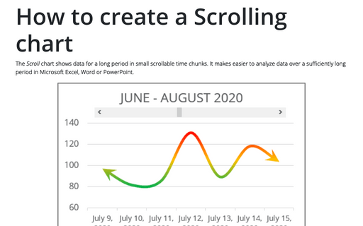
The Scroll chart shows data for a long period in small scrollable time chunks. It makes easier to analyze data over a sufficiently long period in Microsoft Excel, Word or PowerPoint.
The Scroll chart displays some contiguous range of data from a large dataset. Using the provided Control tools, it is possible to add a scroll bar to the chart area and view the desired data range:
The Scroll chart displays some contiguous range of data from a large dataset. Using the provided Control tools, it is possible to add a scroll bar to the chart area and view the desired data range:
Side by side comparison bar chart with differences
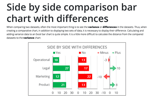
When comparing two datasets, often the most important thing is to see the variance or differences in the datasets. Thus, when creating a comparative chart, in addition to displaying two sets of data, it is necessary to display their difference. Calculating and adding variance data to an Excel bar chart is quite simple. It is a little more difficult to calculate the distance from the compared datasets to the variance chart:
