How to create Master and Scrolled Detail charts
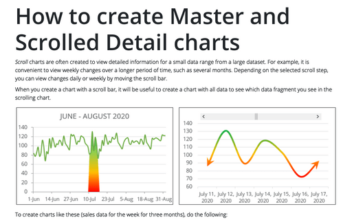
Scroll charts are often created to view detailed information for a small data range from a large dataset. For example, it is convenient to view weekly changes over a longer period of time, such as several months. Depending on the selected scroll step, you can view changes daily or weekly by moving the scroll bar.
Creating a simple thermometer chart
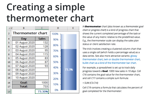
A thermometer chart (also known as a thermometer goal chart or progress chart) is a kind of progress chart that shows the current completed percentage of the task or the value of any metric relative to the predefined value. E.g., the thermometer scale can display the sales plan status or client satisfaction rate.
Using two axes in one chart
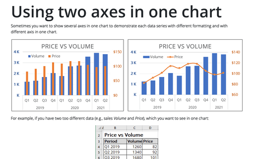
Sometimes you want to show several axes in one chart to demonstrate each data series with different
formatting and with different axis in one chart.
How to create a funny dog breeds lifespan chart in Excel
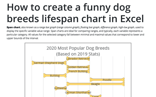
Span chart, also known as a range bar graph (range column graph), floating bar graph, difference graph, high-low graph, used to display the specific variable value range. Span charts are ideal for comparing ranges, and typically, each variable represents a particular category. All values for the selected category fall between minimal and maximal values that correspond to lower and upper bounds of the interval.
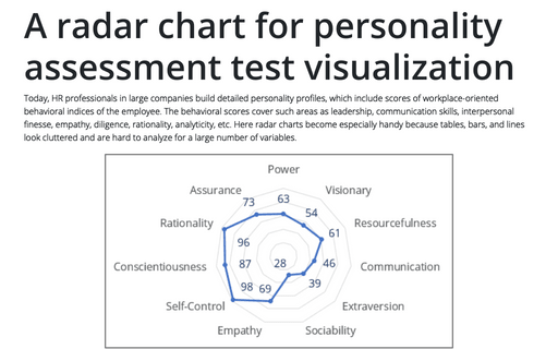
A radar chart for personality assessment test visualization
Today, HR professionals in large companies build detailed personality profiles, which include scores of workplace-oriented behavioral indices of the employee. The behavioral scores cover such areas as leadership, communication skills, interpersonal finesse, empathy, diligence, rationality, analyticity, etc.
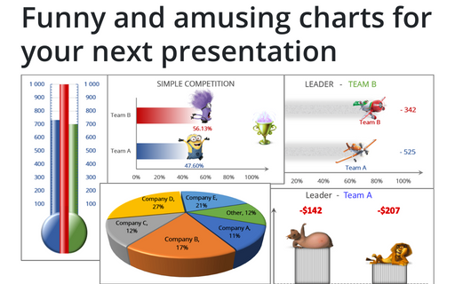
Funny and amusing charts for your next presentation
Several different Excel features can make your presentation less boring:
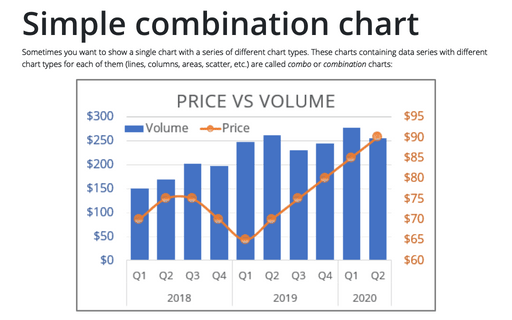
Simple combination chart
Sometimes you want to show a single chart with a series of different chart types. These charts containing data series with different chart types for each of them (lines, columns, areas, scatter, etc.) are called combo or combination charts:
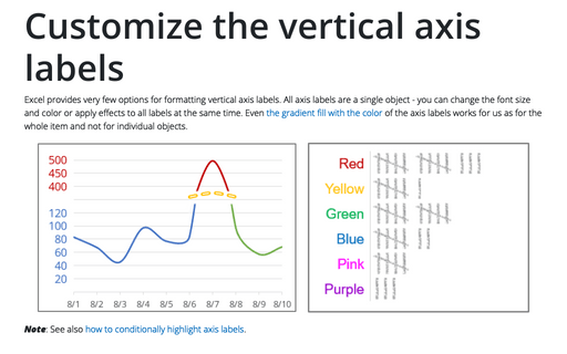
Customize the vertical axis labels
Excel provides very few options for formatting vertical axis labels. All axis labels are a single object - you can change the font size and color or apply effects to all labels at the same time. Even the gradient fill with the color of the axis labels works for us as for the whole item and not for individual objects.
How to create dependent on a volume chart title
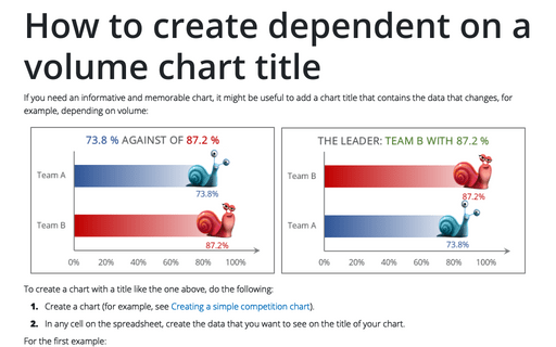
If you need an informative and memorable chart, it might be useful to add a chart title that contains the data that changes, for example, depending on volume:
Creating picture charts
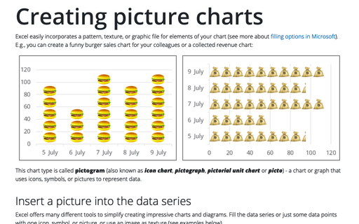
Excel easily incorporates a pattern, texture, or graphic file for elements of your chart (see more about filling options in Microsoft). E.g., you can create a funny burger sales chart for your colleagues or a collected revenue chart:
