How to show Likert scale chart (integrated neutral)
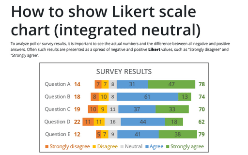
To analyze poll or survey results, it is important to see the actual numbers and the difference between all negative and positive answers. Often such results are presented as a spread of negative and positive Likert values, such as "Strongly disagree" and "Strongly agree".
How to create Butterfly chart in Excel
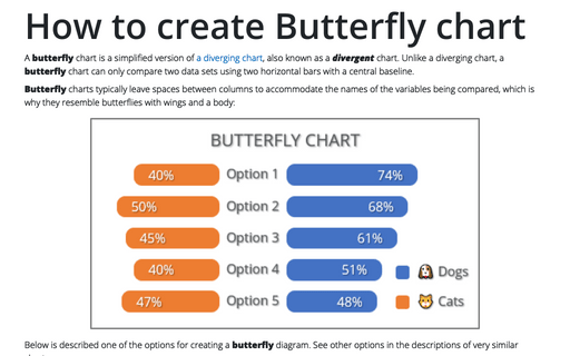
A butterfly chart is a simplified version of a diverging chart, also known as a divergent chart. Unlike a diverging chart, a butterfly chart can only compare two data sets using two horizontal bars with a central baseline.
Creating Pie of Pie and Bar of Pie charts
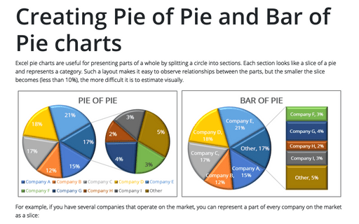
Excel pie charts are useful for presenting parts of a whole by splitting a circle into sections. Each section looks like a slice of a pie and represents a category. Such a layout makes it easy to observe relationships between the parts, but the smaller the slice becomes (less than 10%), the more difficult it is to estimate visually.
Creating a simple competition chart
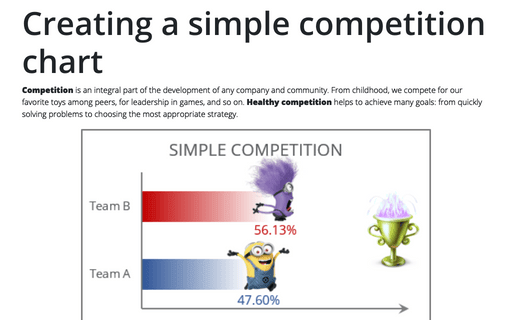
Competition is an integral part of the development of any company and community. From childhood, we compete for our favorite toys among peers, for leadership in games, and so on. Healthy competition helps to achieve many goals: from quickly solving problems to choosing the most appropriate strategy.
How to create a break-even chart in Excel
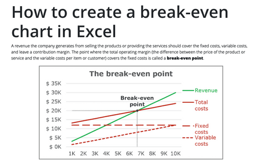
A revenue the company generates from selling the products or providing the services should cover the
fixed costs, variable costs, and leave a contribution margin. The point where the total operating
margin (the difference between the price of the product or service and the variable costs per item
or customer) covers the fixed costs is called a break-even point.
Side by side comparison bar chart with the same axes
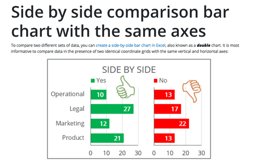
To compare two different sets of data, you can create a side-by-side bar chart in Excel, also known as a double chart. It is most informative to compare data in the presence of two identical coordinate grids with the same vertical and horizontal axes:
Competition chart with residual data
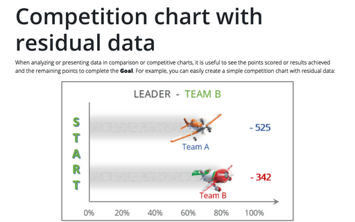
When analyzing or presenting data in comparison or competitive charts, it is useful to see the points scored or results achieved and the remaining points to complete the Goal. For example, you can easily create a simple competition chart with residual data:
6 charts for lively progress visualization
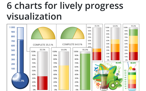
There are several different charts in Excel that can help you to create a perfect progress illustration.
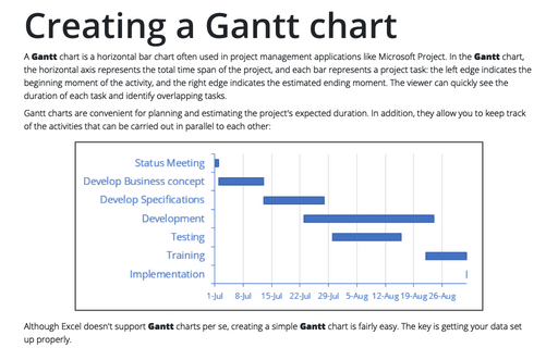
Creating a Gantt chart
A Gantt chart is a horizontal bar chart often used in project management applications like Microsoft Project. In the Gantt chart, the horizontal axis represents the total time span of the project, and each bar represents a project task: the left edge indicates the beginning moment of the activity, and the right edge indicates the estimated ending moment. The viewer can quickly see the duration of each task and identify overlapping tasks.
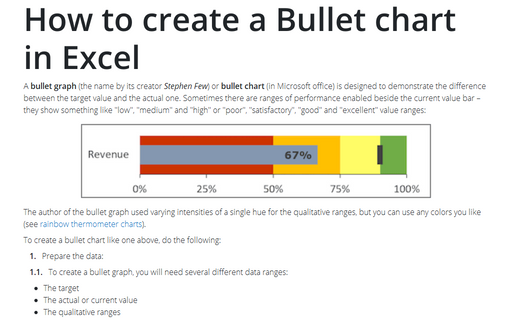
How to create a Bullet chart in Excel
A bullet graph (the name by its creator Stephen Few) or bullet chart (in Microsoft office) is designed to demonstrate the difference between the target value and the actual one. Sometimes there are ranges of performance enabled beside the current value bar – they show something like "low", "medium" and "high" or "poor", "satisfactory", "good" and "excellent" value ranges:
