How to make Mirror chart in Excel
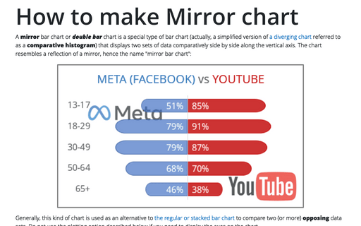
A mirror bar chart or double bar chart is a special type of bar chart (actually, a simplified version of a diverging chart referred to as a comparative histogram) that displays two sets of data comparatively side by side along the vertical axis. The chart resembles a reflection of a mirror, hence the name "mirror bar chart":
How to create a simple histogram chart in Excel
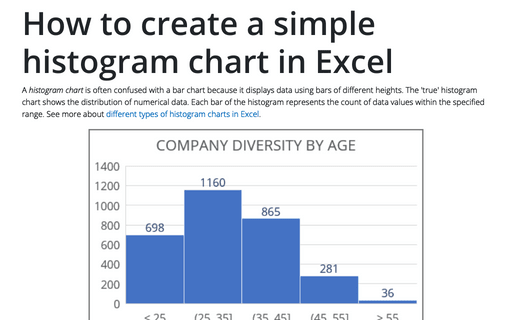
A histogram chart is often confused with a bar chart because it displays data using bars of different heights. The 'true' histogram chart shows the distribution of numerical data. Each bar of the histogram represents the count of data values within the specified range. See more about different types of histogram charts in Excel.
Adding error bars
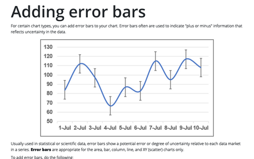
For certain chart types, you can add error bars to your chart. Error bars often are used to indicate "plus or minus" information that reflects uncertainty in the data.
Gantt chart with progress or progress Gantt chart
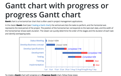
Gantt chart is a horizontal bar chart that is often used in project management
applications.
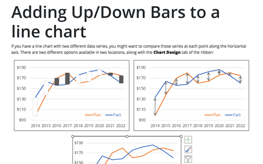
Adding Up/Down Bars to a line chart
If you have a line chart with two different data series, you might want to compare those series at each point along the horizontal axis. There are two different options available in two locations, along with the Chart Design tab of the ribbon:
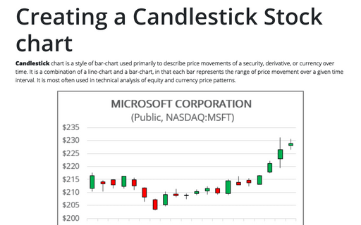
Creating a Candlestick Stock chart
Candlestick chart is a style of bar-chart used primarily to describe price movements of a security, derivative, or currency over time. It is a combination of a line-chart and a bar-chart, in that each bar represents the range of price movement over a given time interval. It is most often used in technical analysis of equity and currency price patterns.
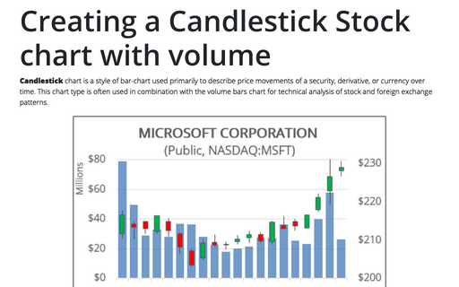
Creating a Candlestick Stock chart with volume
Candlestick chart is a style of bar-chart used primarily to describe price movements of a security, derivative, or currency over time. This chart type is often used in combination with the volume bars chart for technical analysis of stock and foreign exchange patterns.
How to create simple diverging bar chart
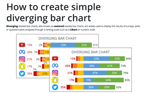
Diverging stacked bar charts, also known as centered stacked bar charts, are widely used to display the results of surveys, polls, or questionnaires analyzed through a ranking scale such as a Likert or numeric scale.
Side by side comparison bar chart
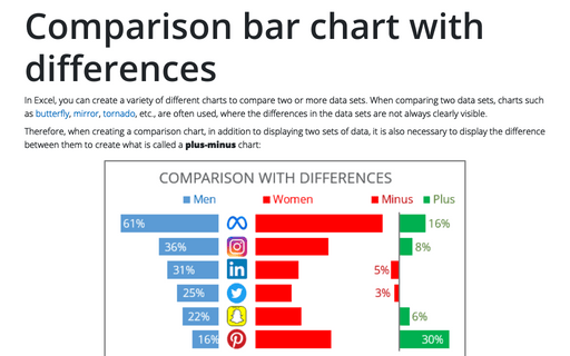
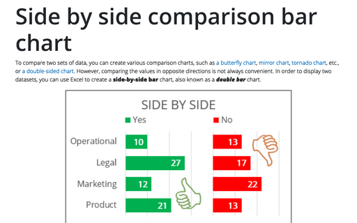
To compare two sets of data, you can create various comparison charts, such as a butterfly chart, mirror chart, tornado chart, etc., or a double-sided chart. However, comparing the values in opposite directions is not always convenient. In order to display two datasets, you can use Excel to create a side-by-side bar chart, also known as a double bar chart.
