Text formatting in PowerPoint
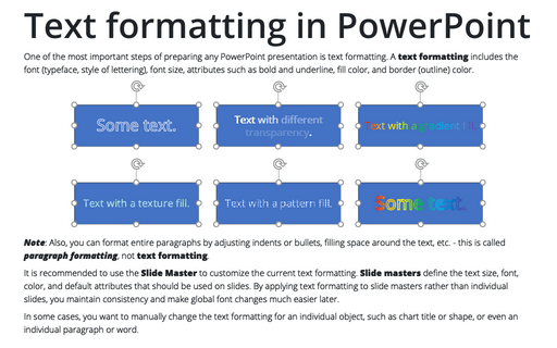
One of the most important steps of preparing any PowerPoint presentation is text formatting. A text formatting includes the font (typeface, style of lettering), font size, attributes such as bold and underline, fill color, and border (outline) color.
Conditional formatting for chart axes
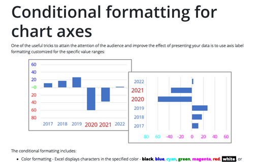
One of the useful tricks to attain the attention of the audience and improve the effect of presenting your data is to use axis label formatting customized for the specific value ranges:
Side by side comparison bar chart with differences
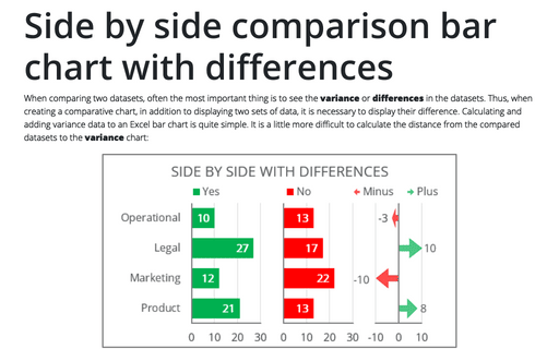
When comparing two datasets, often the most important thing is to see the variance or differences in the datasets. Thus, when creating a comparative chart, in addition to displaying two sets of data, it is necessary to display their difference. Calculating and adding variance data to an Excel bar chart is quite simple. It is a little more difficult to calculate the distance from the compared datasets to the variance chart:
How to add a vertical line to the line or bar chart
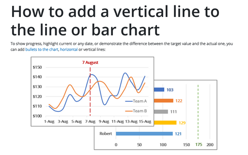
To show progress, highlight current or any date, or demonstrate the difference between the target value and the actual one, you can add bullets to the chart, horizontal or vertical lines:
Side by side comparison bar chart with the same axes
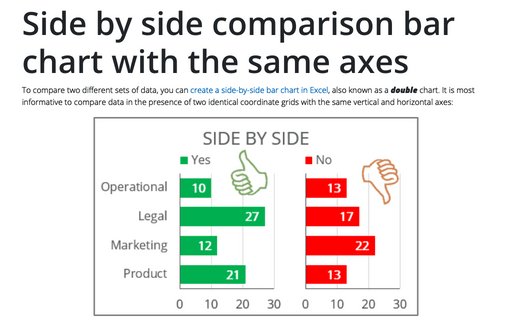
To compare two different sets of data, you can create a side-by-side bar chart in Excel, also known as a double chart. It is most informative to compare data in the presence of two identical coordinate grids with the same vertical and horizontal axes:
Add an illusion of slide depth with reflections for Pictures, Shapes, SmartArt, Charts, and Tables
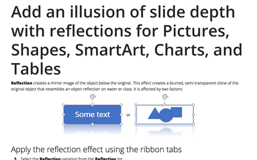
Reflection creates a mirror image of the object below the original. This effect creates a blurred, semi-transparent clone of the original object that resembles an object reflection on water or class. It is affected by two factors:
Add radiance and softness to Pictures, Shapes, SmartArt, and Charts in Powerpoint
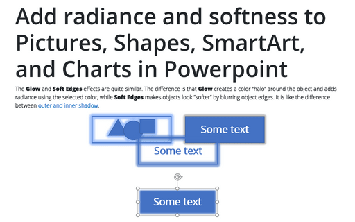
The Glow and Soft Edges effects are quite similar. The difference is that Glow creates a color “halo” around the object and adds radiance using the selected color, while Soft Edges makes objects look ”softer” by blurring object edges. It is like the difference between outer and inner shadow.
Creating a Candlestick Stock chart
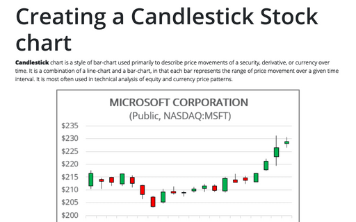
Candlestick chart is a style of bar-chart used primarily to describe price movements of a security, derivative, or currency over time. It is a combination of a line-chart and a bar-chart, in that each bar represents the range of price movement over a given time interval. It is most often used in technical analysis of equity and currency price patterns.
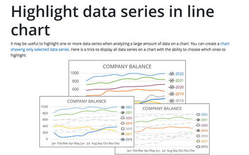
Highlight data series in line chart
It may be useful to highlight one or more data series when analyzing a large amount of data on a chart. You can create a chart showing only selected data series. Here is a trick to display all data series on a chart with the ability to choose which ones to highlight:
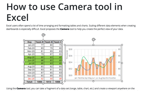
How to use Camera tool in Excel
Excel users often spend a lot of time arranging and formatting tables and charts. Scaling different data elements when creating dashboards is especially difficult. Excel proposes the Camera tool to help you create the perfect view of your data.
