How to create Master and Scrolled Detail charts
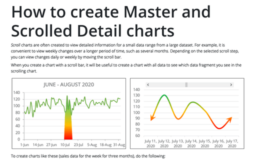
Scroll charts are often created to view detailed information for a small data range from a large dataset. For example, it is convenient to view weekly changes over a longer period of time, such as several months. Depending on the selected scroll step, you can view changes daily or weekly by moving the scroll bar.
How to create PowerPoint progress pie chart
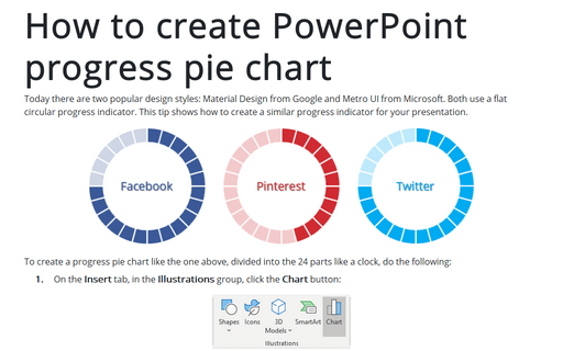
Today there are two popular design styles: Material Design from Google and Metro UI from Microsoft. Both use a flat circular progress indicator. This tip shows how to create a similar progress indicator for your presentation.
How to create a step Area chart for the Mosaic plot in Excel
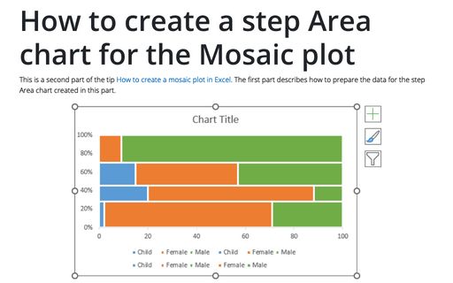
This is a second part of the tip How to create a Mosaic plot in Excel. The first part describes how to prepare the data for the step Area chart created in this part.
How to create a Mosaic plot in Excel
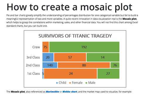
Pie and bar charts greatly simplify the understanding of percentages distribution for one categorical variable but fail to build a meaningful representation of two and more variables. A quite recent innovation in data visualization real is the Mosaic plot, which helps to grasp the correlations within marketing, sales, and other financial data. You will not find this chart among Excel standard charts, but you can build one.
How to create two horizontal axes on the same side
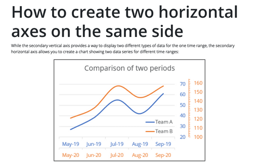
While the secondary vertical axis provides a way to display two different types of data for the one time range, the secondary horizontal axis allows you to create a chart showing two data series for different time ranges:
How to create step chart in Excel
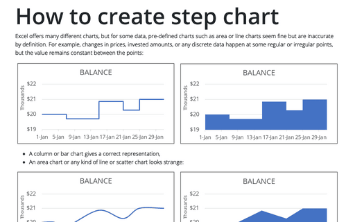
Excel offers many different charts, but for some data, pre-defined charts such as area or line charts seem fine but are inaccurate by definition. For example, changes in prices, invested amounts, or any discrete data happen at some regular or irregular points, but the value remains constant between the points:
Bubble chart
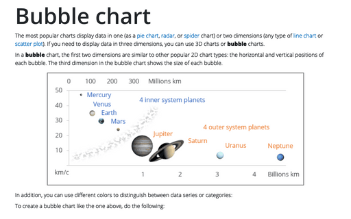
The most popular charts display data in one (as a pie chart, radar, or spider chart) or two dimensions (any type of line chart or scatter plot). If you need to display data in three dimensions, you can use 3D charts or bubble charts.
How to plot investment opportunity zones in Excel
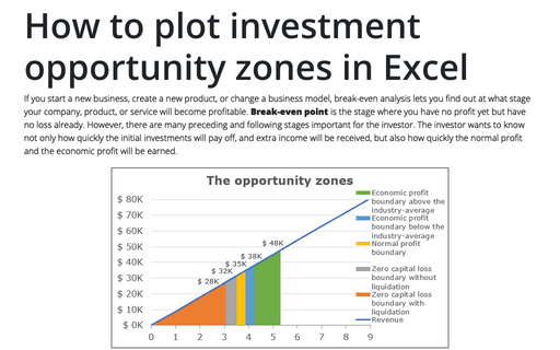
If you start a new business, create a new product, or change a business model, break-even analysis lets you find out at what stage your company, product, or service will become profitable. Break-even point is the stage where you have no profit yet but have no loss already. However, there are many preceding and following stages important for the investor. The investor wants to know not only how quickly the initial investments will pay off, and extra income will be received, but also how quickly the normal profit and the economic profit will be earned.
Three different ways for printing a selected area
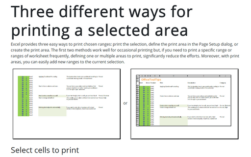
Excel provides three easy ways to print chosen ranges: print the selection, define the print area in the Page Setup dialog, or create the print area. The first two methods work well for occasional printing but, if you need to print a specific range or ranges of worksheet frequently, defining one or multiple areas to print, significantly reduce the efforts. Moreover, with print areas, you can easily add new ranges to the current selection.
Excel 3-D Pie charts
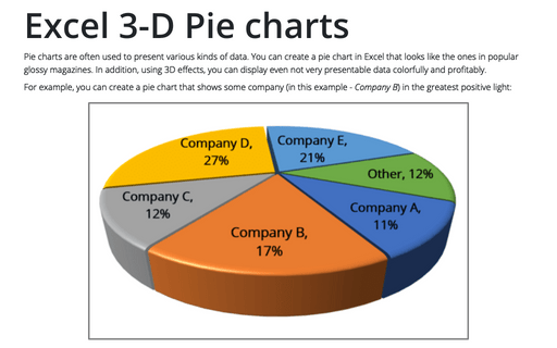
Pie charts are often used to present various kinds of data. You can create a pie chart in Excel that looks like the ones in popular glossy magazines. In addition, using 3D effects, you can display even not very presentable data colorfully and profitably.
