How to add deviations into your chart
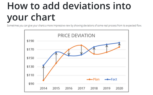
Sometimes you can give your charts a more impressive view by showing deviations of some real process from its expected flow.
Creating picture charts
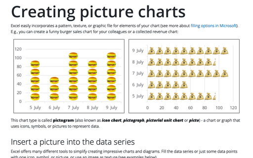
Excel easily incorporates a pattern, texture, or graphic file for elements of your chart (see more about filling options in Microsoft). E.g., you can create a funny burger sales chart for your colleagues or a collected revenue chart:
How to change default chart
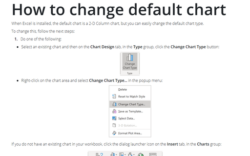
When Excel is installed, the default chart is a 2-D Column chart, but you can easily change the default chart type.
Speedometer chart
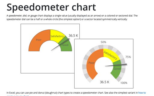
A speedometer, dial, or gauge chart displays a single value (usually displayed as an arrow) on a colored or sectored dial. The speedometer dial can be a half or a whole circle (the simplest option) or a sector located symmetrically vertically:
Show chart data in hidden cells
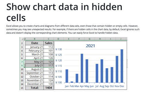
Excel allows you to create charts and diagrams from different data sets, even those that contain hidden or empty cells. However, sometimes you may see unexpected results. For example, if there are hidden cells in the chart data, by default, Excel ignores such data and doesn't display the corresponding chart elements. You can easily force Excel to handle hidden data.
Preventing objects from being printed or why objects aren't printing
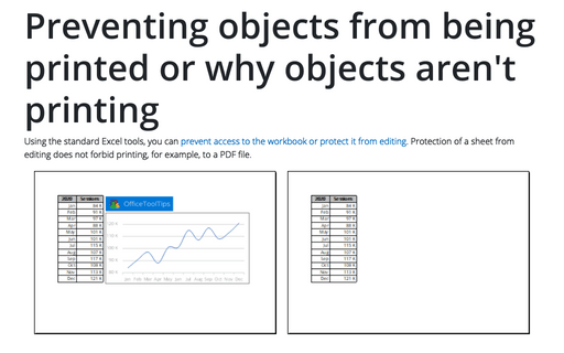
Using the standard Excel tools, you can prevent access to the workbook or protect it from editing. Protection of a sheet from editing does not forbid printing, for example, to a PDF file.
How to use progress pie charts for numbering in PowerPoint
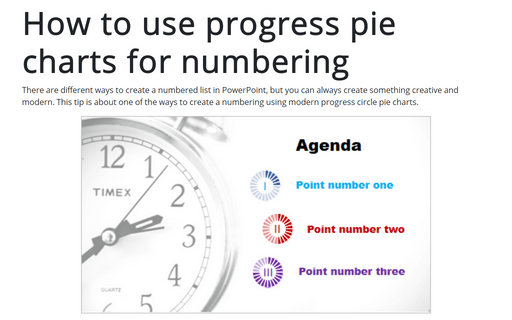
There are different ways to create a numbered list in PowerPoint, but you can always create something creative and modern. This tip is about one of the ways to create a numbering using modern progress circle pie charts.
Waterfall chart
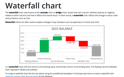
The waterfall chart, also known as the cascade chart or bridge chart, shows how each column, whether positive or negative, relates to other columns and how it affects the overall result. In other words, a waterfall chart reflects the change in value under various factors, such as time.
How to create a Scrolling chart
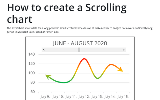
The Scroll chart shows data for a long period in small scrollable time chunks. It makes easier to analyze data over a sufficiently long period in Microsoft Excel, Word or PowerPoint.
The Scroll chart displays some contiguous range of data from a large dataset. Using the provided Control tools, it is possible to add a scroll bar to the chart area and view the desired data range:
The Scroll chart displays some contiguous range of data from a large dataset. Using the provided Control tools, it is possible to add a scroll bar to the chart area and view the desired data range:
Cascade chart using stepped line chart in Excel
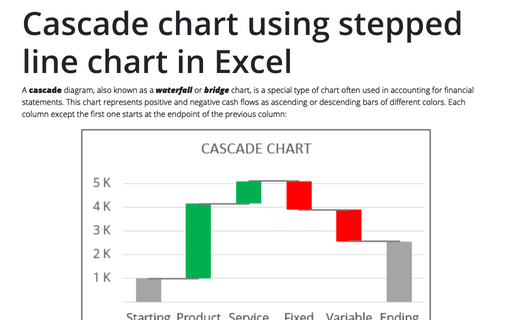
A cascade diagram, also known as a waterfall or bridge chart, is a special type of chart often used in accounting for financial statements. This chart represents positive and negative cash flows as ascending or descending bars of different colors. Each column except the first one starts at the endpoint of the previous column:
