How to show Likert scale chart (integrated neutral)
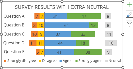
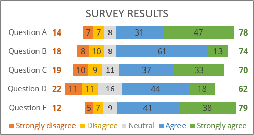
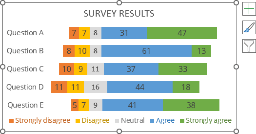
Correct display of feedback results is not easy if there are more than two possible answers - positive, neutral, and negative. However, you can create a chart that shows the whole picture:
See more about visualizing survey results.
The main feature of this chart is the positioning of bars relative to the center - creating a diverging stacked bar chart with neutral values, also known as a centered stacked bar chart.
To create an Excel chart like the one above, do the following:
1. Add additional data to the chart data
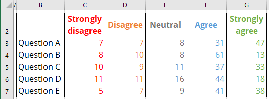
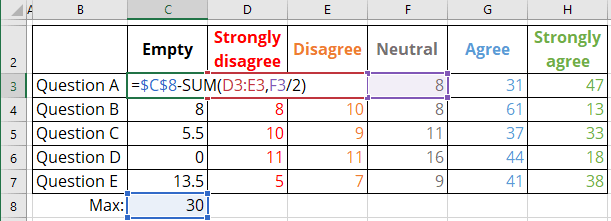
For example, the survey results are presented in the following table:
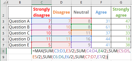
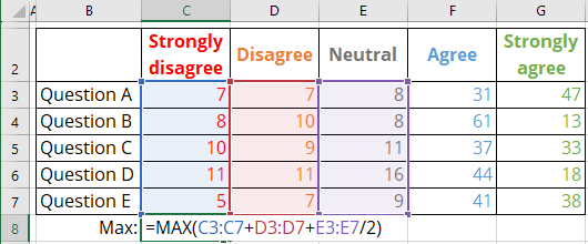
1.1. For correct positioning, calculate the maximum of all negative values plus half of the neutral values (if you don't have neutral values, calculate the maximum of negative values):
- The classical MAX () function:
- The array format of the MAX () function:
1.2. Add a new column to calculate the difference between the calculated maximum and the sum of negative values and half of the neutral values:
2. Create a plain bar chart using all data
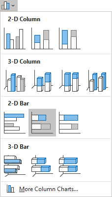
2.1. Select the data range (for this example, B2:H7), then on the Insert tab, in the Charts group, click the Insert Column or Bar Chart button:

From the Insert Column or Bar Chart dropdown list, under 2-D Bar, choose the Stacked Bar chart:
Excel creates the bar chart:
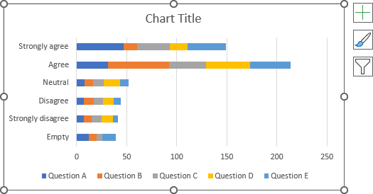
2.2. Switch rows and columns by doing one of the following:
- On the Chart Design tab, in the Data group, click the Switch Row/Column button:

- Right-click on the chart plot area and choose Select Data... in the popup menu:
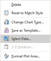
In the Select Data Source dialog box, click the Switch Row/Column button:
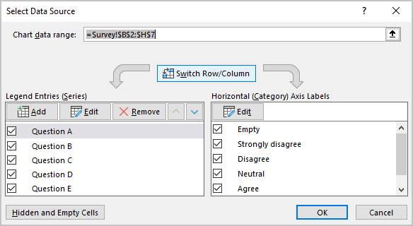
Excel changes the chart:
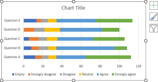
3. Format the horizontal axis
To move the horizontal axis to the correct position, do the following:
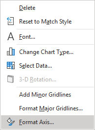
3.1. Right-click on the horizontal axis and choose Format Axis... in the popup menu:
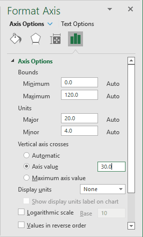
3.2. On the Format Axis pane, on the Axis Options tab, in the Axis Options section, under Vertical axis crosses:
- Check the Axis value option,
- Type the maximum value that you calculated in step 1.1.:
4. Format the vertical axis
To move labels to the correct position in the reverse order, do the following:
4.1. Right-click on the vertical axis and choose Format Axis... in the popup menu.
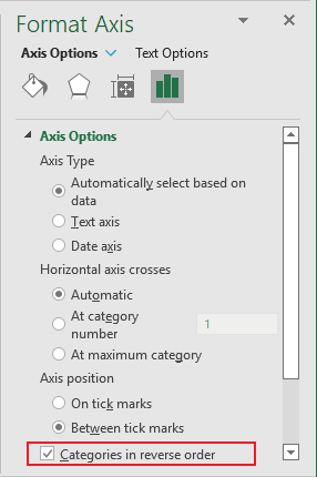
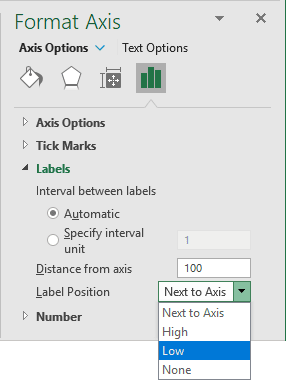
4.2. On the Format Axis pane, on the Axis Options tab:
- In the Axis Options section, select the Categories in reverse order checkbox:
- In the Labels section, from the Label Position dropdown list, choose Low:
5. Hide the first data series
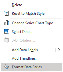
5.1. Right-click on the first data series (in this example, Empty) and choose Format Data Series... in the popup menu:
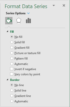
5.2. On the Format Data Series pane, on the Fill & Line tab:
- In the Fill section, select the No fill option,
- In the Border section, select the No line option:
Excel hides the first data series:
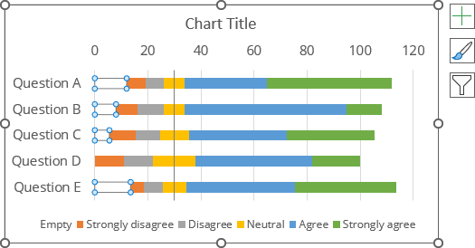
6. Add data labels
To add data labels to the chart, do one of the following:
- Click on the Chart Elements button, select the Data Labels list, then select the position of the labels:
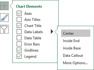
- On the Chart Design tab, in the Chart Layouts group, click the Add Chart Element button:

From the Add Chart Element dropdown list, choose Data Labels, then select the place for the labels:
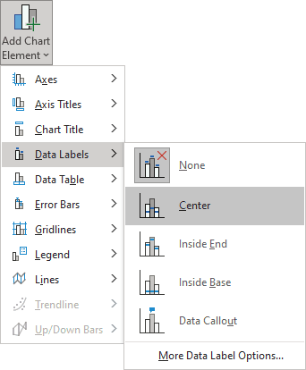
7. Format data labels
To format data labels, right-click on any of them for each data series, then select Format Data Labels... in the popup menu:
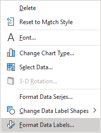
On the Format Data Labels pane, on the Label Options section, in the Label Contains group:
- Check the Value From Cells option,
- Choose the appropriate cells in the Data Label Range dialog box:
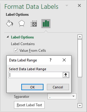
- Unselect all other checkboxes.
8. Format the chart
Optionally, hide the horizontal axis and type the chart title. Also, fill the data series as you prefer (see more about filling options in Microsoft).
For example:
9. Adding the totals
There are some important points for presenting poll or survey results:
A. In many cases, the total number of "Satisfied"/"Unsatisfied" ("Agree"/"Disagree") is more important than the individual "Very satisfied" ("Strongly agree") and "Very unsatisfied" ("Strongly disagree") values.
To add the subtotals, do the following:
1. Add new data for subtotals:
Total Disagree = Strongly disagree + Disagree,
Total Agree = Agree + Strongly Agree:

Notes:
- You can also add half of the neutral value for both sums.
- Instead of actual values, you can calculate the percentage.
2. Add two new data series to the chart:
2.1. Open the Select Data Source dialog box by doing one of the following:
- Right-click on the chart plot area and choose Select Data... in the popup menu,
- On the Chart Design tab, in the Data group, click the Select Data button:

2.2. In the Select Data Source dialog box, click the Add button:
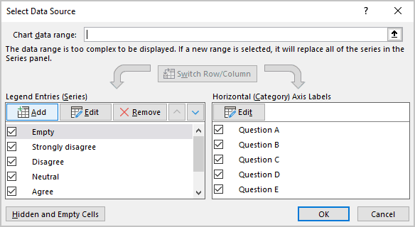
2.3. In the Edit Series dialog box:
- In the Series name field, select the appropriate value,
- In the Series values field, type as many zeros as values of totals you have.
In this example, {0, 0, 0, 0, 0}:
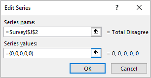
2.4. Repeat the previous step for another total.
3. Add and format the data labels for the new data series (see steps 6-7).
See more about customizing the vertical axis labels.
B. Of course, positive and negative opinions are more important than the absence of opinions. Therefore, it is recommended to indicate the neutral category in gray, faded color. Often the neutral category is taken out separately from the main chart:
