Chart in Excel 365
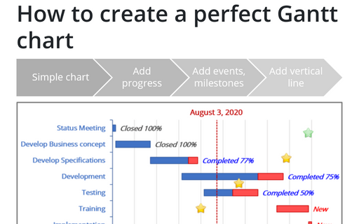
How to create a perfect Gantt chart
Gantt charts illustrate project schedules and, thus, often used by project managers. Project management tools like Microsoft Project are better suited for Gantt charts, but it is easy to create a Gantt chart in Excel following the simple steps.
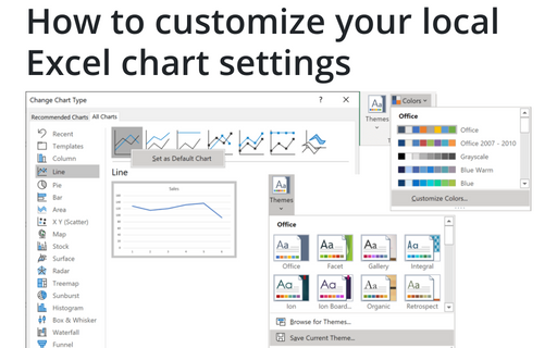
How to customize your local Excel chart settings
The default installation of Excel has reasonable presets for chart types and colors, but you can change those
defaults according to your own preferences.
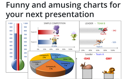
Funny and amusing charts for your next presentation
Several different Excel features can make your presentation less boring:
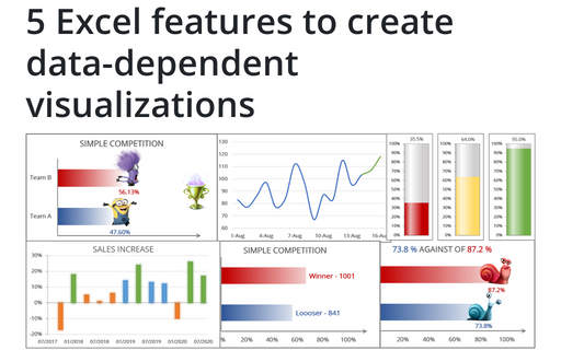
5 Excel features to create data-dependent visualizations
There are several useful features in Excel that can help to create your charts, which automatically change visual appearance depending on data.
How to change default chart
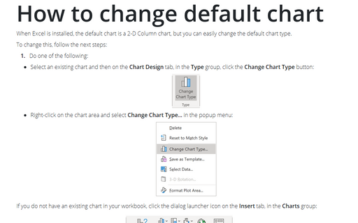
When Excel is installed, the default chart is a 2-D Column chart, but you can easily change the default chart type.
How to hide points on the chart axis
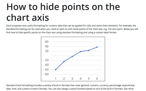
Excel proposes very useful formatting for numeric data that can be applied for cells and some chart elements. For example, the standard formatting can be used when you need or want to omit some points of the chart axis, e.g., the zero point. Below you will find how to hide specific points on the chart axis using standard formatting and using a custom label format:
Conditional formatting for chart axes
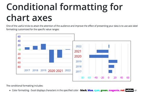
One of the useful tricks to attain the attention of the audience and improve the effect of presenting your data is to use axis label formatting customized for the specific value ranges:
How to add deviations into your chart
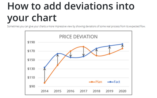
Sometimes you can give your charts a more impressive view by showing deviations of some real process from its expected flow.
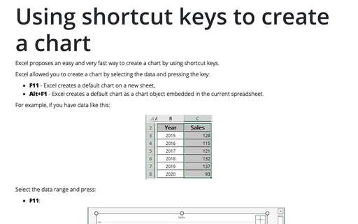
Using shortcut keys to create a chart
Excel proposes an easy and very fast way to create a chart by using shortcut keys.
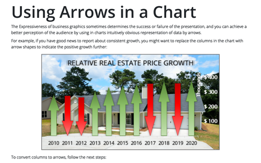
Using Arrows in a Chart
The Expressiveness of business graphics sometimes determines the success or failure of the presentation, and you can achieve a better perception of the audience by using in charts intuitively obvious representation of data by arrows.
