How to create interactive chart with checkboxes in Excel
See also interactive charts.
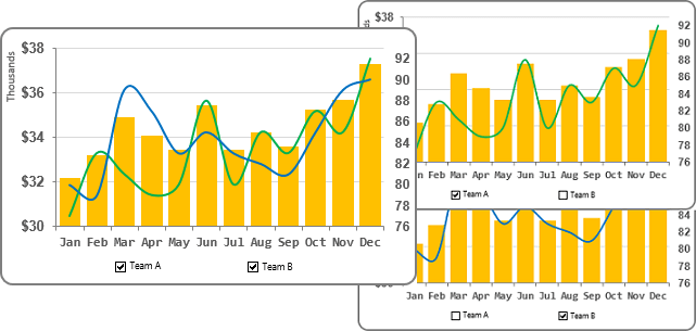
To create an interactive chart with checkboxes, do the following:
1. Add additional data to your spreadsheet for checkbox values:
For example, enter in the cells G2 and G3 the values TRUE :
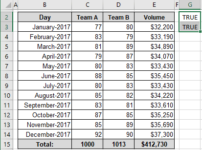
2. Create data ranges, which will be used for the interactive chart:
2.1. On the Formulas tab, in the Defined Names group, click Define Name (see Creating and using named ranges for more details):

2.2. In the New Name dialog box:
- In the Name field, enter the name of this new range, for example, Series1,
- In the Refers to field, enter this formula:
= IF (<condition>, <series data>, 0)
Where the condition is the option to show this data series.
In this example:
= IF ($G$2, $C$3:$C$14, 0):
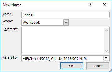
2.3. Add the new data range for the other series.
In this example:
- Name: Series2,
- Refers to: = IF ($G$3, $D$3:$D$14, 0).
3. Create a chart that includes all data series:
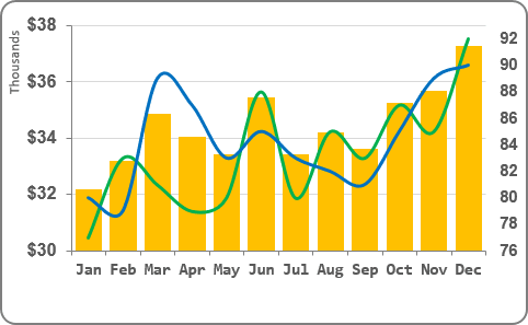
4. Change the data series:
4.1. Do one of the following:
- Under Chart Tools, on the Design tab, in the Data group, choose Select Data:

- Right-click in the chart area and choose Select Data... in the popup menu:
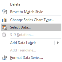
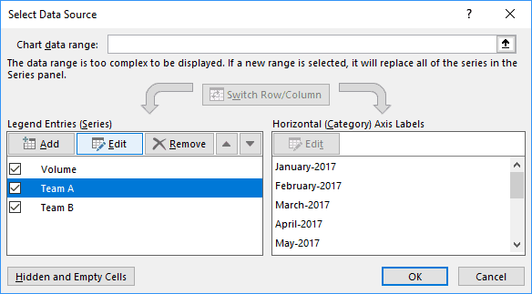
4.2. On the Select Data Source dialog box, for the Legend Entries (Series), select the first data series that you would like to hide and show using the checkboxes and click the Edit button:
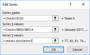
4.3. In the Edit Series dialog box, change Series name and Series Y values (or Series values) to the appropriate names:
4.4. Repeat the previous steps for all other data series that you will show and hide using the checkboxes.
5. Add the checkboxes to the chart:
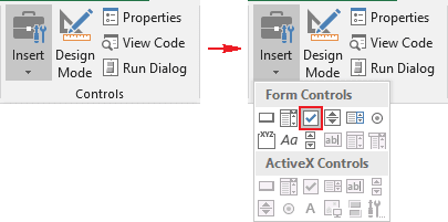
5.1. On the Developer tab (see Show the Developer tab), in the Controls group, click the Insert drop-down list and then choose Check Box:
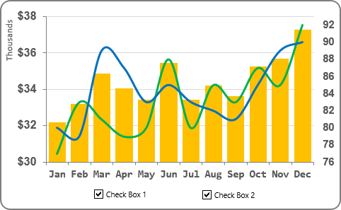
Add as many checkboxes as series will be selected and place them where you want.
In this example, just two checkboxes were used:
5.2. Format checkboxes:
5.2.1. Double-click on every checkbox and change the label.
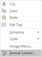
5.2.2. Right-click on the checkbox and choose Format Control... in the popup menu:
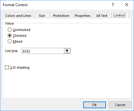
5.2.3. In the Format Control dialog box, on the Control tab, choose the appropriate cell in the Cell link field (in this example, G2):
5.2.4. Format other checkboxes (in this example, for the cell G3).
Make any other adjustments to get the look you desire.
Note: To show data series, Excel will use the colors from the theme by default. To use your colors for checked data series, create a new theme with custom colors. For example:
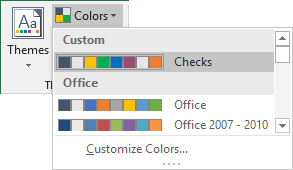
See How to change the default colors that Excel uses for chart series for more details.
See also this tip in French: Comment créer un graphique interactif avec des cases à cocher dans Excel.
