Using Pie Charts and Doughnut Charts in Excel
Excel 365 2016 2010 2007 2003
If you have several parts of something one, you can demonstrate each item in one pie chart. But sometimes you want to demonstrate the changes of those parts and doughnut chart will help you to do this.
Format chart in Excel 2013

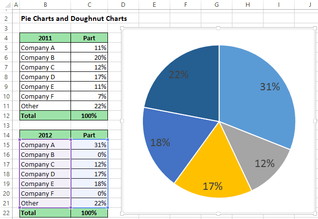
For example, if you have several companies that operate in one business, you can submit a part of every company in this business:
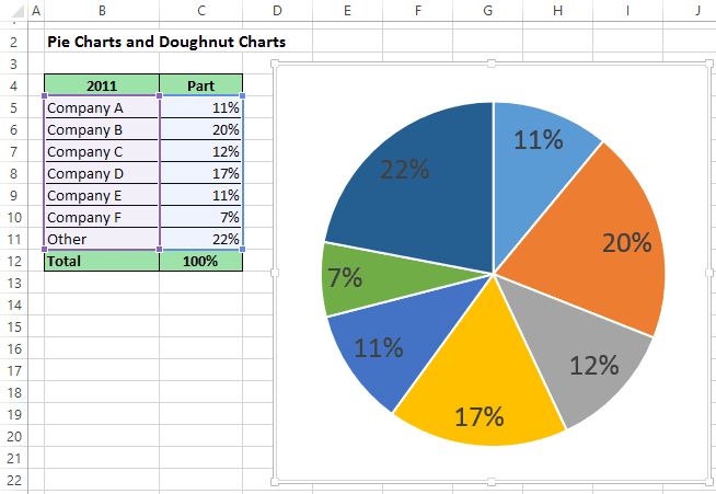
Pie Chart in Excel 2013

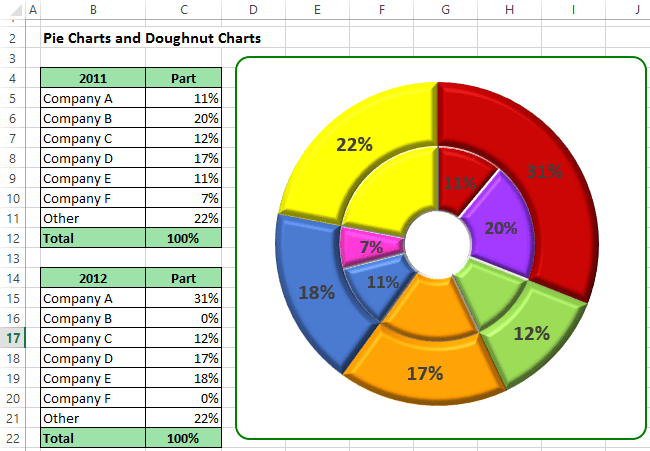
After the merger of some companies have received:
Pie Chart 2 in Excel 2013

To create one chart of this data, follow these steps:

   1.    Select the first data range (in this example B5:C11).

   2.    On the Insert tab, in the Charts group, choose the Pie and Doughnut button:

Pie charts in Excel 2013

Choose Doughnut.

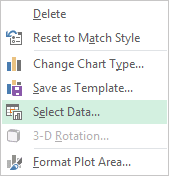
   3.    Right-click in the chart area. In the popup menu select Select Data...:
Select Data in Excel 2013

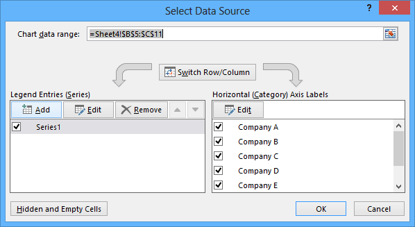
   4.    In the Select Data Source dialog box, click the Add button:
Add data series in Excel 2013

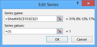
   5.    In the Edit Series dialog box, select the second data range (in this example C15:C21):
Edit Series in Excel 2013

After adding new data series your doughnut chart can be like this:
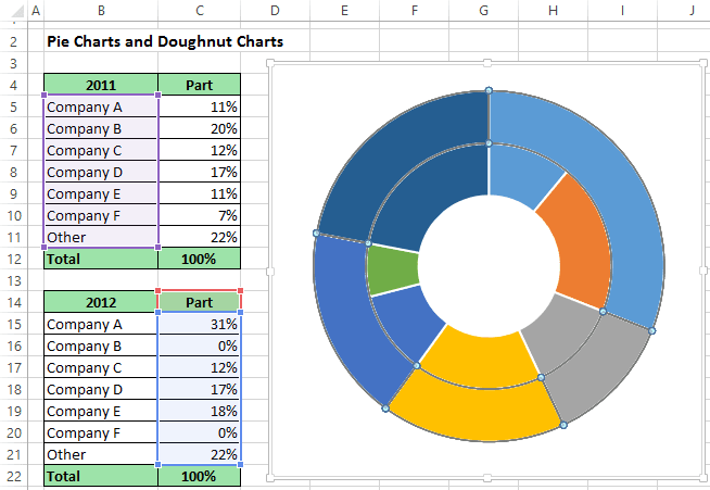
Doughnut Chart in Excel 2013

You can then make any other adjustments to get the look you desire.
Please, disable AdBlock and reload the page to continue

Today, 30% of our visitors use Ad-Block to block ads.We understand your pain with ads, but without ads, we won't be able to provide you with free content soon. If you need our content for work or study, please support our efforts and disable AdBlock for our site. As you will see, we have a lot of helpful information to share.