Gantt chart with progress or progress Gantt chart
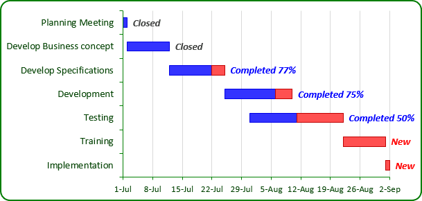
In the classic Gantt chart (see Creating a Gantt chart), horizontal axis represents the total time span of the project, and each bar represents a project task. The viewer can quickly see the duration of each task and identify overlapping tasks. To create the Gantt chart with progress, follow these steps:
1. Select the data range, for example B5:C11; F5:G11:
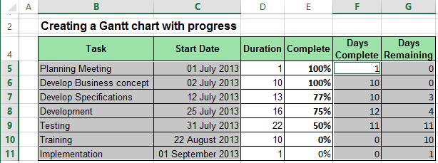
2. On the Insert tab, in the Charts group, select the Bar button and choose Stacked Bar to create a chart:
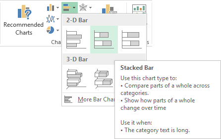
3. Remove the Legend and do one of the following:
- On the Design tab, in the Data group, choose Select Data:

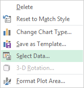
- Right-click in the chart area and choose Select Data... in the popup menu:
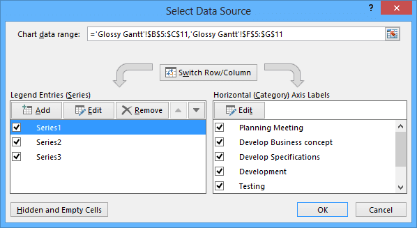
In the Select Data Source dialog box:
- Correct data in Horizontal (Category) Axis Labels. Notice that Excel incorrectly uses the first two columns as the Horizontal (Category) Axis Labels.
- In the Legend Entries (Series) group, add a new data series. Then set the chart's series to
the following:
- Series 1: $C$5:$C$11
- Series 2: $F$5:$F$11
- Series 3: $G$5:$G$11
- Horizontal (Category) Axis Labels: $B$5:$B$11
4. Customize vertical and horizontal axes (for more details see Creating a Gantt chart).
5. Right-click in the every of data series and choose Format Data Series... in the popup menu:
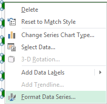
To make the first data series invisible, in the Format Data Series dialog box:
- On the Fill tab, set Fill to No fill
- On the Border Color tab, set Border Color to No line
You can then make any other adjustments to get the expected look.
To add the label to your chart, do the following:
1. Add new data series with data range E5:E11.
2. Right-click in the new data series and choose Add Data Labels and then again Add Data Labels in the popup:
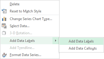
3. Right-click in the new data series labels and choose Format Data Labels... in the popup menu.
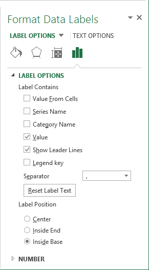
4. In the Format Data Labels pane:
- On the Label Options tab:
- In the Label Contains group, select Value
- In the Label Position group, select Inside Base
- On the Number tab, in the Category list, select Custom, enter format that you want in the Format Code field and press Add:
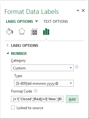
For more details see Conditional formatting of chart axes.
5. Make the new data series invisible.
