Combining several charts into one chart
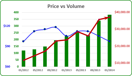
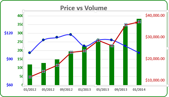
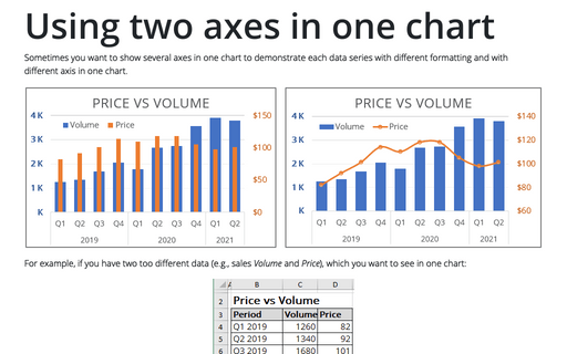
If you need to create a chart that contains only one primary and one secondary axis, see Using two axes in the one chart.
Excel uses only two axis in one chart: primary and secondary. If you want to use another axis, you can create another chart and add it to you first chart. To do this, follow next steps:
1. Select the data range (in this example - income in E4:E13):
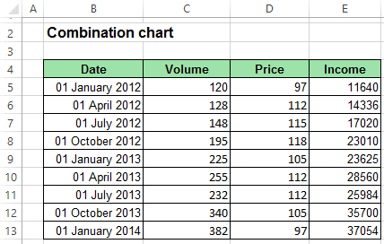
And create a chart that you want:
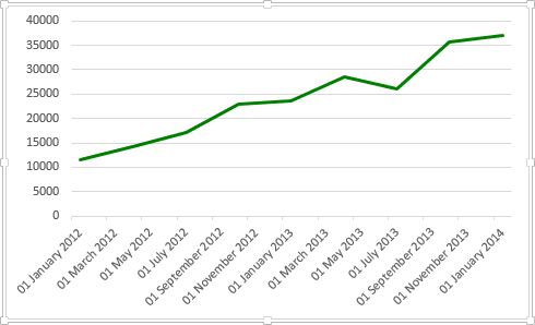
2. Delete the horizontal axis and modify vertical axis:
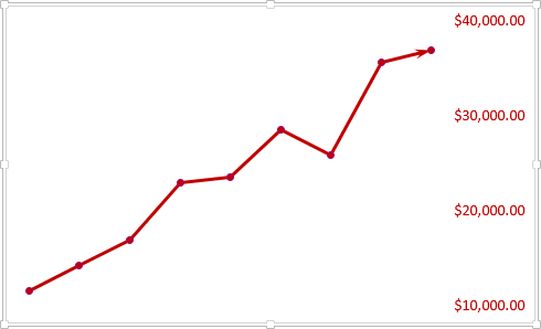
3. Open the Format Chart Area on the Format task pane:
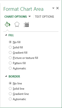
- In the Fill section, select the No fill checkbox.
- In the Border section, select the No line checkbox.
4. Open the Format Plot Area on the Format task pane:
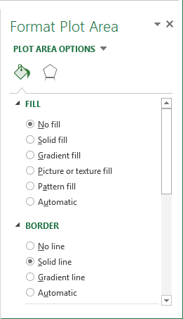
- In the Fill section, select the No fill checkbox.
- In the Border section, select the No line checkbox.
5. The most hard step: Modify first chart to create a space in the right part of the chart and move second chart to create more interesting chart:
