Bubble and Area chart
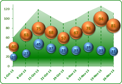
To create the first chart, follow these steps:
1. Select the data range.
2. On the Insert tab, in the Charts group, choose the Area button:

Choose Area in the 2-D Area group and then modify this chart:
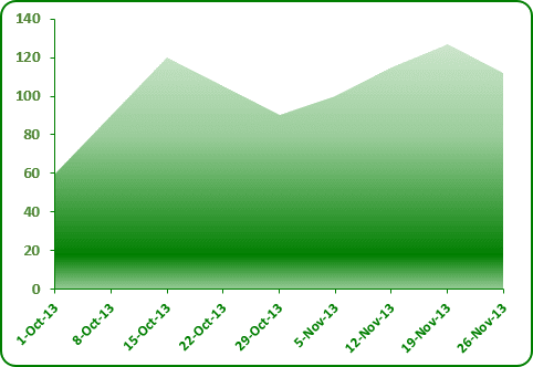
3. To add vertical lines, under Chart Tools, on the Design tab, in the Chart Layouts group, click the Add Chart Element icon and choose Lines list and then Drop Lines:
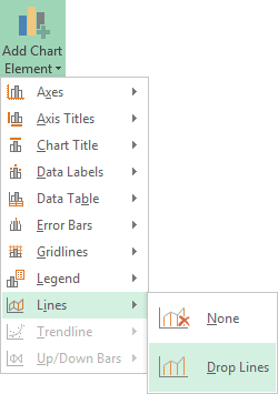
You can customize drop lines: right-click in any one of these lines and choose Format Drop Lines... in the popup menu.
To create second chart, follow these steps:
1. Select the data range.
2. On the Insert tab, in the Charts group, choose the Scatter button:

Choose Bubble with a 3-D effect and, if it is necessary, add another data series:
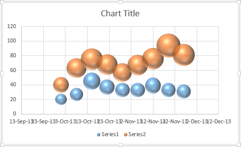
3. Remove axes, legend and title.
4. Open the Format Chart Area on the Format task pane:
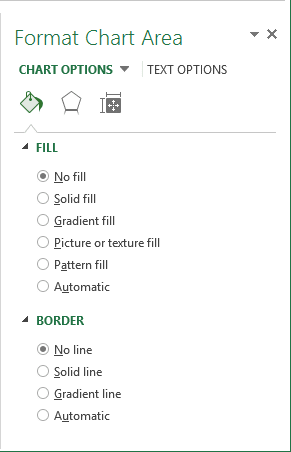
- In the Fill section, select the No fill checkbox.
- In the Border section, select the No line checkbox.
5. Open the Format Plot Area on the Format task pane:
- In the Fill section, select the No fill checkbox.
- In the Border section, select the No line checkbox.
The last and the most hard step: move the second chart.
