Excel 2013
Calculating the number of work days between two dates
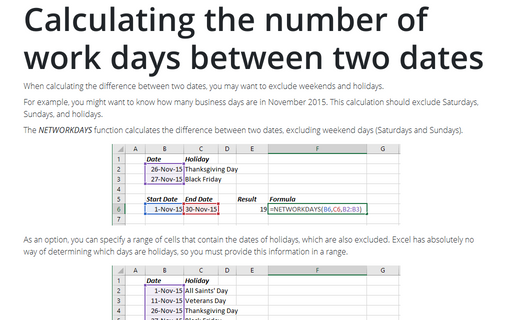
When calculating the difference between two dates, you may want to exclude weekends and holidays.
Calculating the number of days between two dates
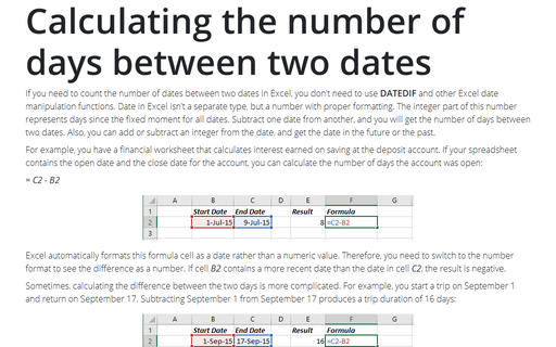
A common type of date calculation determines the number of days between two dates.
Creating a Gantt chart
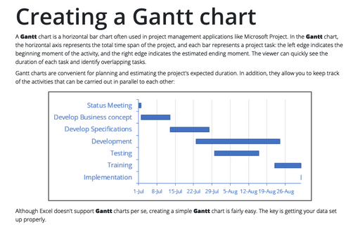
A Gantt chart is a horizontal bar chart that is often used in project management applications
like Microsoft Project.
Creating a simple thermometer chart
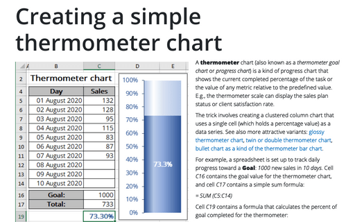
You're probably familiar with a "thermometer" type display that shows the percentage of a task that's
completed. It's very easy to create such a display in Excel.
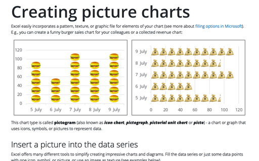
Creating picture charts
Excel makes it easy to incorporate a pattern, texture, or graphic file for elements in your chart. E.g., you
can create funny burger sales chart for your colleagues.
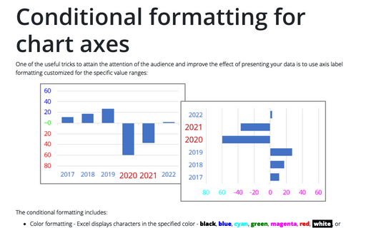
Conditional formatting for chart axes
Another powerful trick to attain the attention of the audience and improve the effect of your presentation
is to use axis label formatting customized for the specific value ranges.
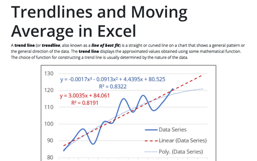
Trendlines and Moving Average in Excel
When you're plotting data over time, you may want to plot a trend line that describes the data. A trend line
points out general trends in your data.
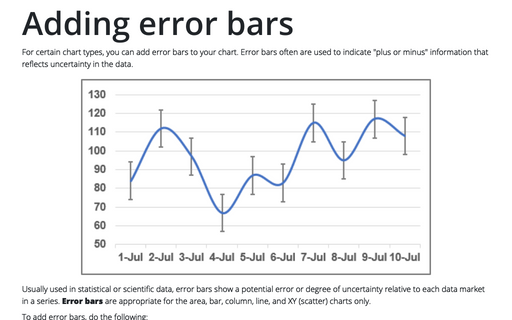
Adding error bars
For certain chart types, you can add error bars to your chart. Error bars often are used to indicate "plus
or minus" information that reflects uncertainty in the data.
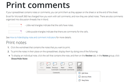
Print comments
If your worksheet contains comments, you can print them as they appear on the sheet or at the end of the
sheet.
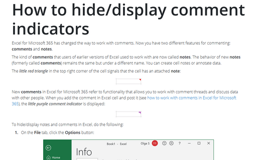
How to hide/display comment indicators
When a comment has been inserted in a cell, the little red triangle is being displayed to indicate a comment
in a cell. This tip is how to hide/display this indicator.
