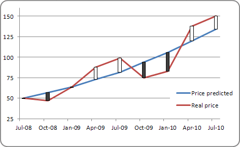
Adding Up/Down Bars to a line chart
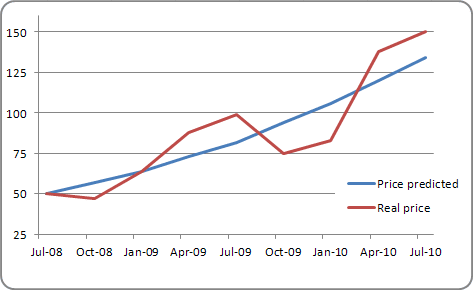
Create a line chart with two different data series, for example:
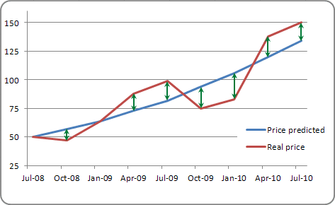
To add High-Low Lines to your chart, select it and then under Chart Tools, on the Layout tab, in the Analysis group, select Lines:
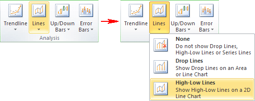
In the Lines drop-down list, select High-Low Lines. High-low lines extend from one line to the other line.
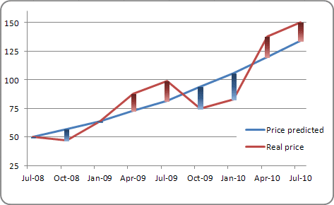
To add Up/Down Bars to your chart, select it and then under Chart Tools, on the Layout tab, in the Analysis group, select Up/Down Bars:

In the Up/Down Bars drop-down list, select Up/Down Bars. Up/Down bars extend from one line to the other line. These bars appear in contrasting colors, depending on which line is higher at that particular point:
