Chart in Excel 2007
Progress Gantt chart with events
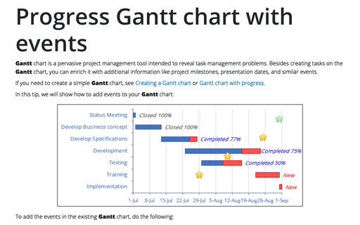
Gantt chart is a pervasive project management tool intended to reveal task management problems. But
you can enrich it with additional information like project milestones, presentation dates and similar
events.
Gantt chart with progress or progress Gantt chart
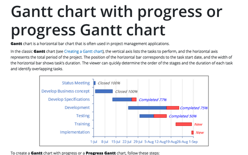
Gantt chart is a horizontal bar chart that is often used in project management applications.
How to add a vertical line to the chart
This tip is about how to add a vertical line in your chart. E.g., this will be useful to show data and
highlight a current date.
How to add a vertical line to the scatter chart
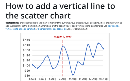
This tip is about how to add a vertical line in your chart. E.g., this will be useful to show data and
highlight a current date.
Creating a Gantt chart
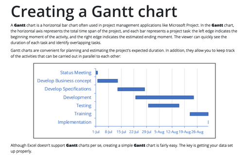
A Gantt chart is a horizontal bar chart that is often used in project management applications
like Microsoft Project.
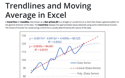
Trendlines and Moving Average in Excel
When you're plotting data over time, you may want to plot a trend line that describes the data. A trend line
points out general trends in your data.
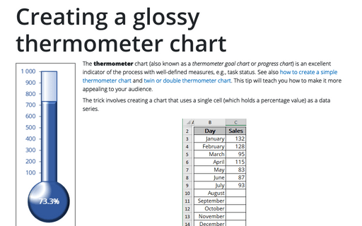
Creating a glossy thermometer chart
Thermometer chart is nice indicator of the process with well-defined measure, e.g. task status. How to
create simple thermometer chart, see Creating a simple thermometer
chart. This tip will teach you how make it more appealing for your audience.
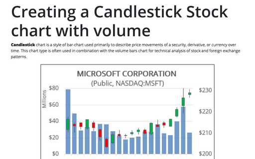
Creating a Candlestick Stock chart with volume
Candlestick chart is a style of bar-chart used primarily to describe price movements of a security,
derivative, or currency over time. This chart type is often used in combination with the volume bars chart
for technical analysis of stock and foreign exchange patterns.
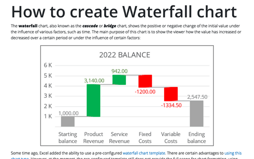
How to create Waterfall chart
The waterfall chart is normally used for understanding how an initial value is affected by a series of
intermediate positive or negative values. Usually the initial and the final values are represented by whole
columns, while the intermediate values are denoted by floating columns.
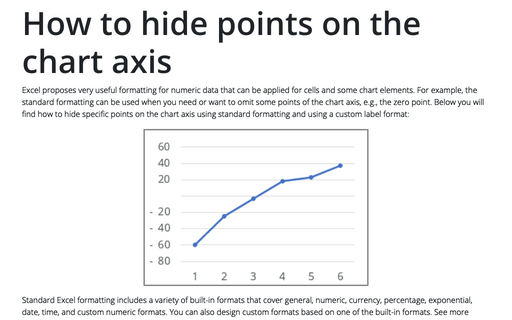
How to hide points on the chart axis
Sometimes you need to omit some points of the chart axis, e.g., the zero point. This tip will show you how
to hide certain points on the chart axis using custom label format.
