Using two axes in one chart
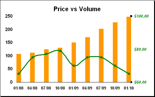
For example, if you have two indicators (e.g., volume and price), which you want to see in one chart:
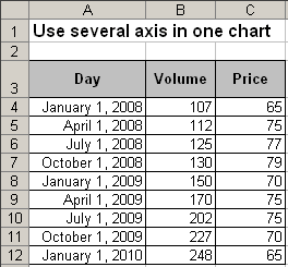
To create the chart for this data, follow these steps:
1. Select the data range (in this example - volume in A4:C12).
2. Choose Insert -> Chart... to open the Chart Wizard dialog box:
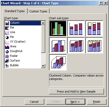
2.1. Choose the Column type, the Clustered Column sub-type and then click Next >.
2.2. In the Step 2 of Chart Wizard check the data and click Next >.
2.3. In the Step 3 of Chart Wizard, in the Titles tab, enter the chart title, in the Gridlines tab, clear the Major gridlines checkbox, hide the legend in the Legend tab, and then click Next >.
2.4. In the Step 4 of Chart Wizard, click the Finish button:
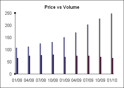
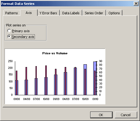
3. Excel use primary axis in charts, to change which axis - primary or secondary - can uses for the data series, do the following:
- Right-click in the second (price) data series, in the popup menu select Format Data Series... to open the Format Data Series dialog box.
- On the Axis tab, choose the Secondary Axis checkbox.
4. To change a format type of the second data series, right-click in the second (price) data series and choose Chart Type...:
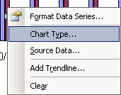
You can choose another chart type, for example, a line.
5. Modify the secondary axis and the chart.
How to add next data series with another axis, see Combining several charts into one chart.
