Creating a gauge chart
This example shows a pie chart set up to resemble a gauge. Although this chart displays a single value (entered in cell B15), it actually uses three data points (in C12:C14).
Cell B15 contains a formula that calculates the percent of goal:
= B13 / B12
As you enter new data in column B, the formulas display the current results.
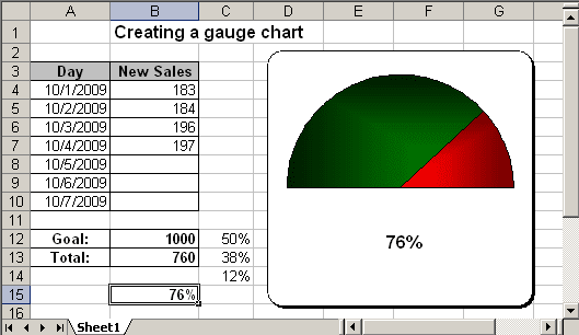
Cell C12 consists of 50%, and that slice is hidden.
The other two slices are apportioned based on the value in cell B15. The formula in cell C13 is
= MIN (C15, 100%) / 2
This formula uses the MIN function to display the smaller of two values: either the value in cell C15 or 100%. It then divides this value by 2 because I'm only dealing with the visible half of the pie chart. Using the MIN function prevents the chart from displaying more than 100%.
The formula in cell C13, shown below, simply calculate the remaining part of the pie:
= 50% - C12
To create the chart like this one, do the following:
1. Select cells C12:C14, click the Chart Wizard button, and create a pie chart.
2. In the Step 3 of the Chart Wizard remove the legend in the Legend tab.
3. Double-click slices to display the Format Data Series dialog box. Then select the Options tab, and change the Angle of first slice setting.
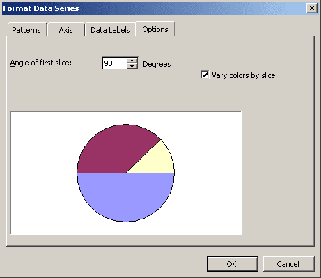
4. Double-click the slice 50% to change the slice's Area and Border:

You can then make any other adjustments to get the look you desire.
