Combining several charts into one chart
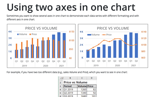
If you need to create a chart that contains only one primary and one secondary axis, see Using two axes in the one chart.
In this tip we will show how different data series (e.g., volume, price and gross income) could be combined in the one chart.
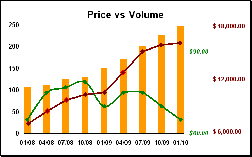
Excel uses only two axis in one chart: primary and secondary. If you want to use another axis, you can create another chart and add it to you first chart. To do this, follow next steps:
1. Select the data range (in this example - gross income in D4:D12):
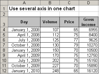
2. Create a chart that you want without the horizontal axis, then modify vertical axis:
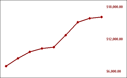
3. Right-click in the chart area, in the popup menu select Format Chart Area... to open the Format Chart Area dialog box:
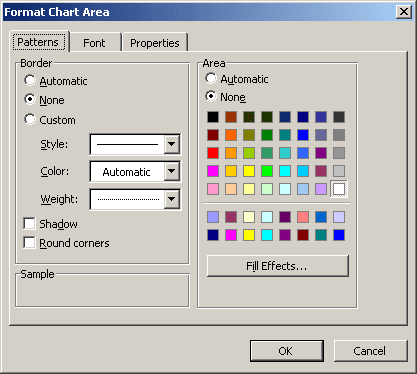
- In the Border group, select the None checkbox.
- In the Area group, select the None checkbox.
4. Right-click in the plot area, in the popup menu select Format Plot Area... to open the Format Plot Area dialog box. On the Patterns tab, select None checkboxes.
5. The most hard step: Modify first chart to create a space in the right part of the chart and move second chart to create more interesting chart.
