Chart in Excel 2003
Combining several charts into one chart
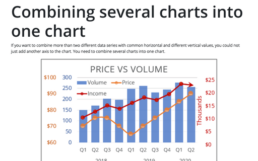
If you want to combine more than two different data series with common horizontal and different vertical
values, you could not just add another axis to the chart. You need to combine several charts into one chart.
Using two axes in one chart
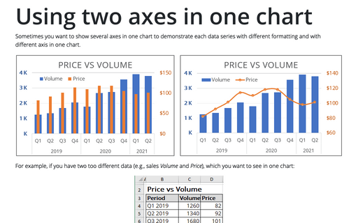
Sometimes you want to show several axes in one chart in order to demonstrate each data series with different
formatting and with different axis in one chart.
How to add deviations into your chart
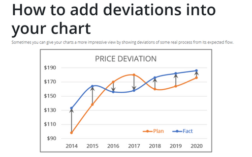
Sometimes you can give your charts more impressive view by showing deviations of some real process from its
expected flow.
How to add Dividers to the chart
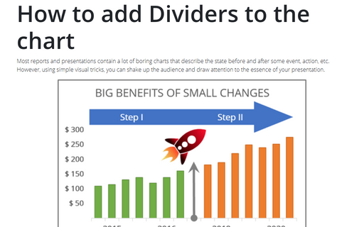
Most reports and presentations contain a lot of boring charts that describe the state before and after
some event, action, etc. However, using simple visual tricks you can shake up the audience and draw an
attention to the essence of your presentation.
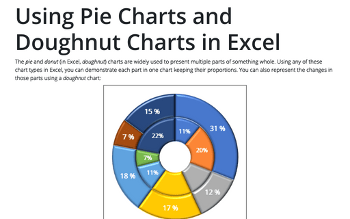
Using Pie Charts and Doughnut Charts in Excel
If you have several parts of something one, you can demonstrate each item in one pie chart. But sometimes
you want to demonstrate the changes of those parts and doughnut chart will help you to do this.
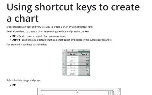
Using shortcut keys to create a chart
Excel propose easy and very fast way to create a chart by using shortcut keys.
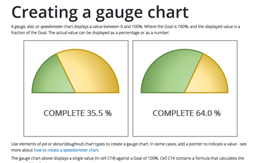
Creating a gauge chart
This chart resembles a speedometer gauge and displays a value between 0 and 100%.
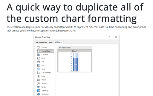
A quick way to duplicate all of the custom chart formatting
Creation of a large number of visually consistent charts to represent different data is a time consuming and
error prone task, unless you know how to copy formatting between charts.
