Creating a twin or double thermometer chart
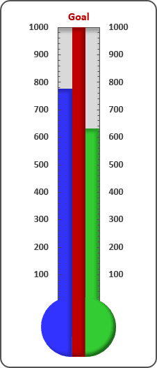
For example, the worksheet contains data from two teams to track monthly progress towards the goal: 1,000 new sales during the year. Cells C17 and D17 contain the goal value, and cells C19 and D19 contain a simple sum formula:
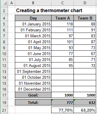
C19: =SUM(C5:C16) and D19: =SUM(D5:D16)
Cells C21 and D21 contain a formula that calculates the percent of goal:
C21: =C19/C17 and D21: =D19/D17
As you enter new data in column C or D, the formulas display the current results.
To create the chart like this one, do the following:
1. Select cells C21 and D21, if you want to create a percentage axis or select cells C17, C19 and D19, if you want to create an volume axis.
2. On the Insert tab, in the Charts group, choose the Column button:

Choose the Clustered Column
 chart.
3. Remove the horizontal (x) axis, gridlines, legend, and the title.
4. To sort the columns in a different order, follow the next steps:
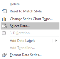
4.1. Right-click in the chart area and select Select Data... in the popup menu:
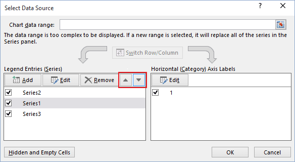
4.2. In the Select Data Source dialog box, choose the data series, and click Up or Down:
5. To make marks for axis, do the following:
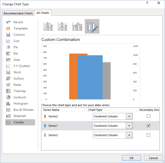
5.1. Right-click on the chart area and select Change Chart Type... in the popup menu:
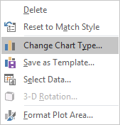
5.2. In the Change Chart Type dialog box, select the Secondary Axis for the Series1:
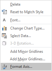
5.3. Right-click the vertical axis and choose Format Axis... in the popup menu (or double-click the axis):
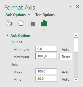
On the Format Axis pane, in the Axis Options tab:
- In the Axis Options group, set the Minimum to 0 and the Maximum to
1 (in you use an percentage axis) or to 1000 (for this example):
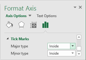
- In the Tick Marks group, select the Inside option for Major type and for
Minor type:
You can also hide the zero point in the axis (see How to hide points on the chart axis).
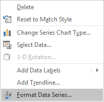
5.4. To make columns occupy the entire width of the plot area, right-click the column, and choose Format Data Series... in the popup menu:
On the Format Data Series pane, in the Series Options tab, change the Gap Width setting:
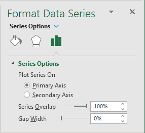
Set the Gap Width to 0.
6. On the Insert tab, in the Illustrations group, select Shapes:

7. On the Shapes list, in the Basic Shapes group, choose the shapes that you want to add in your chart. Format shapes, and insert the data label if you want (see How to insert cell content to the shape).
You can then make any other adjustments to get the look you desire.
See also this tip in French: Comment créer un graphique de thermomètre double.
