Creating a semaphore thermometer chart
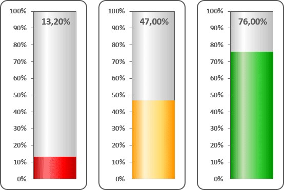
For example, a worksheet set up to track daily progress toward a goal: 1,000 new sales in 10 days. Cell C16 contains the goal value, and cell C17 contains a simple sum formula:
= SUM (C5:C14)
Cell C19 contains a formula that calculates the percent of goal (see Creating a simple thermometer chart):
= C17 / C16
To create the chart like this one, do the following:
1. Add additional data to see different colors for different volumes (in this example, cells C20:C23):

2. Select cells C20:C23.
3. On the Insert tab, in the Charts group, choose the Column button:

Choose the Stacked Column
 chart.
4. Do one of the following:
- Right-click in the chart area. In the popup menu select Select Data...:
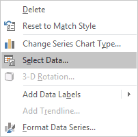
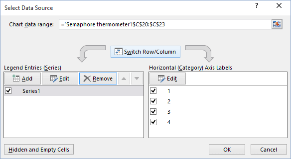
Then in the Select Data Source dialog box, click the Switch Row/Column button:
- Under Chart Tools, on the Design tab, in the Data group, click the Switch
Row/Column button:

5. Remove the horizontal (x) axis and the legend. Make any other adjustments to get the look you desire (see Creating a simple thermometer chart for more details).
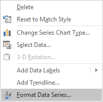
6. Right-click in the data series and choose Format Data Series... in the popup menu:
7. On the Format Data Series pane, on the Fill tab, choose the color you prefer:
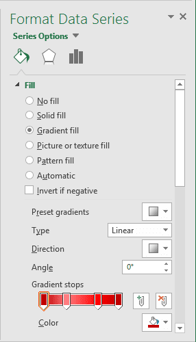
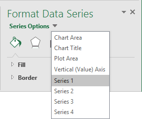
8. In the Format Data Series pane, choose different colors for every series. You can choose different series in that pane:
Make any other adjustments to get the look you desire.
See also this tip in French: Comment créer un graphique de thermomètre de sémaphore.
