Excel 2016
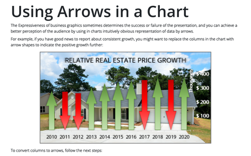
Using Arrows in a Chart
The Expressiveness of business graphics sometimes determines the success or failure of the presentation,
and you can achieve a better perception of the audience by using in charts intuitively obvious representation
of data by arrows.
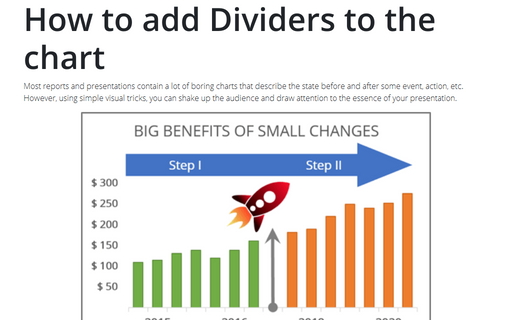
How to add Dividers to the chart
Most reports and presentations contain a lot of boring charts that describe the state before and after some
event, action, etc. However, using simple visual tricks, you can shake up the audience and draw attention
to the essence of your presentation.
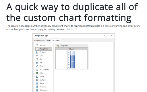
A quick way to duplicate all of the custom chart formatting
The creation of a large number of visually consistent charts to represent different data is a time consuming and
error prone task unless you know how to copy formatting between charts.
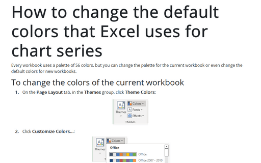
How to change the default colors that Excel uses for chart series
Every workbook uses a palette of 56 colors, but you can change the palette for the current workbook or even
change the default colors for new workbooks.
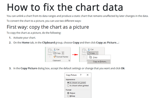
How to fix the chart data
You can unlink a chart from its data ranges and produce a static chart that remains unaffected by later
changes in the data.
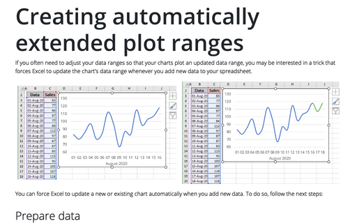
Creating automatically extended plot ranges
If you often need to adjust your data ranges so that your charts plot an updated data range, you may be
interested in a trick that forces Excel to update the chart's data range whenever you add new data to your
worksheet.
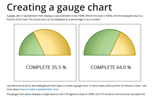
Creating a gauge chart
This chart resembles a speedometer gauge and displays a value between 0 and 100%.
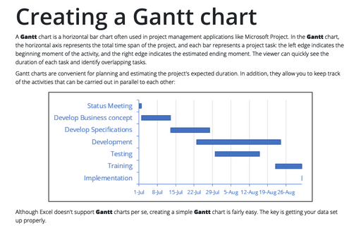
Creating a Gantt chart
A Gantt chart is a horizontal bar chart that is often used in project management applications
like Microsoft Project.
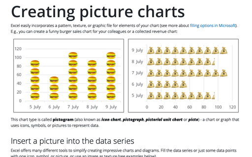
Creating picture charts
Excel makes it easy to incorporate a pattern, texture, or graphic file for elements in your chart. E.g., you
can create a funny burger sales chart for your colleagues.
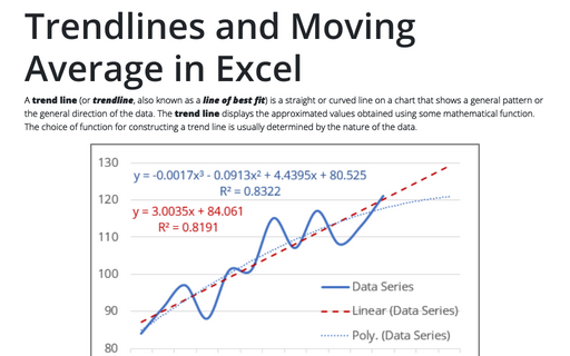
Trendlines and Moving Average in Excel
When you're plotting data over time, you may want to plot a trend line that describes the data. A trend line
points out general trends in your data.
