Chart in Excel 2013
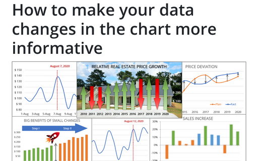
How to make your data changes in the chart more informative
Simple line and bar charts often attract little or no interest of the audience, but Excel allows you to
attract an attention to your data by emphasizing change direction, difference or period.
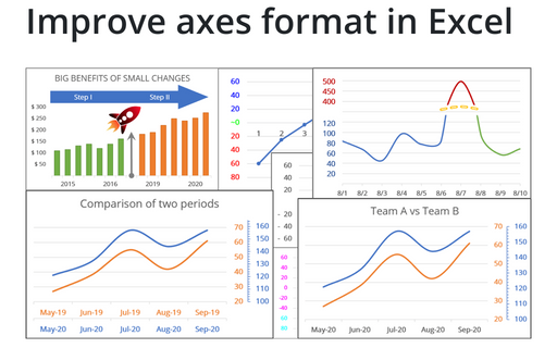
Improve axes format in Excel
Very few Excel users pay an attention to the chart axes, but there are some tricks with axes that will help
you to improve your visualizations with little or no efforts.
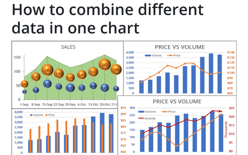
How to combine different data in one chart
To make your data more information you can combine different chars in many ways.
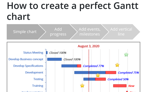
How to create a perfect Gantt chart
Gantt charts illustrate project schedules and, thus, often used by project managers. Project management
tools like Microsoft Project are better suited for Gantt charts, but it is easy to create a Gantt chart in
Excel following the simple steps.
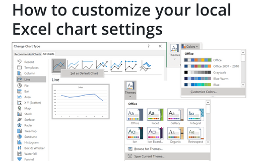
How to customize your local Excel chart settings
Default installation of Excel have reasonable presets for chart types and colors, but you can change those
defaults according your own preferences.
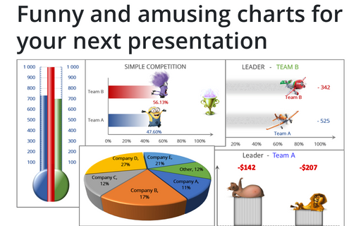
Funny and amusing charts for your next presentation
There are several different Excel features that can make your presentation less boring:
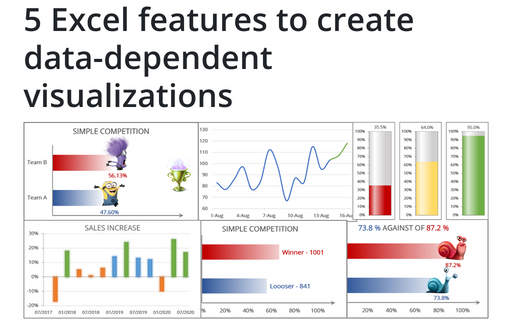
5 Excel features to create data-dependent visualizations
There are several useful features in Excel that can help to create your charts, which automatically change
visual appearance depending on data.
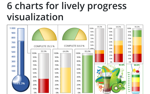
6 charts for lively progress visualization
There are several different charts in Excel that can help you to create a perfect progress illustration.
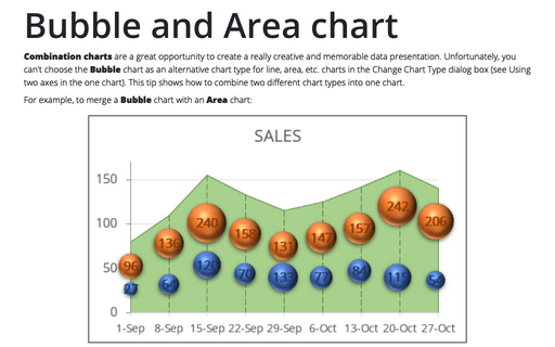
Bubble and Area chart
In this tip we will show how to different charts could be combined in the one chart. In example we will
combine a Bubble chart with an Area chart:
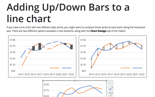
Adding Up/Down Bars to a line chart
If you have a line chart with two different data series, you might want to compare those series at each
point along the horizontal axis. There are two different options for this, available in two locations along
the Layout tab of the ribbon.
