Chart in Excel 2010
Combining several charts into one chart
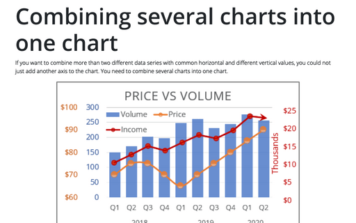
If you want to combine more than two different data series with common horizontal and different vertical
values, you could not just add another axis to the chart. You need to combine several charts into one chart.
Using two axes in one chart
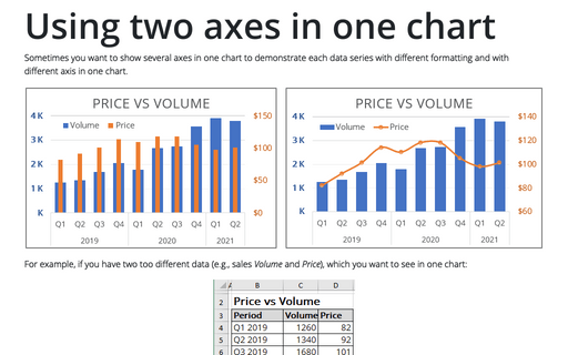
Sometimes you want to show several axes in one chart in order to demonstrate each data series with different
formatting and with different axis in one chart.
Excel 3-D Pie charts
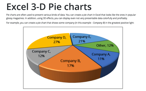
This tip is about how to create a pie chart such as in popular glossy magazines.
How to add deviations into your chart
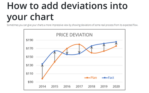
Sometimes you can give your charts more impressive view by showing deviations of some real process from its
expected flow.
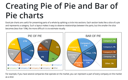
Creating Pie of Pie and Bar of Pie charts
If you have several parts of something whole, you can demonstrate each item in one pie chart. But, when
several parts each amount to less than 10 percent of the pie, it becomes hard to distinguish the slices.
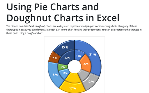
Using Pie Charts and Doughnut Charts in Excel
If you have several parts of something one, you can demonstrate each item in one pie chart. But sometimes
you want to demonstrate the changes of those parts and doughnut chart will help you to do this.
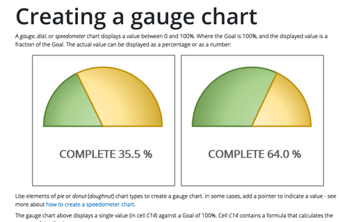
Creating a gauge chart
This chart resembles a speedometer gauge and displays a value between 0 and 100%.
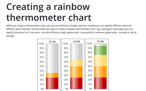
Creating a rainbow thermometer chart
Creating a thermometer chart you are not limited to a single color bar. Instead you can specify different
colors for different value intervals. This tip shows you how to create a rainbow thermometer chart. E.g.,
working on some goal you can specify risk zones for it: red zone - risk of the fail is high, yellow zone -
success/fail is unknown, green zone - success is not far enough.
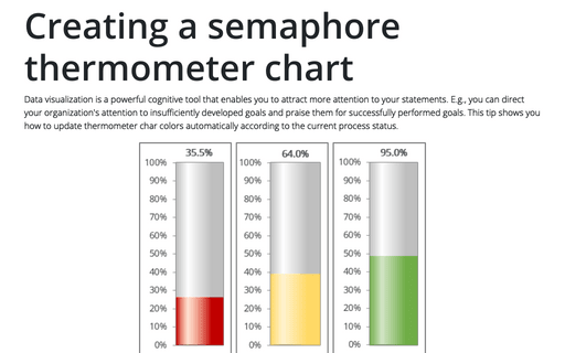
Creating a semaphore thermometer chart
Data visualization is a key cognitive tool that enables you to attract more attention to your statements.
E.g., you can direct your organization attention to insufficiently developed goals and praise them for
successfully performed goals. This tip shows you how to update thermometer char colors automatically
according to the current process status.
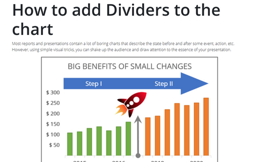
How to add Dividers to the chart
Most reports and presentations contain a lot of boring charts that describe the state before and after some
event, action, etc. However, using simple visual tricks you can shake up the audience and draw an attention
to the essence of your presentation.
