Using Arrows in a Chart
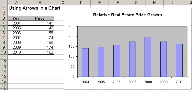
For example, if you have good news to report about consistent growth, you might want to replace the columns in the chart with arrow shapes in order to further indicate the positive growth:

To convert columns to arrows, follow next steps:
1. Create a column chart showing a single series.
2. In an empty section of the worksheet, do the following to insert a new block arrow shape:
- Select the Insert -> Picture -> AutoShapes.
- Choose the Up Arrow (or Down Arrow) from the Shapes list:

3. Select the arrow and press Ctrl+C to copy the arrow to the Clipboard.
4. Click a column in the chart to select all the columns in the data series (you can also select only one column).
5. Press Ctrl+V to paste the arrow. Excel fills the columns with a picture of the block arrow.
You can then make any other adjustments to get the look you desire.
6. After creating the chart, you can delete the arrow created in step 2 by clicking the arrow and press the Delete key.
