How to create Waterfall chart
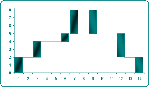
To create a simple waterfall chart, do the following:
1. Add three columns with "Y empty" data, "Y plus" data and "Y minus" data (you can add a column for empty data and a new column with independent data for every unique color in you waterfall chart), where:
C: = IF (B5 > B4, B4, B5), D: = IF (B5 > B4, B5 - B4, 0), and E: = IF (B5 > B4, 0, B4 - B5)
2. Add rows with empty "Y" data, if necessary (in this example 5, 7, 8, 11, 13, 14 and 16) and then add two columns for continuous line (see in the bottom of this tip).
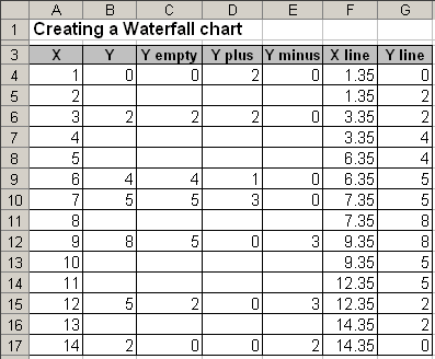
3. Select the data range (in this example C4:E17).
4. Click the Chart Wizard ![]() button (or choose Insert -> Chart...).
button (or choose Insert -> Chart...).
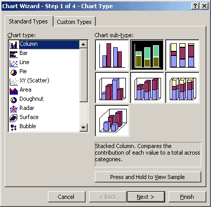
5. In the Chart Wizard dialog box, choose a Column type and the Stacked Column sub-type and then click Next >:
6. In the Step 2 of Chart Wizard, check the data and click Next >.
7. In the Step 3 of Chart Wizard:
- Remove Major gridlines on the Gridlines tab
- Remove the legend on the Legend tab.
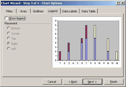
8. In the Step 4 of Chart Wizard, click the Finish button.
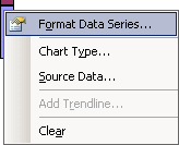
9. Right-click in the any of first series column and choose Format Data Series...:
10. In the Format Data Series dialog box, on the Patterns tab, check the None option in the Border group and check the None option in the Area group:
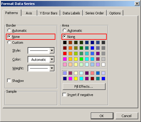
You can then make any other adjustments to get the look you desire.
To add the continuous line, do the following:
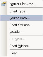
- Right-click in the chart area and choose Source Data... in the popup menu:
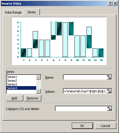
- In the Source Data dialog box, on the Series tab, click the Add button and
select the data range in the Values field (in this example G4:G17):
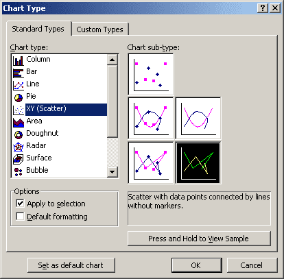
- Right-click in the chart area and choose Chart Type... in the popup menu.
- In the Chart Type dialog box, choose the XY (Scatter) type and the Scatter with
data points connected by lines without markers sub-type:
- Edit data source for add "X" points (repeat steps 1-2):
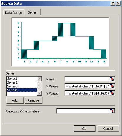
- Format this line.
