Excel 2003
Waterfall chart using Error bars
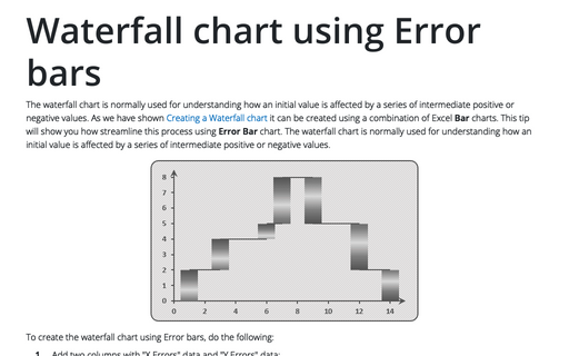
The waterfall chart is normally used for understanding how an initial value is affected by a series of
intermediate positive or negative values. As we have shown
Creating a Waterfall chart it can be created
using a combination of Excel Bar charts. This tip will show you how streamline this process using
Error Bar chart. The waterfall chart is normally used for understanding how an initial value is
affected by a series of intermediate positive or negative values.
Creating a Candlestick Stock chart
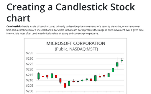
Candlestick chart is a style of bar-chart used primarily to describe price movements of a security,
derivative, or currency over time. It is a combination of a line-chart and a bar-chart, in that each bar
represents the range of price movement over a given time interval. It is most often used in technical
analysis of equity and currency price patterns.
How to insert cell content to the shape
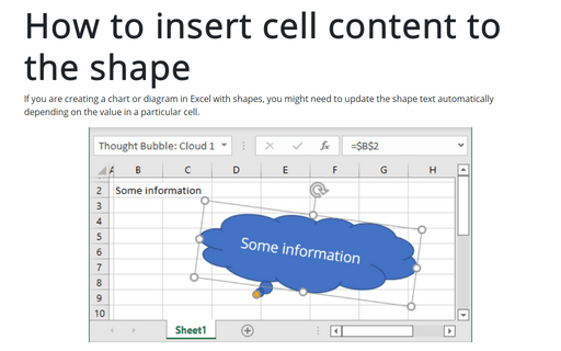
If you are creating chart or diagram in Excel with shapes, you might need to update the shape text
automatically depending on the value in a particular cell.
Conditional formatting for chart axes
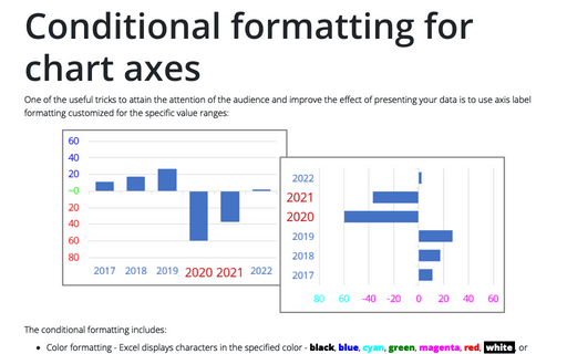
Another powerful trick to attain the attention of the audience and improve the effect of your presentation
is to use axis label formatting customized for the specific value ranges.
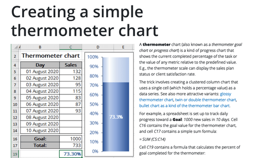
Creating a simple thermometer chart
You're probably familiar with a "thermometer" type display that shows the percentage of a task that's
completed. It's very easy to create such a display in Excel.
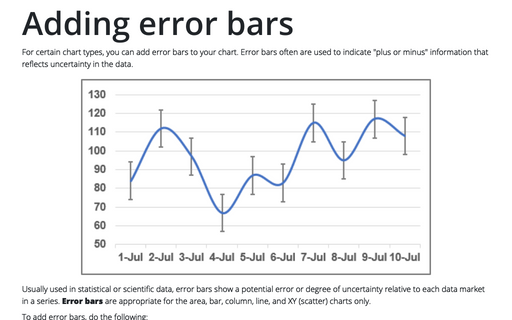
Adding error bars
For certain chart types, you can add error bars to your chart. Error bars often are used to indicate 'plus
or minus' information that reflects uncertainty in the data.
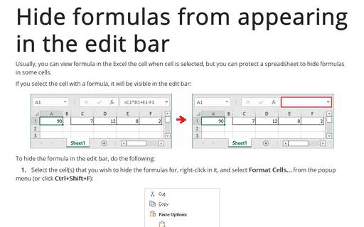
Hide formulas from appearing in the edit bar
Usually you can view a formula in the Excel cell when cell is selected, but you can protect spreadsheet to
hide formulas in some cells.
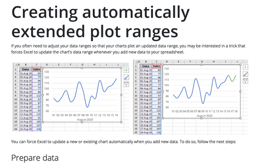
Creating automatically extended plot ranges
If you often need to adjust your data ranges so that your charts plot an updated data range, you may be
interested in a trick that forces Excel to update the chart's data range whenever you add new data to your
worksheet.
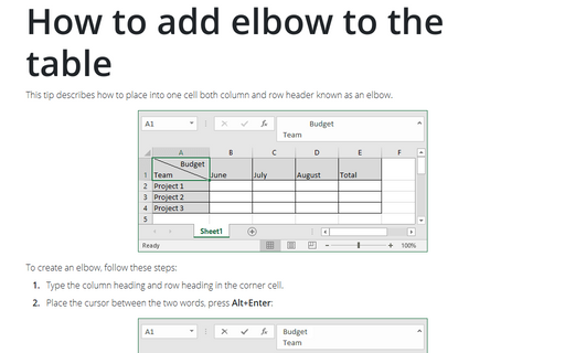
How to add elbow to the table
This tip describes how to place into one cell both column and row header known as elbow.
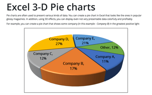
Excel 3-D Pie charts
This tip is about how to create a pie chart such as in popular glossy magazines.
