Chart in Excel 2003
How to fix the chart data
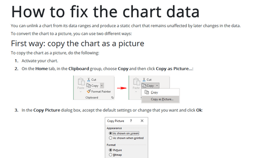
You can unlink a chart from its data ranges and produce a static chart that remains unaffected by later
changes in the data.
The Chart Toolbar
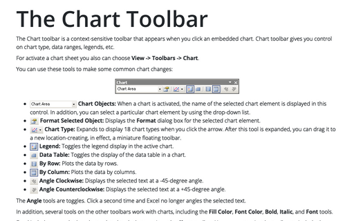
The Chart toolbar is a context-sensitive toolbar that appears when you click an embedded chart. Chart
toolbar gives you control on chart type, data ranges, legends, etc.
Using Arrows in a Chart
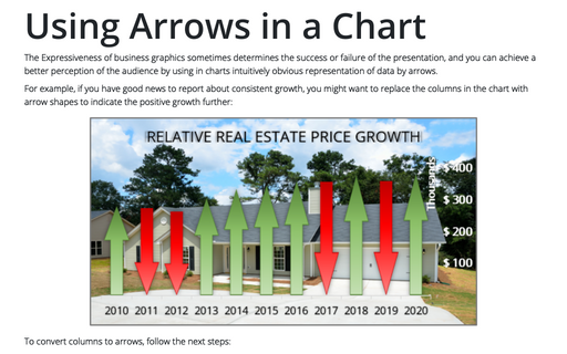
Expressiveness of business graphics sometimes determines the success or failure of the presentation and you
can achieve better perception of the audience by using in charts intuitively obvious representation of data
by arrows.
Creating picture charts
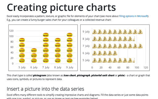
Excel makes it easy to incorporate a pattern, texture, or graphic file for elements in your chart. E.g., you
can create funny burger sales chart for your colleagues.
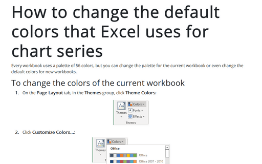
How to change the default colors that Excel uses for chart series
Every workbook uses a palette of 56 colors, but you can change palette for the current workbook or even
change the default colors for new workbooks.
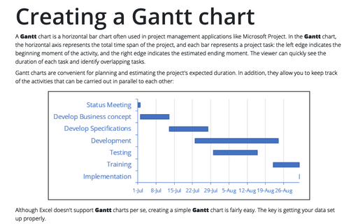
Creating a Gantt chart
A Gantt chart is a horizontal bar chart that is often used in project management applications
like Microsoft Project.
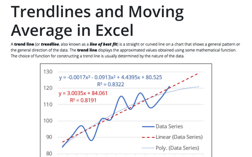
Trendlines and Moving Average in Excel
When you're plotting data over time, you may want to plot a trend line that describes the data. A trend line
points out general trends in your data.
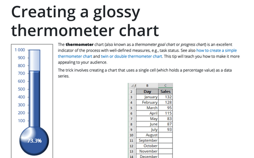
Creating a glossy thermometer chart
Thermometer chart is nice indicator of the process with well-defined measure, e.g. task status. How to
create simple thermometer chart, see
Creating a simple thermometer chart.
This tip will teach you how make it more appealing for your audience.
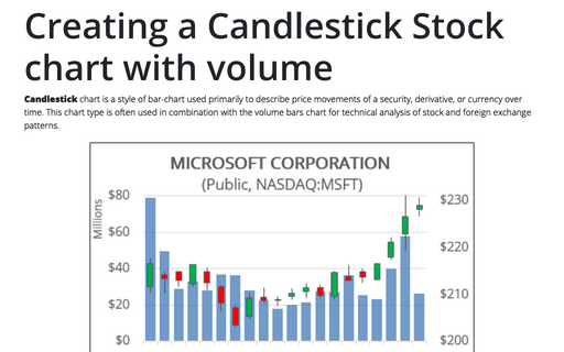
Creating a Candlestick Stock chart with volume
Candlestick chart is a style of bar-chart used primarily to describe price movements of a security,
derivative, or currency over time. This chart type is often used in combination with the volume bars chart
for technical analysis of stock and foreign exchange patterns.
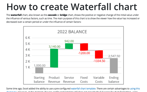
How to create Waterfall chart
The waterfall chart is normally used for understanding how an initial value is affected by a series of
intermediate positive or negative values. Usually the initial and the final values are represented by whole
columns, while the intermediate values are denoted by floating columns.
