Adding error bars
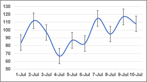
Usually used in statistical or scientific data, error bars show a potential error or degree of uncertainty relative to each data market in a series. Error bars are appropriate for the area, bar, column, line, and XY (scatter) charts only.
To add error bars, do the following:
1. Select a data series, Excel displays the Chart Design and Format tabs.
2. Do one of the following:
- On the Chart Design tab, in the Chart Layouts group, click the
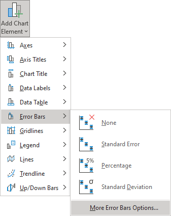
Add Chart Element drop-down list:

In the Add Chart Element drop-down list, choose the Error Bars list:
- Click the Chart Elements button:
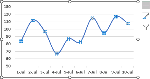
In the Chart elements list, choose the Error Bars list:
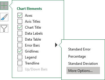
Excel proposes several error bars. Also, you can use More Error Bars Options.... If necessary, you can fine-tune the error bar settings from the Format Error Bars pane:
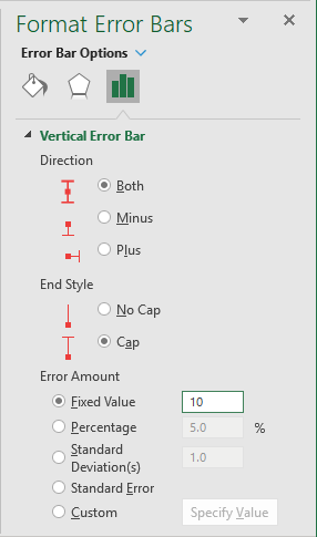
In the Format Error Bars pane you can choose:
- In the Direction group:
- Both Shows the actual data point value plus and minus a specific error amount
- Minus Shows the actual data point value minus a specific error amount
- Plus Shows the actual data point value plus a specific error amount
- In the End Style group:
- No Cap Display error bars without end caps
- Cap Displays error bars with end caps
- In the Error Amount group, Excel enables you to specify several types of error bars:
- Fixed value uses the constant value that you specify in the Fixed value box to calculate the error amount for each data point and displays this error amount in the same height for Y error bars and the same width for X error bars.
For example, see How to create a simple Bullet graph in Excel.
- Percentage uses the percentage that you specify in the Percentage box to calculate the error amount for each data point as a percentage of the value of that data point. Y error bars and X error bars that are based on the percentage of the value of the data points vary in size.
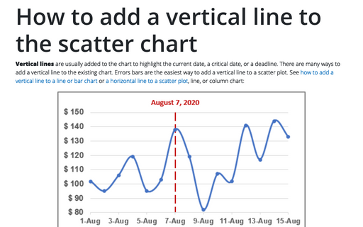
For example, see How to add a vertical line to the chart.
- Standard deviation(s) displays the standard deviation for the plotted values that are calculated for each data point and then multiplied by the number that you specify in the Standard deviation(s) box. The resulting Y error bars or X error bars are the same size and do not vary with each data point.
- Standard error displays the standard error amount for all plotted values. All data points in the series display the error amount in the same height for Y error bars and the same width for X error bars.
- Custom uses values in a worksheet range that you specify as error amounts. Using this option, you can include formulas in the worksheet range when calculating the error amounts.
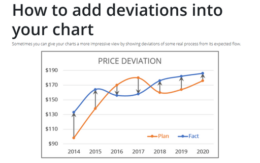
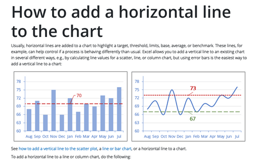
For example, see How to add deviations into your chart or How to add a horizontal line to the chart.
- Fixed value uses the constant value that you specify in the Fixed value box to calculate the error amount for each data point and displays this error amount in the same height for Y error bars and the same width for X error bars.
See also this tip in French: Ajouter de barres d’erreur.
